. 2000:47:309-30.
doi: 10.1016/s0065-308x(00)47013-2.

Forecasting disease risk for increased epidemic preparedness in public health

Affiliations

Forecasting disease risk for increased epidemic preparedness in public health

M F Myers et al. Adv Parasitol. 2000.

Abstract

Emerging infectious diseases pose a growing threat to human populations. Many of the world's epidemic diseases (particularly those transmitted by intermediate hosts) are known to be highly sensitive to long-term changes in climate and short-term fluctuations in the weather. The application of environmental data to the study of disease offers the capability to demonstrate vector-environment relationships and potentially forecast the risk of disease outbreaks or epidemics. Accurate disease forecasting models would markedly improve epidemic prevention and control capabilities. This chapter examines the potential for epidemic forecasting and discusses the issues associated with the development of global networks for surveillance and prediction. Existing global systems for epidemic preparedness focus on disease surveillance using either expert knowledge or statistical modelling of disease activity and thresholds to identify times and areas of risk. Predictive health information systems would use monitored environmental variables, linked to a disease system, to be observed and provide prior information of outbreaks. The components and varieties of forecasting systems are discussed with selected examples, along with issues relating to further development.


Figures

Figure 1
Figure 1
A three-tiered approach for epidemic forecasting, early warning and detection. Each tier is associated with specific indicators and responses. In this simplified example for malaria epidemics, a first warning flag is raised at the regional level after Sea Surface Temperature (SST) anomalies suggest an impending El Niño event. Subsequent excess rainfall is monitored directly as part of an early warning system and Flag 2 is raised once a critical threshold is reached. Malaria cases are monitored at the individual (sentinel) facility level and an epidemic declared once a defined threshold has been reached. (Cox et al., 1999).
Plate 16
Plate 16
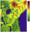
Average Normalized Difference Vegetation Index (NDVI) of East Africa during 1993 at a 1 × 1 km spatial resolution. The image is based on daily retrievals from channels 1 and 2 of the AVHRR on the National Oceanic and Atmospheric Administration (NOAA) satellites. The NDVI is scaled linearly between brown (0) and green (0.7). Blue indicates permanent water, and north is to the top of the page. The white numbers represent the following countries: 1, Uganda; 2, Kenya; 3, Rwanda; 4, Burundi; 5, Tanzania. The black numbers 6 and 7 indicate the location of Wajir and Kericho, respectively, whose malaria epidemiology is contrasted in the text. See Myers et al. (this volume).
Plate 17
Plate 17
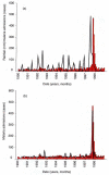
(a) Malaria cases and rainfall by month (1991–1998) for Wajir, Northern Kenya. Red bars indicate malaria cases, and black lines rainfall totals. (b) Observed (red bars) and predicted (black line) malaria cases in Wajir, Northern Kenya. The prediction is based on a simple quadratic relationship between present cases (x) and rainfall (y) 3 months previously; where x = 19.9635 − 0.0399y, + 0.0018y2. The 20-case baseline is a statistical artefact, probably resulting from the background of imported malaria cases. See Myers et al. (this volume).
Plate 18
Plate 18
Rainfall anomalies in the arid areas of sub-Saharan Africa. (a) An ecological classification for Africa based on rainfall amount (Pratt and Gwynne, 1977) using long-term climate data (Hutchinson et al., 1995). Yellow corresponds to deserts, and light and dark orange to arid and semi-arid regions, respectively. The light- and dark-green areas are sub-humid and humid zones, which are masked out of the other maps in this plate. (h) Rainfall anomaly maps for January 1999 calculated as deviations from the long-term average. Red areas indicate negative deviations, white no change and green positive deviations, and the data are scaled linearly between the darkest red (−200 mm) and the darkest green (+200 mm) areas. In all maps, north is to the top of the page, and data for Madagascar are not shown. See Myers et al. (this volume). Rainfall anomalies in the arid areas of sub-Saharan Africa. (c)–(d) Rainfall anomaly maps for April and July 1999, respectively, calculated as deviations from the long-term average. Red areas indicate negative deviations, white no change and green positive deviations, and the data are scaled linearly between the darkest red (−200 mm) and the darkest green (+200 mm) areas. In all maps, north is to the top of the page, and data for Madagascar are not shown. See Myers et al. (this volume).
Plate 18
Plate 18
Rainfall anomalies in the arid areas of sub-Saharan Africa. (a) An ecological classification for Africa based on rainfall amount (Pratt and Gwynne, 1977) using long-term climate data (Hutchinson et al., 1995). Yellow corresponds to deserts, and light and dark orange to arid and semi-arid regions, respectively. The light- and dark-green areas are sub-humid and humid zones, which are masked out of the other maps in this plate. (h) Rainfall anomaly maps for January 1999 calculated as deviations from the long-term average. Red areas indicate negative deviations, white no change and green positive deviations, and the data are scaled linearly between the darkest red (−200 mm) and the darkest green (+200 mm) areas. In all maps, north is to the top of the page, and data for Madagascar are not shown. See Myers et al. (this volume). Rainfall anomalies in the arid areas of sub-Saharan Africa. (c)–(d) Rainfall anomaly maps for April and July 1999, respectively, calculated as deviations from the long-term average. Red areas indicate negative deviations, white no change and green positive deviations, and the data are scaled linearly between the darkest red (−200 mm) and the darkest green (+200 mm) areas. In all maps, north is to the top of the page, and data for Madagascar are not shown. See Myers et al. (this volume).

References

    1. Baylis M, Mellor PS, Meiswinkel R. Horse sickness and ENSO in South Africa. Nature. 1999;397:574. - PubMed
    1. Berkelman RL. Emerging infectious diseases in the United States. Annals of the New York Academy of Science. 1994;740:346–361. - PubMed
    1. Berkelman RL. The public health response to emerging infectious diseases: are current approaches adequate? In: Greenwood B, De Cock K, editors. New And Resurgent Infections: Prediction, Detection and Management of Tomorrow’s Epidemics. John Wiley; London: 1998.
    1. Bonabeau E, Toubiana L, Flahault A. The geographical spread of influenza. Proceeedings of the Royal Society of London B. 1998;265:2421–2425. - PMC - PubMed
    1. Bouma MJ, Poveda G, Rojas W, et al. Predicting high risk years for malaria in Colombia using parameters of El Niño Southern Oscillation. Tropical Medicine and International Health. 1997;2:1122–1127. - PubMed

Publication types

LinkOut - more resources