Defining equity in physical access to clinical services using geographical information systems as part of malaria planning and monitoring in Kenya
- PMID: 14516303
- PMCID: PMC2912492
- DOI: 10.1046/j.1365-3156.2003.01112.x
Defining equity in physical access to clinical services using geographical information systems as part of malaria planning and monitoring in Kenya
Abstract
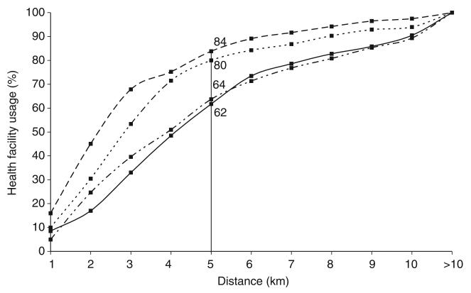
Distance is a crucial feature of health service use and yet its application and utility to health care planning have not been well explored, particularly in the light of large-scale international and national efforts such as Roll Back Malaria. We have developed a high-resolution map of population-to-service access in four districts of Kenya. Theoretical physical access, based upon national targets, developed as part of the Kenyan health sector reform agenda, was compared with actual health service usage data among 1668 paediatric patients attending 81 sampled government health facilities. Actual and theoretical use were highly correlated. Patients in the larger districts of Kwale and Makueni, where access to government health facilities was relatively poor, travelled greater mean distances than those in Greater Kisii and Bondo. More than 60% of the patients in the four districts attended health facilities within a 5-km range. Interpolated physical access surfaces across districts highlighted areas of poor access and large differences between urban and rural settings. Users from rural communities travelled greater distances to health facilities than those in urban communities. The implications of planning and monitoring equitable delivery of clinical services at national and international levels are discussed.
Figures
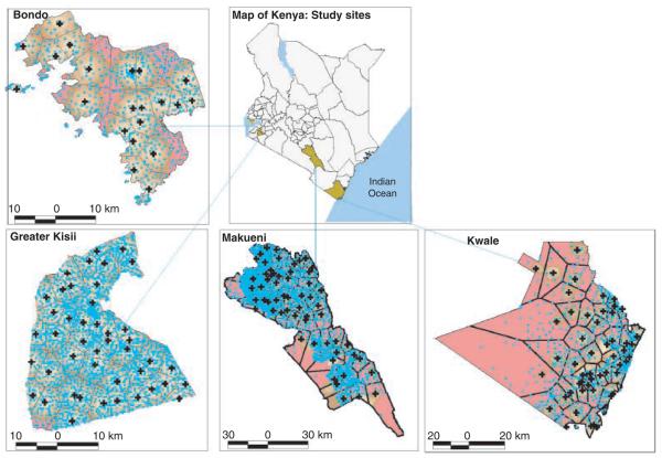
 ) showing the study area (
 ) and maps of each of the four districts showing a surface map of populations overall access to government health facilities (
 ) with varying shades of brown representing areas with access distances between <1–5 km and the red colour representing areas >5 km (
 <1,
<1,  1–2,
1–2,  2–3,
2–3,  3–4,
3–4,  4–5 and
  >5 km). The populations are represented by light blue point
  , which are the EA centroids. Almost the entire population in Greater Kisii is within 5 km of a government health facility. In Bondo, Kwale and Makueni, 80%, 65% and 65% of the population were within 5 km of a government health facility, respectively.
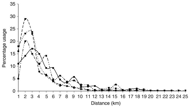
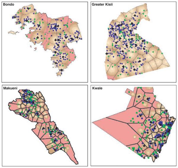
 ) and those >5 km (green centroid point
  ). There was a close relationship between distance travelled by patients and the population's underlying access to GoK health facilities with varying shades of brown representing areas with access distances between <1–5 km and the red colour representing areas >5 km (
 <1,
<1,  1–2,
1–2,  2–3,
2–3,  3–4,
3–4,  4–5 and
  >5 km). The figure also shows the facilities catchment areas
  and the position of the facilities [
 ] used in the study for each district.
References
-
- Andes N, Davis JE. Linking public health data using geographic information system techniques: Alaskan community characteristics and infant mortality. Statistics and Medicine. 1995;14:481–490. - PubMed
-
- Annis S. Physical access and utilisation of health services in rural Guatemala. Social Science and Medicine. 1981;15D:515–523. - PubMed
-
- Central Bureau of Statistics . 1999 Population and Housing Census: Counting Our People for Development: Population Distribution by Administrative Areas and Urban Centres. Vol. 1. Central Bureau of Statistics, Ministry of Finance & Planning; GoK, Nairobi: 2001. pp. 1–411.
-
- Division of Statistics, United Nations . Accessibility Indicators in GIS. UN Department for Economic and Social Information and Policy Analysis; New York: 1997. pp. 1–24.
-
- Fiedler JL. A review of literature on access and utilisation of medical care with emphasis on rural primary care. Social Science and Medicine. 1981;15:129–142. - PubMed
Publication types
MeSH terms
Grants and funding
LinkOut - more resources
Full Text Sources
Medical