

doi: 10.1186/cc2401.
Epub 2003 Nov 5.
Statistics review 7: Correlation and regression
Affiliations
- PMID: 14624685
- PMCID: PMC374386
- DOI: 10.1186/cc2401
Item in Clipboard
Statistics review 7: Correlation and regression
Crit Care.
2003 Dec.
Abstract
The present review introduces methods of analyzing the relationship between two quantitative variables. The calculation and interpretation of the sample product moment correlation coefficient and the linear regression equation are discussed and illustrated. Common misuses of the techniques are considered. Tests and confidence intervals for the population parameters are described, and failures of the underlying assumptions are highlighted.
Figures

Scatter diagram for ln urea and age

Correlation coefficient (r) = +0.9. Positive linear relationship.

Correlation coefficient (r) = -0.9. Negative linear relationship.

Correlation coefficient (r) = 0.04. No relationship.

Correlation coefficient (r) = -0.03. Nonlinear relationship.
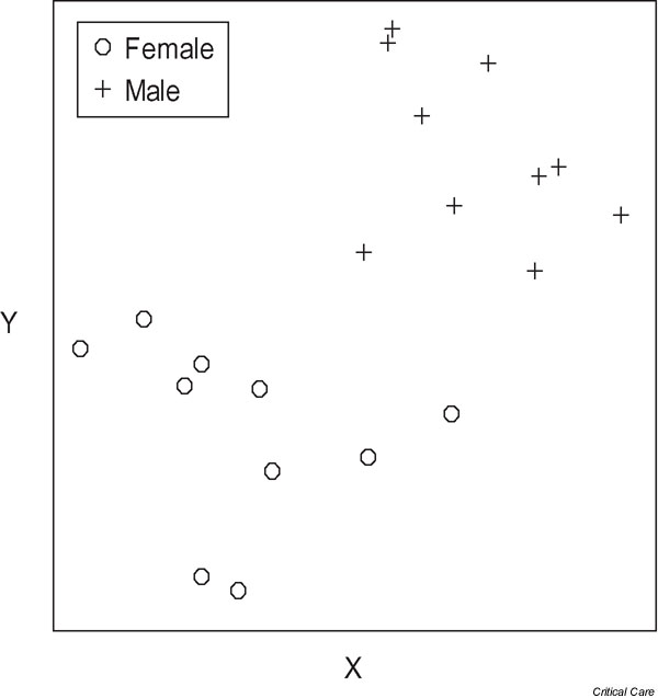
Subgroups in the data resulting in a misleading correlation. All data: r = 0.57; males: r = -0.41; females: r = -0.26.

Regression line for ln urea and age: ln urea = 0.72 + (0.017 × age).

Regression line obtained by minimizing the sums of squares of all of the deviations.

Total, explained and unexplained deviations for a point.

Regression line, its 95% confidence interval and the 95% prediction interval for individual patients.

(a) Scatter diagram of y against x suggests that the relationship is nonlinear. (b) Plot of residuals against fitted values in panel a; the curvature of the relationship is shown more clearly. (c) Scatter diagram of y against x suggests that the variability in y increases with x. (d) Plot of residuals against fitted values for panel c; the increasing variability in y with x is shown more clearly.

Plot of residuals against fitted values for the accident and emergency unit data.

Normal plot of residuals for the accident and emergency unit data.
References
-
- Kirkwood BR, Sterne JAC. Essential Medical Statistics. 2. Oxford: Blackwell Science; 2003.
-
- Bland M. An Introduction to Medical Statistics. 3. Oxford: Oxford University Press; 2001.
-
- Bland M, Altman DG. Statistical methods for assessing agreement between two methods of clinical measurement. Lancet. 1986;i:307–310. - PubMed
MeSH terms
LinkOut - more resources
Full Text Sources
