. 2004 Dec 28;101(52):18246-50.
doi: 10.1073/pnas.0405682101. Epub 2004 Dec 16.

Emergent trade-offs and selection for outbreak frequency in spatial epidemics

Affiliations

Emergent trade-offs and selection for outbreak frequency in spatial epidemics

W Marijn van Ballegooijen et al. Proc Natl Acad Sci U S A. .

Abstract

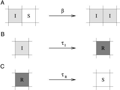
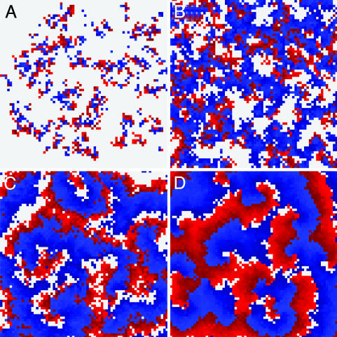
Nonspatial theory on pathogen evolution generally predicts selection for maximal number of secondary infections, constrained only by supposed physiological trade-offs between pathogen infectiousness and virulence. Spread of diseases in human populations can, however, exhibit large scale patterns, underlining the need for spatially explicit approaches to pathogen evolution. Here, we show, in a spatial model where all pathogen traits are allowed to evolve independently, that evolutionary trajectories follow a single relationship between transmission and clearance. This trade-off relation is an emergent system property, as opposed to being a property of pathogen physiology, and maximizes outbreak frequency instead of the number of secondary infections. We conclude that spatial pattern formation in contact networks can act to link infectiousness and clearance during pathogen evolution in the absence of any physiological trade-off. Selection for outbreak frequency offers an explanation for the evolution of pathogens that cause mild but frequent infections.


Figures

Fig. 1.
Fig. 1.
Representation of processes in the contact network model. (A) Infection. Infected hosts (I) can infect susceptible (S) neighbors with infection rate β. The total probability of infection is 1 – eiβΔt, where i is the number of infected neighbors. (B) Acquisition of resistance. Hosts are infectious for a fixed period τI, after which they become resistant (R). (C) Loss of resistance. After a fixed period τR, resistant hosts once again become susceptible.
Fig. 2.
Fig. 2.
Spatial patterns in the contact network for various combinations of infection rate β and infection period τI. Colors represent the following: gray, susceptible; red, infected; blue, resistant. (A) Localized disease outbreaks are self-limiting in size for τI = 1.0 and β = 0.3. (B) Turbulent waves for τI = 0.5 and β = 1. Here, infection waves are narrow, and occasionally waves break and new wave centers are formed. (C) The transition between turbulent and regular waves, τI = 0.3 and β = 2.75 (R0 = 6.6), to which evolutionary trajectories are drawn. (D) Stable spiral waves for τI = 0.7 and β = 4.2. These waves are broad and do not easily break, resulting in periodically reoccurring infection waves. Grid size for all panels is 75 × 75. In all results presented, τR was set to unity.
Fig. 3.
Fig. 3.
Evolutionary trajectories follow paths of increasing outbreak frequency. (A) Evolutionary trajectories of evolution of infection rate and infection period. Circles represent the initial pathogen traits for nine simulations. The trajectories represent the change in the mean infectiousness and infection period. Mutation rate is set at μ = 0.01, mutation stepsize is Δβ =±0.01, and ΔτI = ±0.01. Maximum infection rate was set at β = 4. Regardless of initial conditions, evolution proceeds to and along an emergent trade-off relationship between infection rate and infection period. This trade-off can be described by R0 = 8 βτI = 6.6 (gray curve). (B) Outbreak frequency was measured by the average frequency at which hosts are infected. Outbreak frequency increases from blue to green, yellow, orange, and red. The emergent trade-off (gray curve represents R0 = 6.6) corresponds to a ridge of high outbreak frequency. In the white area, for R0 of approximately <1.6, simulations lead to pathogen extinction. This raised existence threshold (in the nonspatial model, the threshold is R0 = 1) is caused by local self-shading of infected hosts (31). Results shown are for a 120 × 120 grid.
Fig. 4.
Fig. 4.
Evolutionary dynamics. The evolutionary trajectory (black line) represents the change in the population's mean infection rate and infection period over time (same as Fig. 3). Point clouds represent all pathogen types present in the 120 × 120 grid at one time. The point clouds are plotted every 5,000 time units to give an indication of the temporal dynamics of the evolutionary process. During evolution, pathogen diversity is low; typically only two and three step mutants are present. Relaxation to the R0 = 6.6 emergent trade-off line (gray line) is relatively fast, whereas progression along the line is much slower. This result occurs because, along the trade-off, traveling waves are relatively stable, slowing down the spread of new genetic information through the system.
Fig. 5.
Fig. 5.
An illustration of the mechanism of selection for outbreak frequency. (A) Two “cities,” numbered 1 and 2, emit infection waves at frequency f1 = 0.625 and f2 = 0.5, respectively. In contrast to our full spatial model, where outbreak frequency is a result of spatial pattern formation and depends on infection rate and infection period, these defined “city areas” simply periodically infect all hosts directly surrounding them. The cities differ only in outbreak frequency and have identical pathogen genotypes, with infection rate β = 3 and infection period τI = 0.3. Colors are gray for susceptible hosts, red and blue for infected and resistant hosts from city 1, and magenta and cyan for infected and resistant hosts from city 2 (t = 7). (B) At t = 75, the waves from city 1, with the higher outbreak frequency, have completely taken over the area between the two cities. The takeover process can be visualized by plotting a horizontal cross section through both cities against time (C). The observed displacement speed can be accurately quantified by formula image (dashed line), where v is the speed of the infection waves (29). Grid size is 120 × 400 cells.
Fig. 6.
Fig. 6.
Evolutionary optimization along explicit trade-offs. Red lines represent trade-offs, i.e., combinations of infection rate and infection period to which evolution is constrained. Green stars indicate maximal number of secondary infections (i.e., maximal R0). Black dots indicate the endpoint of evolutionary simulations. Outbreak frequency is indicated by the gray shaded area. The emergent trade-off at R0 = 6.6 is shown by a blue dashed line. (A) Evolution along a linear trade-off between infection rate and infection period leads to evolutionary optimization close to maximum outbreak frequency. (B) Selection for outbreak frequency can limit evolution for increased infection rate and infection period, even when these traits are positively correlated. (C) Nonlinear trade-off curves that result in multiple local frequency optima give rise to alternatively stable evolutionary attractors. Results shown are for a 120 × 120 grid.
Fig. 7.
Fig. 7.
Evolutionary trajectories for a stochastic infection period. (A) Evolutionary trajectories, representing the change in mean infection rate and infection period, resulting from using a lognormally distributed (stochastic) infection period. Vertical axis represents the lognormal distribution mean; standard deviation was set at 0.1. Evolution again proceeds to and along a hyperbolic trade-off relationship between infection rate and infection period, but this time the emergent trade-off is located at R0 = 7.6 (black curve). The gray curve indicates R0 = 6.6 for comparison. (B) The shift in the emergent trade-off corresponds to changes in the frequency landscape. The emergent trade-off can be shifted even further by increasing the standard deviation of the lognormal distribution. Parameters and colors are as in Fig. 3; results shown are for a 120 × 120 grid.

Similar articles

Cited by

References

    1. Bull, J. J. (1994) Evolution 48, 1423–1437. - PubMed
    1. Frank, S. A. (1996) Q. Rev. Biol. 71, 37–78. - PubMed
    1. Boots, M. & Sasaki, A. (1999) Proc. R. Soc. London Ser. B Biol. Sci. 266, 1933–1938. - PMC - PubMed
    1. Gandon, S., Mackinnon, M. J., Nee, S. & Read, A. F. (2001) Nature 414, 751–756. - PubMed
    1. van Baalen, M. & Sabelis, M. W. (1995) Am. Nat. 146, 881–910.

Publication types