. 2005 Oct 27;437(7063):1299-320.
doi: 10.1038/nature04226.

A haplotype map of the human genome

A haplotype map of the human genome

International HapMap Consortium. Nature. .

Abstract

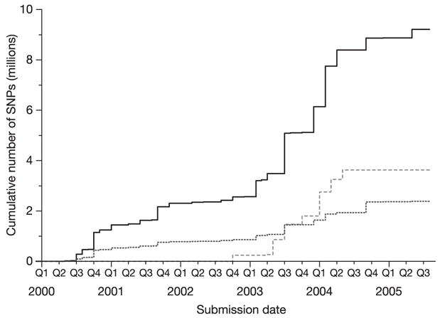
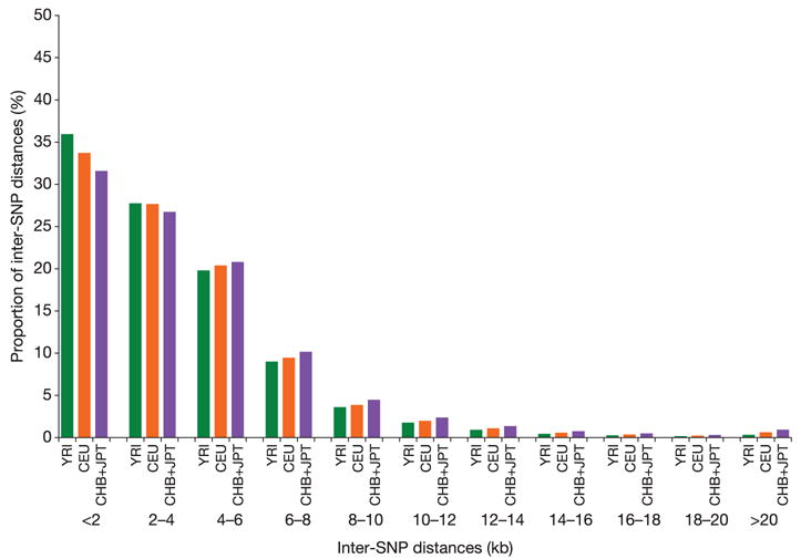
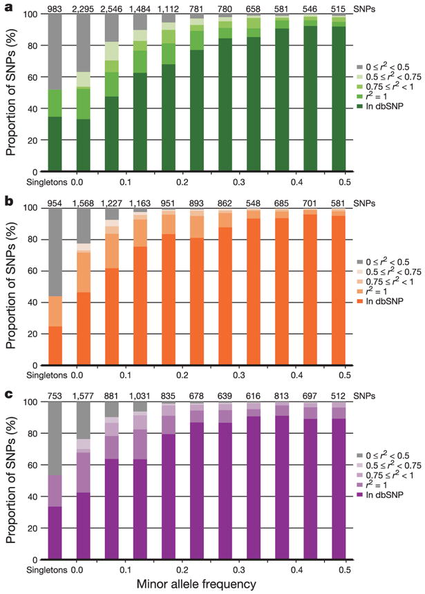
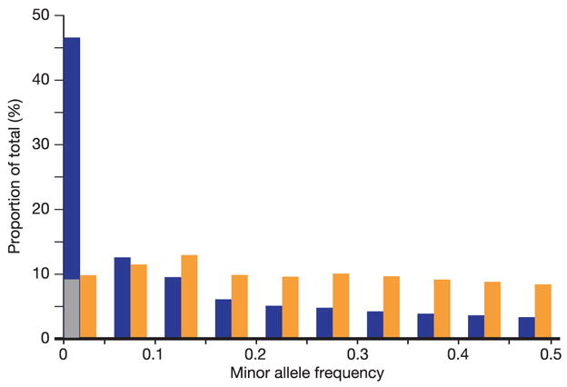
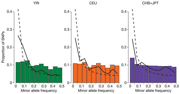
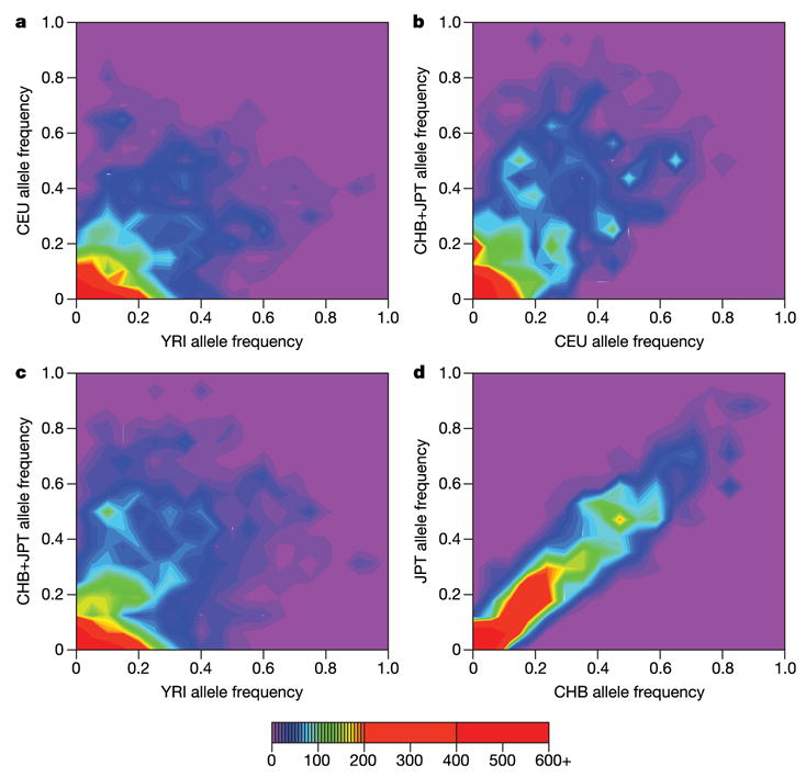
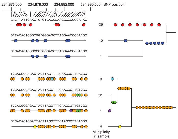
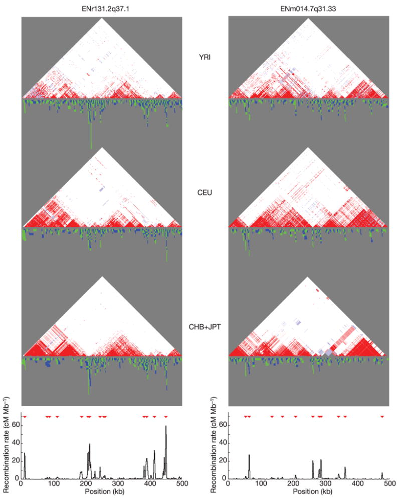
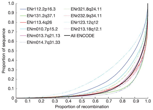
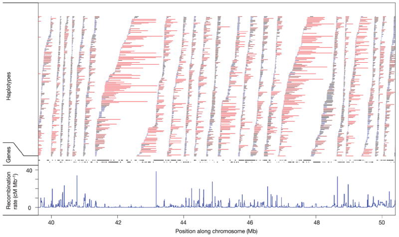
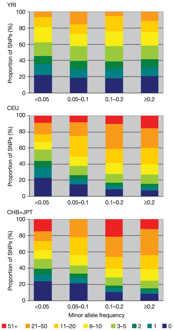
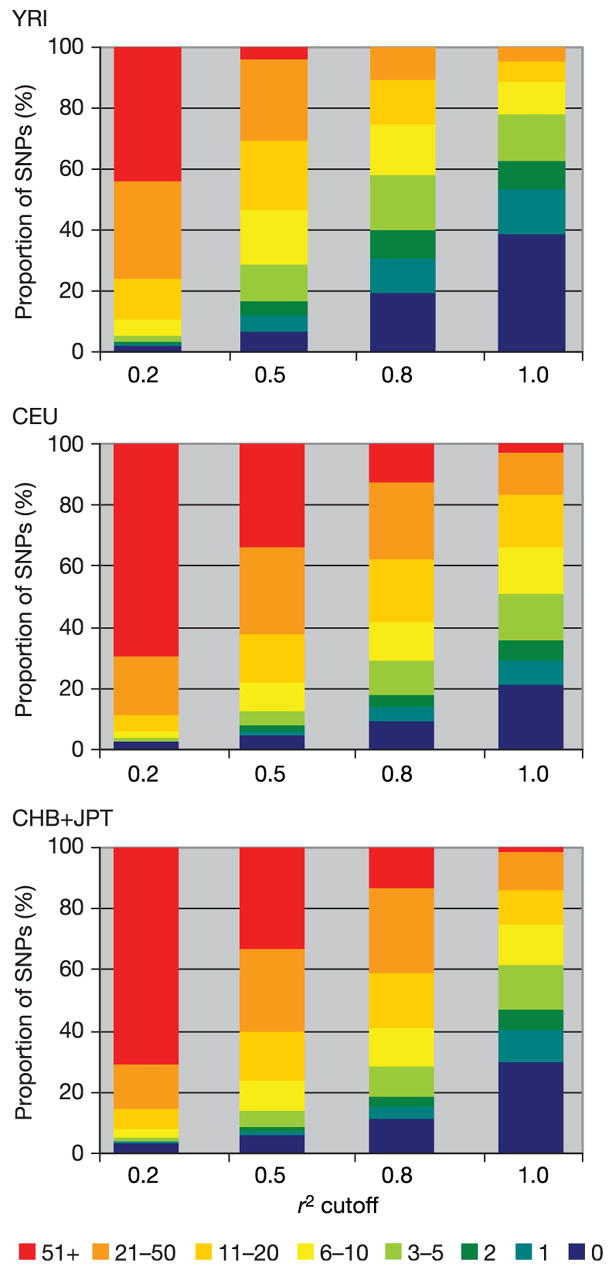
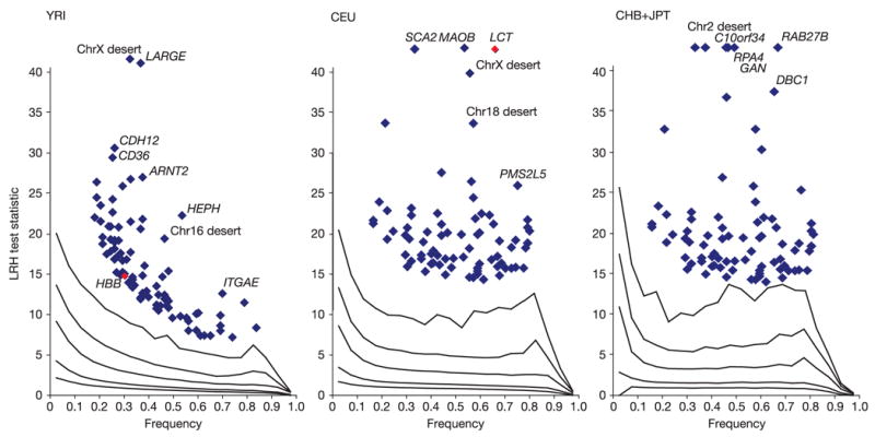
Inherited genetic variation has a critical but as yet largely uncharacterized role in human disease. Here we report a public database of common variation in the human genome: more than one million single nucleotide polymorphisms (SNPs) for which accurate and complete genotypes have been obtained in 269 DNA samples from four populations, including ten 500-kilobase regions in which essentially all information about common DNA variation has been extracted. These data document the generality of recombination hotspots, a block-like structure of linkage disequilibrium and low haplotype diversity, leading to substantial correlations of SNPs with many of their neighbours. We show how the HapMap resource can guide the design and analysis of genetic association studies, shed light on structural variation and recombination, and identify loci that may have been subject to natural selection during human evolution.


Figures

Figure 1
Figure 1. Number of SNPs in dbSNP over time
The cumulative number of non-redundant SNPs (each mapped to a single location in the genome) is shown as a solid line, as well as the number of SNPs validated by genotyping (dotted line) and double-hit status (dashed line). Years are divided into quarters (Q1–Q4).
Figure 2
Figure 2. Distribution of inter-SNP distances
The distributions are shown for each analysis panel for the HapMappable genome (defined in the Methods), for all common SNPs (with MAF ≥ 0.05).
Figure 3
Figure 3. Allele frequency and completeness of dbSNP for the ENCODE regions
a–c, The fraction of SNPs in dbSNP, or with a proxy in dbSNP, are shown as a function of minor allele frequency for each analysis panel (a, YRI; b, CEU; c, CHB+JPT). Singletons refer to heterozygotes observed in a single individual, and are broken out from other SNPs with MAF < 0.05. Because all ENCODE SNPs have been deposited in dbSNP, for this figure we define a SNP as ‘in dbSNP’ if it would be in dbSNP build 125 independent of the HapMap ENCODE resequencing project. All remaining SNPs (not in dbSNP) were discovered only by ENCODE resequencing; they are categorized by their correlation (r2) to those in dbSNP. Note that the number of SNPs in each frequency bin differs among analysis panels, because not all SNPs are polymorphic in all analysis panels.
Figure 4
Figure 4. Minor allele frequency distribution of SNPs in the ENCODE data, and their contribution to heterozygosity
This figure shows the polymorphic SNPs from the HapMap ENCODE regions according to minor allele frequency (blue), with the lowest minor allele frequency bin (<0.05) separated into singletons (SNPs heterozygous in one individual only, shown in grey) and SNPs with more than one heterozygous individual. For this analysis, MAF is averaged across the analysis panels. The sum of the contribution of each MAF bin to the overall heterozygosity of the ENCODE regions is also shown (orange).
Figure 5
Figure 5. Allele frequency distributions for autosomal SNPs
For each analysis panel we plotted (bars) the MAF distribution of all the Phase I SNPs with a frequency greater than zero. The solid line shows the MAF distribution for the ENCODE SNPs, and the dashed line shows the MAF distribution expected for the standard neutral population model with constant population size and random mating without ascertainment bias.
Figure 6
Figure 6. Comparison of allele frequencies in the ENCODE data for all pairs of analysis panels and between the CHB and JPT sample sets
For each polymorphic SNP we identified the minor allele across all panels (ad) and then calculated the frequency of this allele in each analysis panel/sample set. The colour in each bin represents the number of SNPs that display each given set of allele frequencies. The purple regions show that very few SNPs are common in one panel but rare in another. The red regions show that there are many SNPs that have similar low frequencies in each pair of analysis panels/sample sets.
Figure 7
Figure 7. Genealogical relationships among haplotypes and r2 values in a region without obligate recombination events
The region of chromosome 2 (234,876,004–234,884,481 bp; NCBI build 34) within ENr131.2q37 contains 36 SNPs, with zero obligate recombination events in the CEU samples. The left part of the plot shows the seven different haplotypes observed over this region (alleles are indicated only at SNPs), with their respective counts in the data. Underneath each of these haplotypes is a binary representation of the same data, with coloured circles at SNP positions where a haplotype has the less common allele at that site. Groups of SNPs all captured by a single tag SNP (with r2 ≥ 0.8) using a pairwise tagging algorithm, have the same colour. Seven tag SNPs corresponding to the seven different colours capture all the SNPs in this region. On the right these SNPs are mapped to the genealogical tree relating the seven haplotypes for the data in this region.
Figure 8
Figure 8. Comparison of linkage disequilibrium and recombination for two ENCODE regions
For each region (ENr131.2q37.1 and ENm014.7q31.33), D′ plots for the YRI, CEU and CHB+JPT analysis panels are shown: white, D′ < 1 and LOD < 2; blue, D′ = 1 and LOD < 2; pink, D′ < 1 and LOD ≥ 2; red, D′ = 1 and LOD ≥ 2. Below each of these plots is shown the intervals where distinct obligate recombination events must have occurred (blue and green indicate adjacent intervals). Stacked intervals represent regions where there are multiple recombination events in the sample history. The bottom plot shows estimated recombination rates, with hotspots shown as red triangles.
Figure 9
Figure 9. The distribution of recombination events over the ENCODE regions
Proportion of sequence containing a given fraction of all recombination for the ten ENCODE regions (coloured lines) and combined (black line). For each line, SNP intervals are placed in decreasing order of estimated recombination rate, combined across analysis panels, and the cumulative recombination fraction is plotted against the cumulative proportion of sequence. If recombination rates were constant, each line would lie exactly along the diagonal, and so lines further to the right reveal the fraction of regions where recombination is more strongly locally concentrated.
Figure 10
Figure 10. The relationship among recombination rates, haplotype lengths and gene locations
Recombination rates in cM Mb−1 (blue). Non-redundant haplotypes with frequency of at least 5% in the combined sample (bars) and genes (black segments) are shown in an example gene-dense region of chromosome 19 (19q13). Haplotypes are coloured by the number of detectable recombination events they span, with red indicating many events and blue few.
Figure 11
Figure 11
The number of proxy SNPs (r2 ≥ 0.8) as a function of MAF in the ENCODE data.
Figure 12
Figure 12
The number of proxies per SNP in the ENCODE data as a function of the threshold for correlation (r2).
Figure 13
Figure 13
Relationship in the Phase I HapMap between the threshold for declaring correlation between proxies and the proportion of all SNPs captured.
Figure 14
Figure 14. Tag SNP information capture
The proportion of common SNPs captured with r2 ≥ 0.8 as a function of the average tag SNP spacing is shown for the phased ENCODE data, plotted (left to right) for tag SNPs prioritized by Tagger (multimarker and pairwise) and for tag SNPs picked at random. Results were averaged over all the ENCODE regions.
Figure 15
Figure 15. Length of LD spans
We fitted a simple model for the decay of linkage disequilibrium to windows of 1 million bases distributed throughout the genome. The results of model fitting are summarized for the CHB+JPT analysis panel, by plotting the fitted r2 value for SNPs separated by 30 kb. The overall pattern of variation was very similar in the other analysis panels (see Supplementary Information).
Figure 16
Figure 16. The distribution of the long range haplotype (LRH92) test statistic for natural selection
In the YRI analysis panel, diversity around the HBB gene is highlighted by the red point. In the CEU analysis panel, diversity within the LCT gene region is similarly highlighted.

Comment in

Similar articles

  • [Analysis and application of haplotype in forensic medicine].
    Ye Y, Luo HB, Hou YP. Ye Y, et al. Fa Yi Xue Za Zhi. 2009 Apr;25(2):133-7. Fa Yi Xue Za Zhi. 2009. PMID: 19537256 Review. Chinese.
  • A second generation human haplotype map of over 3.1 million SNPs.
    International HapMap Consortium; Frazer KA, Ballinger DG, Cox DR, Hinds DA, Stuve LL, Gibbs RA, Belmont JW, Boudreau A, Hardenbol P, Leal SM, Pasternak S, Wheeler DA, Willis TD, Yu F, Yang H, Zeng C, Gao Y, Hu H, Hu W, Li C, Lin W, Liu S, Pan H, Tang X, Wang J, Wang W, Yu J, Zhang B, Zhang Q, Zhao H, Zhao H, Zhou J, Gabriel SB, Barry R, Blumenstiel B, Camargo A, Defelice M, Faggart M, Goyette M, Gupta S, Moore J, Nguyen H, Onofrio RC, Parkin M, Roy J, Stahl E, Winchester E, Ziaugra L, Altshuler D, Shen Y, Yao Z, Huang W, Chu X, He Y, Jin L, Liu Y, Shen Y, Sun W, Wang H, Wang Y, Wang Y, Xiong X, Xu L, Waye MM, Tsui SK, Xue H, Wong JT, Galver LM, Fan JB, Gunderson K, Murray SS, Oliphant AR, Chee MS, Montpetit A, Chagnon F, Ferretti V, Leboeuf M, Olivier JF, Phillips MS, Roumy S, Sallée C, Verner A, Hudson TJ, Kwok PY, Cai D, Koboldt DC, Miller RD, Pawlikowska L, Taillon-Miller P, Xiao M, Tsui LC, Mak W, Song YQ, Tam PK, Nakamura Y, Kawaguchi T, Kitamoto T, Morizono T, Nagashima A, Ohnishi Y, Sekine A, Tanaka T, Tsunoda T, Deloukas P, Bird CP, Delgado M, Dermitzakis ET, Gwilliam R, Hunt S, Morrison J, Powell D, Stranger BE, Whittaker P, Bentley DR, Daly MJ, de Bakker PI, Barrett J, C… See abstract for full author list ➔ International HapMap Consortium, et al. Nature. 2007 Oct 18;449(7164):851-61. doi: 10.1038/nature06258. Nature. 2007. PMID: 17943122 Free PMC article.
  • SNP frequency, haplotype structure and linkage disequilibrium in elite maize inbred lines.
    Ching A, Caldwell KS, Jung M, Dolan M, Smith OS, Tingey S, Morgante M, Rafalski AJ. Ching A, et al. BMC Genet. 2002 Oct 7;3:19. doi: 10.1186/1471-2156-3-19. Epub 2002 Oct 7. BMC Genet. 2002. PMID: 12366868 Free PMC article.
  • Haplotype and linkage disequilibrium architecture for human cancer-associated genes.
    Bonnen PE, Wang PJ, Kimmel M, Chakraborty R, Nelson DL. Bonnen PE, et al. Genome Res. 2002 Dec;12(12):1846-53. doi: 10.1101/gr.483802. Genome Res. 2002. PMID: 12466288 Free PMC article.
  • HapMap and mapping genes for cardiovascular disease.
    Musunuru K, Kathiresan S. Musunuru K, et al. Circ Cardiovasc Genet. 2008 Oct;1(1):66-71. doi: 10.1161/CIRCGENETICS.108.813675. Circ Cardiovasc Genet. 2008. PMID: 20031544 Free PMC article. Review.

Cited by

References

    1. Lechler R, Warrens A. HLA in Health and Disease. 2. Academic Press; San Diego, California: 2005.
    1. Strittmatter WJ, Roses AD. Apolipoprotein E and Alzheimer’s disease. Annu Rev Neurosci. 1996;19:53–77. - PubMed
    1. Dahlbäck B. Resistance to activated protein C caused by the factor V R506Q mutation is a common risk factor for venous thrombosis. Thromb Haemost. 1997;78:483–488. - PubMed
    1. Altshuler D, et al. The common PPARγ Pro12Ala polymorphism is associated with decreased risk of type 2 diabetes. Nature Genet. 2000;26:76–80. - PubMed
    1. Deeb SS, et al. A Pro12Ala substitution in PPARγ2 associated with decreased receptor activity, lower body mass index and improved insulin sensitivity. Nature Genet. 1998;20:284–287. - PubMed

Publication types

MeSH terms

Substances