. 2006 Mar 9:7:123.
doi: 10.1186/1471-2105-7-123.

Detecting outliers when fitting data with nonlinear regression - a new method based on robust nonlinear regression and the false discovery rate

Affiliations

Detecting outliers when fitting data with nonlinear regression - a new method based on robust nonlinear regression and the false discovery rate

Harvey J Motulsky et al. BMC Bioinformatics. .

Abstract

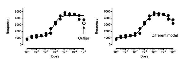
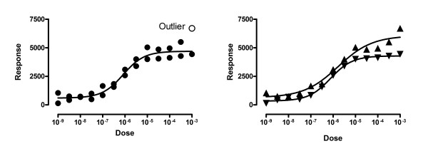
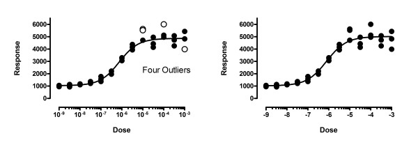
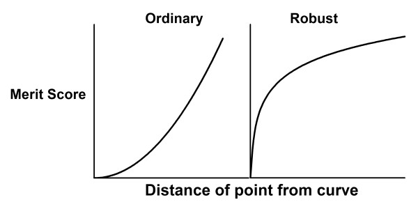
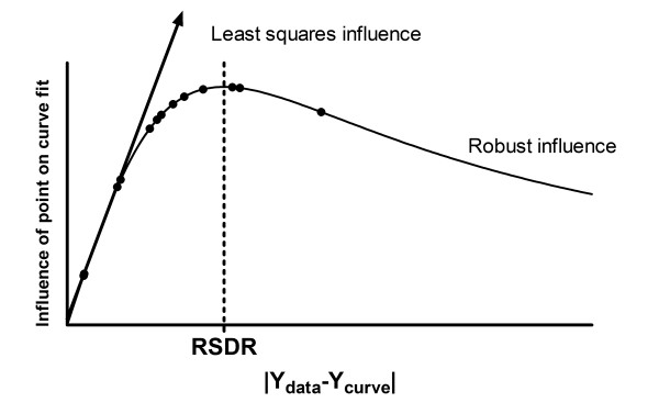
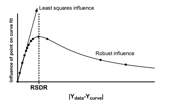
Background: Nonlinear regression, like linear regression, assumes that the scatter of data around the ideal curve follows a Gaussian or normal distribution. This assumption leads to the familiar goal of regression: to minimize the sum of the squares of the vertical or Y-value distances between the points and the curve. Outliers can dominate the sum-of-the-squares calculation, and lead to misleading results. However, we know of no practical method for routinely identifying outliers when fitting curves with nonlinear regression.

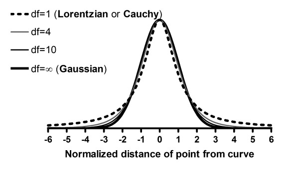
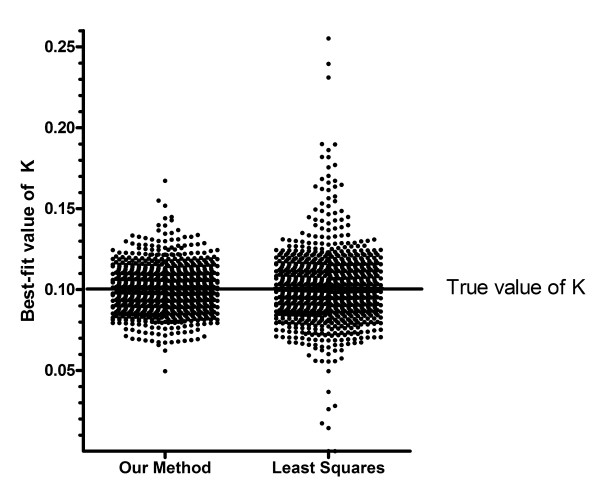
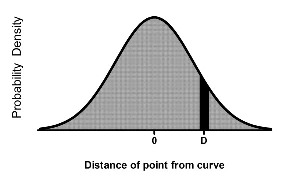
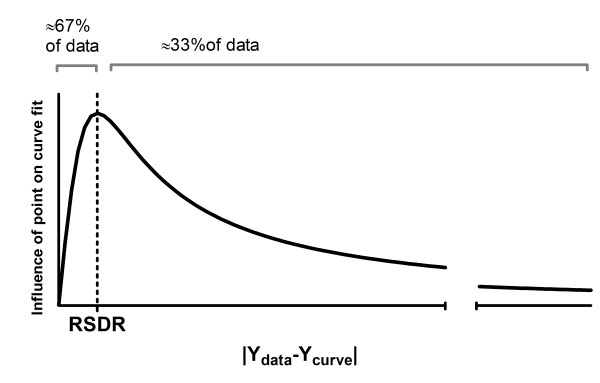
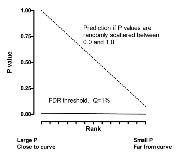
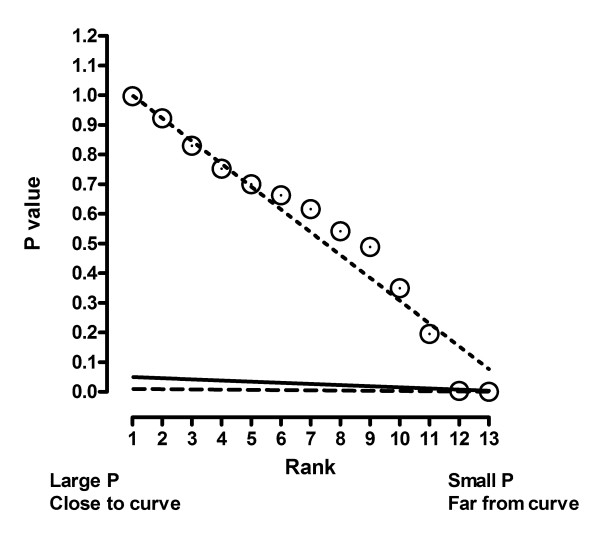
Results: We describe a new method for identifying outliers when fitting data with nonlinear regression. We first fit the data using a robust form of nonlinear regression, based on the assumption that scatter follows a Lorentzian distribution. We devised a new adaptive method that gradually becomes more robust as the method proceeds. To define outliers, we adapted the false discovery rate approach to handling multiple comparisons. We then remove the outliers, and analyze the data using ordinary least-squares regression. Because the method combines robust regression and outlier removal, we call it the ROUT method. When analyzing simulated data, where all scatter is Gaussian, our method detects (falsely) one or more outlier in only about 1-3% of experiments. When analyzing data contaminated with one or several outliers, the ROUT method performs well at outlier identification, with an average False Discovery Rate less than 1%.

Conclusion: Our method, which combines a new method of robust nonlinear regression with a new method of outlier identification, identifies outliers from nonlinear curve fits with reasonable power and few false positives.


Figures

Figure 1
Figure 1
The Lorentzian distribution. The graph shows the t probability distribution for 1, 4, 10 and infinite degrees of freedom. The distribution with 1 df is also known as the Lorentzian or Cauchy distribution. Our robust curve fitting method assumes that scatter follows this distribution.
Figure 2
Figure 2
Robust curve fits vs. least-squares curve fits. The three examples show that a single outlier greatly affects the least-squares fit (dotted), but not the robust fit (solid).
Figure 3
Figure 3
Choosing a value for Q. The value of Q determines how aggressively the method will remove outliers. This figure shows three possible values of Q with small and large numbers of data points. Each graph includes an open symbols positioned just far enough from the curve to be barely defined as an outlier. If the open symbols were moved any closer to the curve, they would no longer be defined to be outliers. If Q is set to a low value, fewer good points will be defined as outliers, but it is harder to identify outliers. The left panel shows Q = 0.1%, which seems too low. If Q is set to a high value, it is easier to identify outliers but more good points will be identified as outliers. The right panel shows Q = 10%. We recommend setting Q to 1% as shown in the middle panels.
Figure 4
Figure 4
Identifying extreme outliers. This shows the first of 5000 simulated data sets with a single outlier (open symbol) whose distance from the ideal curve equations 7 times the standard deviation of the Gaussian scatter of the rest of the points. Our method detected an outlier like this in all but 5 of 5000 simulated data sets, while falsely defining very few good points to be an outlier (False Discovery Rate = 1.18%).
Figure 5
Figure 5
Identifying moderate outliers. These are the first two of 5000 simulated data sets, where the scatter is Gaussian but one outlier was added whose distance from the ideal curve equalled 4.5 times the standard deviation used to simulate the remaining points. Our method detected the outlier in the left panel (with Q set to 1%), and in 58% of 5000 simulations, but did not detect it in the right panel or in 42% of simulations. The False Discover Rate was 0.94%.
Figure 6
Figure 6
Simulated data sets where the scatter follows a t distribution with 2 degrees of freedom. These are the first three of 1000 simulated data sets, where the scatter was generated using a t distribution with 2 degrees of freedom. Note that the data are much more spread out than they would have been had they been simulated from a Gaussian distribution.
Figure 7
Figure 7
Best-fit value for the rate constants. One thousand simulated data sets (similar to those of Figure 6, with scatter much wider than Gaussian) were fit to a one-phase exponential decay model with our method (left) or least-squares regression (right). Each dot is the best-fit value of the rate constant for one simulated data set. The dots are more tightly clustered around the true value of 0.10 in the left panel, showing that our outlier-removal method gives more accurate results (on average) than least-squares regression.
Figure 8
Figure 8
The ROUT method is not fooled by totally random data. These data were simulated from a Gaussian distribution around a horizontal line. Each simulated data set was then fit to a sigmoid dose-response curve, fixing the bottom plateau and slope, and fitting the top plateau and the EC50. Our fear was that our method would define many points to 'outliers' and leave behind points that define a dose-response curve. That didn't happen. Our method found an outlier in only one of 1000 simulations.
Figure 9
Figure 9
Don't eliminate outliers unless you are sure you are fitting the correct model. The left panel shows the data fit with our method to a sigmoid dose response curve. One of the points is declared to be an outlier and removed. The right panel shows the data fit to an alternative model with a biphasic dose-response curve. When fit with this model, none of the points are outliers.
Figure 10
Figure 10
Don't eliminate outliers when the data are not independent. The left panel treats the values as unmatched duplicates, and one point is found to be an outlier. The right panel shows that, in fact, the graph superimposes two different curves from two distinct subjects, and none of the points are outliers.
Figure 11
Figure 11
Don't use outlier elimination if you don't use weighting correctly. The graph shows data simulated with Gaussian scatter with a standard deviation equal to 10% of the Y value. The left panel shows our method used incorrectly, without adjusting for the fact that the scatter increases as Y increases. Four outliers are identified, all incorrectly. The right panel shows the correct analysis, where weighted residuals are used to define outliers, and no outliers are found.
Figure 12
Figure 12
A Gaussian probability density curve. The ratio of the black area to the entire area under the curve is the probability that a value selected from this Gaussian distribution will have a value of D plus or minus ΔD.
Figure 13
Figure 13
Why assuming a Lorentzian distribution of residuals makes the fitting process robust. The graph shows the contribution of a point to the merit score for Gaussian (left) and Lorentzian (right) as a function of the distance of a point from the curve. The goal of curve fitting is to minimize the merit score. The curve in the right panel starts to level off. This means that moving the curve a bit closer to, or further from, a point that is already far from the curve won't change the merit score very much. This is the definition of a robust fitting method. In contrast, the curve on the left does not level off, so points far from the curve have a huge impact on least squares fitting.
Figure 14
Figure 14
The influence curve of robust fitting. This curve is the derivative of the curve shown in the right panel of Figure 13. The influence peaks for points whose distance from the curve equals the robust standard deviation of the residuals (RSDR). The RSDR is recomputed every iteration. This means that about two-thirds of the points get about the same influence they would have had with least-squares regression.
Figure 15
Figure 15
How the Benjamini and Hochberg method works. This method is used to decide which P values in a set of many are low enough to be defined to be 'significant'. The P values are ranked from large to small. The ranks are plotted on the X axis, with the actual P values plotted on the Y axis. The dotted line shows the expectation if in fact all null hypotheses are true – 50% of the P values are less than 0.5, 25% are less than 0.25, etc. The solid line shows the Benjamini-Hochberg threshold for declaring a P value to be significant. It is defined by multiplying the dotted line by a fraction Q (here set to 1%). When the P value is lower than that threshold, that P value and all lower P values are defined to denote 'statistically significant' differences.
Figure 16
Figure 16
Worked example. Data and least-squares fit. The dashed line shows the results of least-squares regression to a one-phase exponential decay model.
Figure 17
Figure 17
Worked example. The influence function for robust fitting, prior to the first iteration. The influence function is defined as RR/(1+RR2), where RR is defined in Equation 13. Even the points with the largest residuals (to the right on the graph) have substantial influence.
Figure 18
Figure 18
Worked example. Fit with robust nonlinear regression.
Figure 19
Figure 19
Worked example. The influence function for robust fitting, after the final iteration. Now that the curve is much closer to most of the points, the RSDR is lower, so the influence curve is shifted to the left. This makes two of the points (to the right) have much less influence than they had at the beginning (compare to Figure 17).
Figure 20
Figure 20
Worked example. Using the Benjamini and Hochberg method to detect outliers. A P value was determined for each point by computing a t ratio by dividing its residual by the RSDR, and computing a two-tailed P value from the t distribution. See Table 1. The P values are shown plotted against their rank. The dashed line shows what you'd expect to see if the P values are randomly scattered between 0 and 1. All but lowest two of the P values lie very close to this line. The solid line shows the cutoff when Q is set to 5%. Both of the points with the lowest P values (the two points furthest from the robust best-fit curves) are defined to be outliers. The dashed line shows the cutoff when Q is set to 1% as we suggest. Only one point is an outlier with this definition, which we choose to use.
Figure 21
Figure 21
Worked example. Least squares regression after excluding the outlier. The outlier is shown with an open symbol. It was not included in the least squares regression (dashed curve).
Figure 22
Figure 22
A second example. The least squares fit (dashed) and robust fit (solid) are almost identical.
Figure 23
Figure 23
Using the Benjamini and Hochberg method to detect outliers in the second example. A P value was determined for each point by computing a t ratio by dividing its residual by the RSDR, and computing a two-tailed P value from the t distribution. The P values are shown plotted against their rank. The dashed line shows what you'd expect to see if the P values are randomly scattered between 0 and 1. All the points are near this line, and none are below the solid Q = 1% threshold line. Therefore none of the points are defined to be outliers.

References

    1. Barnett V, Lewis T. Outliers in Statistical Data. 3. New York: John Wiley and sons; 1994.
    1. Hampel FR, Ronchetti EM, Rousseeuw PJ, Stahel WA. Robust Statistics the Approach Based on Influence Functions. New York: John Wiley and Sons; 1986.
    1. Hoaglin DC, Mosteller F, Tukey JW. Understanding Robust and Exploratory Data Analysis. New York: John Wiley and sons; 1983.
    1. Press WH, Teukolsky SA, Vettering WT, Flannery BP. Numerical Recipes in C the Art of Scientific Computing. New York, NY: Cambridge University Press; 1988.
    1. Benjamini Y, Hochberg Y. Controlling the false discovery rate: A practical and powerful approach to multiple testing. J R Statist Soc B. 1995;57:290–300.

Publication types

LinkOut - more resources