

Current practices in spatial analysis of cancer data: mapping health statistics to inform policymakers and the public
- PMID: 17092353
- PMCID: PMC1647272
- DOI: 10.1186/1476-072X-5-49
Current practices in spatial analysis of cancer data: mapping health statistics to inform policymakers and the public
Abstract
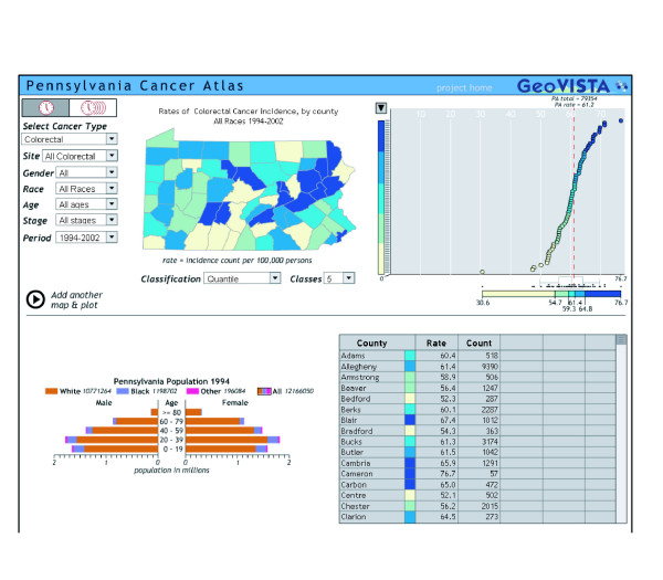
Background: To communicate population-based cancer statistics, cancer researchers have a long tradition of presenting data in a spatial representation, or map. Historically, health data were presented in printed atlases in which the map producer selected the content and format. The availability of geographic information systems (GIS) with comprehensive mapping and spatial analysis capability for desktop and Internet mapping has greatly expanded the number of producers and consumers of health maps, including policymakers and the public.Because health maps, particularly ones that show elevated cancer rates, historically have raised public concerns, it is essential that these maps be designed to be accurate, clear, and interpretable for the broad range of users who may view them. This article focuses on designing maps to communicate effectively. It is based on years of research into the use of health maps for communicating among public health researchers.
Results: The basics for designing maps that communicate effectively are similar to the basics for any mode of communication. Tasks include deciding on the purpose, knowing the audience and its characteristics, choosing a media suitable for both the purpose and the audience, and finally testing the map design to ensure that it suits the purpose with the intended audience, and communicates accurately and effectively. Special considerations for health maps include ensuring confidentiality and reflecting the uncertainty of small area statistics. Statistical maps need to be based on sound practices and principles developed by the statistical and cartographic communities.
Conclusion: The biggest challenge is to ensure that maps of health statistics inform without misinforming. Advances in the sciences of cartography, statistics, and visualization of spatial data are constantly expanding the toolkit available to mapmakers to meet this challenge. Asking potential users to answer questions or to talk about what they see is still the best way to evaluate the effectiveness of a specific map design.
Figures
References
-
- Nelson DE, Brownson RC, Remington PL, Pavanta C. Translating public health data. In: Nelson DE, Brownson RC, Remington PL, Pavanta C, editor. Communicating Public Health Information Effectively: A Guide for Practitioners. Washington, D.C.: American Public Health Association; 2002. pp. 33–46.
-
- Sheridan SL, Pignone M. Numeracy and the medical student's ability to interpret data. Eff Clin Pract. 2002;5:35–40. - PubMed
Publication types
MeSH terms
LinkOut - more resources
Full Text Sources
