Positional artifacts in microarrays: experimental verification and construction of COP, an automated detection tool
- PMID: 17158151
- PMCID: PMC1802630
- DOI: 10.1093/nar/gkl871
Positional artifacts in microarrays: experimental verification and construction of COP, an automated detection tool
Abstract
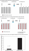
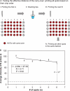
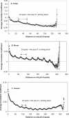
Microarray technology is currently one of the most widely-used technologies in biology. Many studies focus on inferring the function of an unknown gene from its co-expressed genes. Here, we are able to show that there are two types of positional artifacts in microarray data introducing spurious correlations between genes. First, we find that genes that are close on the microarray chips tend to have higher correlations between their expression profiles. We call this the 'chip artifact'. Our calculations suggest that the carry-over during the printing process is one of the major sources of this type of artifact, which is later confirmed by our experiments. Based on our experiments, the measured intensity of a microarray spot contains 0.1% (for fully-hybridized spots) to 93% (for un-hybridized ones) of noise resulting from this artifact. Secondly, we, for the first time, show that genes that are close on the microtiter plates in microarray experiments also tend to have higher correlations. We call this the 'plate artifact'. Both types of artifacts exist with different severity in all cDNA microarray experiments that we analyzed. Therefore, we develop an automated web tool-COP (COrrelations by Positional artifacts) to detect these artifacts in microarray experiments. COP has been integrated with the microarray data normalization tool, ExpressYourself, which is available at http://bioinfo.mbb.yale.edu/ExpressYourself/. Together, the two can eliminate most of the common noises in microarray data.
Figures


Similar articles
-
ExpressYourself: A modular platform for processing and visualizing microarray data.Nucleic Acids Res. 2003 Jul 1;31(13):3477-82. doi: 10.1093/nar/gkg628. Nucleic Acids Res. 2003. PMID: 12824348 Free PMC article.
-
Pre-processing of microarray data and analysis of differential expression.Methods Mol Biol. 2008;452:89-110. doi: 10.1007/978-1-60327-159-2_4. Methods Mol Biol. 2008. PMID: 18563370 Review.
-
Visualization of microarray results to assist interpretation.Tuberculosis (Edinb). 2004;84(3-4):275-81. doi: 10.1016/j.tube.2003.12.012. Tuberculosis (Edinb). 2004. PMID: 15207497
-
Identification and handling of artifactual gene expression profiles emerging in microarray hybridization experiments.Nucleic Acids Res. 2004 Mar 3;32(4):e46. doi: 10.1093/nar/gnh043. Nucleic Acids Res. 2004. PMID: 14999086 Free PMC article.
-
Microarray data analysis for differential expression: a tutorial.P R Health Sci J. 2009 Jun;28(2):89-104. P R Health Sci J. 2009. PMID: 19530550 Review.
Cited by
-
Autocorrelation analysis reveals widespread spatial biases in microarray experiments.BMC Genomics. 2007 Jun 12;8:164. doi: 10.1186/1471-2164-8-164. BMC Genomics. 2007. PMID: 17565680 Free PMC article.
-
Data-analysis strategies for image-based cell profiling.Nat Methods. 2017 Aug 31;14(9):849-863. doi: 10.1038/nmeth.4397. Nat Methods. 2017. PMID: 28858338 Free PMC article.
-
A statistical framework for high-content phenotypic profiling using cellular feature distributions.Commun Biol. 2022 Dec 22;5(1):1409. doi: 10.1038/s42003-022-04343-3. Commun Biol. 2022. PMID: 36550289 Free PMC article.
-
Correcting positional correlations in Affymetrix® genome chips.Sci Rep. 2015 Mar 13;5:9078. doi: 10.1038/srep09078. Sci Rep. 2015. PMID: 25767049 Free PMC article.
-
Genome-scale analysis of interaction dynamics reveals organization of biological networks.Bioinformatics. 2012 Jul 15;28(14):1873-8. doi: 10.1093/bioinformatics/bts283. Epub 2012 May 9. Bioinformatics. 2012. PMID: 22576179 Free PMC article.
References
-
- Schena M., Shalon D., Davis R.W., Brown P.O. Quantitative monitoring of gene expression patterns with a complementary DNA microarray. Science. 1995;270:467–470. - PubMed
-
- Shalon D., Smith S.J., Brown P.O. A DNA microarray system for analyzing complex DNA samples using two-color fluorescent probe hybridization. Genome Res. 1996;6:639–645. - PubMed
-
- Brown P.O., Botstein D. Exploring the new world of the genome with DNA micrarrays. Nature Genet. 1999;21:33–37. - PubMed
-
- Altman R.B., Raychaudhuri S. Whole-genome expression analysis: challenges beyond clustering. Curr. Opin. Struct. Biol. 2001;11:340–347. - PubMed
Publication types
MeSH terms
LinkOut - more resources
Full Text Sources
Miscellaneous

