. 2006 Dec 21;52(6):1085-96.
doi: 10.1016/j.neuron.2006.10.034.

A central source of movement variability

Affiliations

A central source of movement variability

Mark M Churchland et al. Neuron. .

Abstract

Movements are universally, sometimes frustratingly, variable. When such variability causes error, we typically assume that something went wrong during the movement. The same assumption is made by recent and influential models of motor control. These posit that the principal limit on repeatable performance is neuromuscular noise that corrupts movement as it occurs. An alternative hypothesis is that movement variability arises before movements begin, during motor preparation. We examined this possibility directly by recording the preparatory activity of single cortical neurons during a highly practiced reach task. Small variations in preparatory neural activity were predictive of small variations in the upcoming reach. Effect magnitudes were such that at least half of the observed movement variability likely had its source during motor preparation. Thus, even for a highly practiced task, the ability to repeatedly plan the same movement limits our ability to repeatedly execute the same movement.


Figures

Figure 1
Figure 1
Illustration of the basic task. A. Movements began and ended with the hand touching the display. The hand was a few mm from the screen while in flight. The white trace shows the reach trajectory for one trial. B. Timeline of the task and behavior for the same trial. The target jittered slightly (2 mm standard deviation) upon first appearing, and continued to do so throughout the delay period. The cessation of jitter provided the go cue, at which time the central spot was also extinguished. The plot ends at the time the reward was delivered. C. Horizontal hand velocity and position for instructed-slow (green) and fast (red) reaches (0°, 12 cm distant target). During this session, the monkey performed ∼70 trials for each instructed speed at this target location. Data in this panel are plotted for every 5th trial, with one trace per trial. D. Peak hand velocity is plotted as a function of trial number for every reach to that target location.
Figure 2
Figure 2
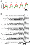
Responses of one example neuron (B24). A. Firing rate versus time. Each subpanel plots the response for 1 of the 5 distances (labeled at top). Dots show the time of target onset (T), the go cue (G), and the median time of movement onset (M). Mean firing rates were computed with data locked to the target onset, and again with data locked to the go cue. These two means are plotted with a break between them, a necessity given the variable delay period. Trace widths show +/- SE. B. Raster plots showing individual-trial responses for the same neuron (all for the instructed-fast, 6 cm target). Ticks show spike times. Data are time-aligned to peak reach velocity. The reach velocity on each trial (black trace) is superimposed on the mean reach velocity across all trials (grey trace). The vertical scale is 1 m/s. Trials are ordered from fast to slow.
Figure 3
Figure 3
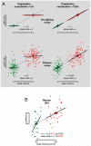
Possible results. A. Simulations assuming that velocity variability is unrelated (left column) or entirely related (right column) to preparatory variability. Top and bottom rows correspond to simulations with no spiking noise or Poisson spiking noise. Each dot plots the simulated firing rate versus peak velocity on a given trial. Crosses plot the means for the instructed slow (green) and fast (red) conditions. The grey line plots the predicted slope based on those means. Black lines plot slopes obtained by linear regression. Simulations were based on measurements from neuron B24, using the 6 cm distance. On each trial, the peak velocity was drawn from a Gaussian distribution with the empirical mean and SD. The underlying rate then either did (right column) or did not (left column) co-vary about its mean with that velocity. For the top row, the underlying rate is realized exactly, while for the bottom row it is corrupted by Poisson-distributed noise. B. Similar format, but for the actual data recorded from neuron B24 (6 cm distance).
Figure 4
Figure 4
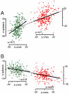
Scatterplots of firing rate versus peak reach velocity for two example neurons. A. Neuron B24. Presentation is similar to that in Figure 3B, but trials are pooled across all target locations for statistical power (instructed-fast was preferred at all locations). Each dot plots, for one trial, the delay-period firing rate versus the subsequent peak velocity (474 total trials). Both are expressed as the difference from their mean (which was different for different target locations). Black lines show the result of a linear regression. Data for the two instructed speeds (green and red) are plotted with vertical and horizontal offsets so that the grey line connecting their means has a slope equal to the predicted slope (averaged across target locations). B. Similar plot for neuron A06, which had a consistent preference for instructed slow (384 total trials). For both neurons/speeds, p-values are based on the regression, but were also significant (p<0.01 in every case) using a nonparametric test (Spearman’s rank correlation).
Figure 5
Figure 5
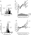
Population analyses using correlation (top panels) and regression (bottom panels). A. Distributions of correlation coefficients for cases where sufficient data from a given neuron (>50 trials) could be pooled across target locations with a robust (>10 spikes/s) instructed-speed preference (see Methods for details). Data are plotted so that correlation coefficients are positive if they agree with the predicted slope and negative if they do not. The arrow gives the mean of the distribution (significance via t-test). Black bars indicate individually significant correlations (p<0.05). B. Relationship of trial-by-trial correlations to the predicted slope. For each bin on the x-axis, we pooled data from all neurons/target locations where the predicted-slope (eqn. 1) fell within that range. This included data for both instructed speeds (which shared a predicted slope). Black symbols plot the correlation coefficient for each bin; flanking traces give 95% confidence intervals. The grey histogram plots the number of trials/bin. For most neurons there were target locations (e.g., non preferred directions) with a weak impact of instructed speed. Thus, predicted slopes near zero were the most common, but all bins had >100 trials. The rightmost interval was expanded with this intent. 0.1% of the data falls outside the range of the bins. C. Distribution of regression slopes (similar analysis/format as in A.) D. Relationship of trial-by-trial regression slopes to the predicted slope (similar analysis/format as in B). For the pooled data in each bin a regression was applied. T resulting slopes are given by the solid circles (with flanking 95% confidence intervals). Open symbols plot a control analysis where all the same peak velocities and firing rates were used, but where each trial’s peak velocity was randomly reassigned to a new trial. This was done within each condition, before pooling data across conditions, and was repeated 100 times with different random seeds.
Figure 6
Figure 6
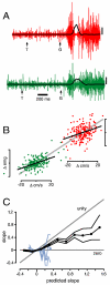
Muscle activity. A. Example EMG traces (deltoid of monkey A). Data are for one ‘fast’ and one ‘slow’ reach (red and green traces) to a 12 cm distant rightwards target. Black traces show hand velocity (calibration = 1 m/s). Arrows indicate target onset and the go cue. B. Trial-by-trial relationship for the same muscle recording. Each dot plots, for one trial, average EMG activity versus peak velocity. As before, means were subtracted before pooling trials across target locations. The vertical scale is arbitrary. C. Relationship of trial-by-trial regression slopes to the predicted slope (similar analysis/format as for neural data in Fig. 5D). Data were pooled (in bins) from muscles/target-locations with similar predicted slopes. Solid black symbols plot the regression slope for each bin. Flanking traces give 95% confidence intervals. Blue symbols plot the same analysis but for delay-epoch EMG (averaged from 50 ms after target onset until 50 ms after the go cue).
Figure 7
Figure 7
Scatterplot of the trial-by-trial slope versus the predicted slope, with one point per neuron/target-location/instructed-speed (i.e., with no pooling). To limit the unreliability of individual measurements, this analysis was applied only where there were >15 trials for a given neuron/condition (1094 data points passed this test). The black line plots the results of a ‘meta-regression’ of the trial-by-trial versus the predicted slope, and reveals a significant ‘meta-slope’ (p<10-9, p<10-12 via a non-parametric Spearman’s rank correlation; y-intercept not significantly different from zero).
Figure 8
Figure 8
Trial-by-trial relationships for a monkey (G) trained without instructed-speeds. A. An example neuron (G12) with a negative relationship. Responses are pooled (after subtracting means) across all 14 target locations. The regression slope was -13 spikes/s per m/s (r = -0.17). B. An example neuron (G17) with a positive relationship (slope = 10 spikes/s per m/s; r = 0.19). C. Histogram (using a logarithmic x-axis) of the frequency with which we observed different magnitude slopes. For each neuron (13) and target location (14, an average of 58 trials each) we regressed delay-period firing rate versus peak reach velocity and took the absolute slope. The top panel plots the distribution of those slopes, while the black trace at bottom plots the difference between this distribution and that expected by chance (see Methods). The grey trace plots the same analysis for data from monkeys A and B, based on the absolute distribution of trial-by-trial slopes seen in Figure 7.

References

    1. Churchland MM, Santhanam G, Shenoy KV. Preparatory activity in premotor and motor cortex reflects the speed of the upcoming reach. J Neurophysiol. 2006a - PubMed
    1. Churchland MM, Yu BM, Ryu SI, Santhanam G, Shenoy KV. Neural variability in premotor cortex provides a signature of motor preparation. J Neurosci. 2006b;26:3697–3712. - PMC - PubMed
    1. Cisek P. Preparing for speed. Focus on: ‘Preparatory activity in premotor and motor cortex reflects the speed of the upcoming reach’. J Neurophysiol. 2006 - PubMed
    1. Crammond DJ, Kalaska JF. Prior information in motor and premotor cortex: activity during the delay period and effect on pre-movement activity. J Neurophysiol. 2000;84:986–1005. - PubMed
    1. Dum RP, Strick PL. Frontal lobe inputs to the digit representations of the motor areas on the lateral surface of the hemisphere. J Neurosci. 2005;25:1375–1386. - PMC - PubMed

Publication types