. 2007 Apr 15;92(8):2926-43.
doi: 10.1529/biophysj.106.101428. Epub 2007 Jan 26.

Deconvolving single-molecule intensity distributions for quantitative microscopy measurements

Affiliations

Deconvolving single-molecule intensity distributions for quantitative microscopy measurements

Sarah A Mutch et al. Biophys J. .

Abstract

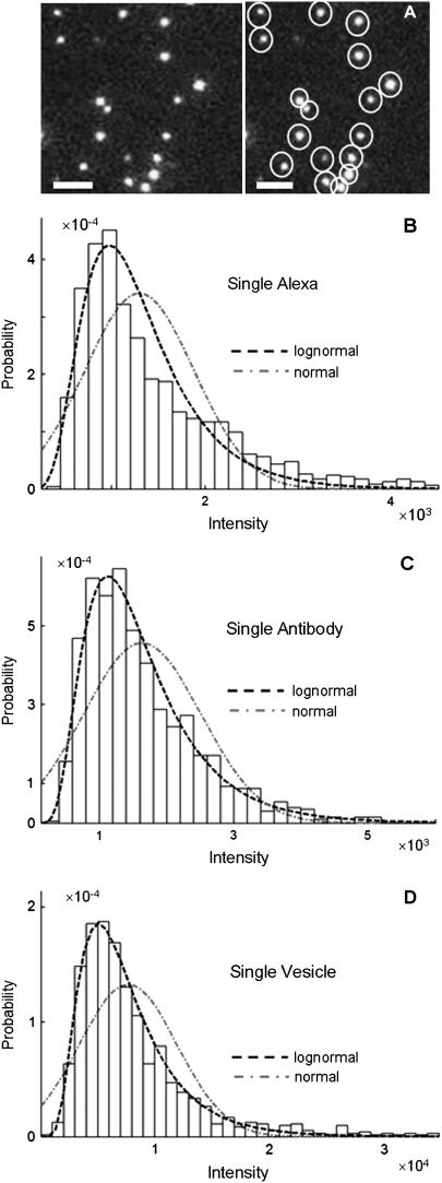
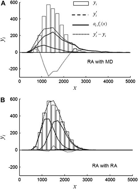
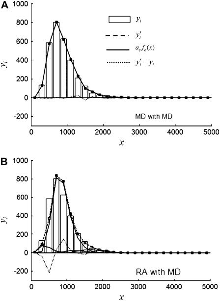
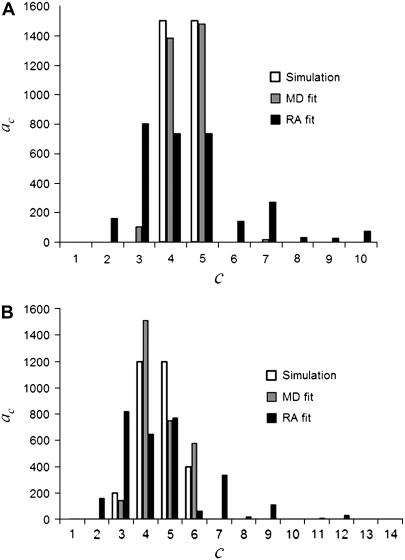
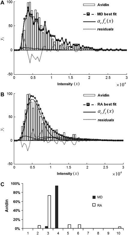
In fluorescence microscopy, images often contain puncta in which the fluorescent molecules are spatially clustered. This article describes a method that uses single-molecule intensity distributions to deconvolve the number of fluorophores present in fluorescent puncta as a way to "count" protein number. This method requires a determination of the correct statistical relationship between the single-molecule and single-puncta intensity distributions. Once the correct relationship has been determined, basis histograms can be generated from the single-molecule intensity distribution to fit the puncta distribution. Simulated data were used to demonstrate procedures to determine this relationship, and to test the methodology. This method has the advantages of single-molecule measurements, providing both the mean and variation in molecules per puncta. This methodology has been tested with the avidin-biocytin binding system for which the best-fit distribution of biocytins in the sample puncta was in good agreement with a bulk determination of the avidin-biocytin binding ratio.


Figures

FIGURE 1
FIGURE 1
Fluorescence intensity distributions of single molecules and particles. (A) Image of GAM labeled with multiple Alexa Fluor 488; the right panel shows each molecules being circled automatically by the imaging software to define a region of interest. The plots are intensity distributions of (B) single Alexa Fluor 488 carboxylic acid succinimidyl ester molecules, (C) single goat anti-mouse IgG molecules labeled with multiple Alexa Fluor 488, and (D) single synaptic vesicles tagged with anti-SV2 primary antibody and Alexa Fluor 488-labeled GAM secondary antibody. For BD, the dashed line is the best fit lognormal distribution to the data, and the dash-dot line is the best fit normal distribution to the data. The distribution of the intensity data is better fit by a lognormal distribution in all cases, despite the increase in the number of fluorophores per ROI between B and D. The images of the single fluorophores were faint when collected at the same excitation power as used for C and D, and thus images of the single fluorophores were collected using a higher laser power, so that the shape of the intensity distribution in B could be more easily compared with those in C and D.
FIGURE 2
FIGURE 2
(A) MD basis histograms, formula image, for c = 1–5. (B) Lognormal cumulative probability plots of formula image for c = 1–5. The slope of the lognormal cumulative probability plot is proportional to the shape, formula image. For a MD process, the slopes are independent of c, which indicates that the relative width of the MD basis histograms is the same regardless of the number of fluorophores in the puncta.
FIGURE 3
FIGURE 3
(A) RA basis histograms, formula image, for c =1−5. (B) Lognormal cumulative probability plots of formula image for c=1–5. The slope of the lognormal cumulative probability plot is proportional to the shape, formula image. For a RA process, the slope decrease as c increases, which indicates that the relative width of the RA basis histograms decreases with increasing c.
FIGURE 4
FIGURE 4
Comparison of RA and MD basis histograms. (A) Probability plots of the basis histograms generated by the MD (solid curves) and RA (dashed curves) process for c = 2 and 3. (B) Ratio of formula image of the MD and RA basis histograms for c = 1–8. The decrease in the ratio for RA basis histograms indicates a decrease in the relative width of the distribution.
FIGURE 5
FIGURE 5
Best-fit results for simulated distribution 3RA (see Tables 1 and 3; a Case I example) fitted with (A) MD basis histograms and (B) RA basis histograms. The vertical bars are the simulated data formula image, the dashed line is a plot of the best-fit result, formula image, the solid lines are plots of formula image (see Table 3), and the dotted line is a plot of the residuals of the fit (formula image).
FIGURE 6
FIGURE 6
Best-fit results for simulated distribution 5MD (see Tables 1 and 4; a Case II example) fitted with (A) MD basis histograms and (B) RA basis histograms. The vertical bars are the simulated data formula image, the dashed line is a plot of the best fit result, formula image, the solid lines are plots of formula image (see Table 4); and the dotted line is a plot of the residuals of the fit (formula image).
FIGURE 7
FIGURE 7
Distribution of coefficients from MD and RA fits of (A) 4MD and (B) 8MD (see Tables 1 and 5; a Case III example). The open bars are formula image, the actual number of ROIs in the set with c fluorophores. The vertical bars are formula image, the best-fit number of ROIs in the set with c fluorophores for the fit using MD basis histograms. The solid bars are formula image, the best fit number of ROIs in the set with c fluorophores for the fit using RA basis histograms.
FIGURE 8
FIGURE 8
Single-molecule measurements of the binding of Alexa Fluor 488-tagged biocytin to avidin. (A) Results of fitting avidin/labeled-biocytin emission data using MD basis histograms. (B) Results of fitting avidin/labeled-biocytin emission data using RA basis histograms. (C) Histogram showing the percentage of avidin with c biocytins obtained from the fits using MD (solid vertical bars) and RA (open vertical bars) basis histograms. For A and B, the vertical bars are the simulated data formula image, the dashed line is a plot of the best-fit result formula image, the solid lines are plots of formula image, and the dotted line is a plot of the residuals of the fit (formula image).

References

    1. Selinummi, J., J. R. Sarkanen, A. Niemisto, M. L. Linne, T. Ylikomi, O. Yli-Harja, and T. O. Jalonen. 2006. Quantification of vesicles in differentiating human SH-SY5Y neuroblastoma cells by automated image analysis. Neurosci. Lett. 396:102–107. - PubMed
    1. Krzan, M., M. Stenovec, M. Kreft, T. Pangrsic, S. Grilc, P. G. Haydon, and R. Zorec. 2003. Calcium-dependent exocytosis of atrial natriuretic peptide from astrocytes. J. Neurosci. 23:1580–1583. - PMC - PubMed
    1. Antonova, I., O. Arancio, A. C. Trillat, H. G. Wang, L. Zablow, H. Udo, E. R. Kandel, and R. D. Hawkins. 2001. Rapid increase in clusters of presynaptic proteins at onset of long-lasting potentiation. Science. 294:1547–1550. - PubMed
    1. Ogoshi, F., and J. H. Weiss. 2003. Heterogeneity of Ca2+-permeable AMPA/kainate channel expression in hippocampal pyramidal neurons: fluorescence imaging and immunocytochemical assessment. J. Neurosci. 23:10521–10530. - PMC - PubMed
    1. Axelrod, D. 2001. Total internal reflection fluorescence microscopy in cell biology. Traffic. 2:764–774. - PubMed

Publication types

LinkOut - more resources