Review
. 2007 Jan 29;362(1477):67-94.
doi: 10.1098/rstb.2006.1955.

Marine pelagic ecosystems: the west Antarctic Peninsula

Affiliations
Review

Marine pelagic ecosystems: the west Antarctic Peninsula

Hugh W Ducklow et al. Philos Trans R Soc Lond B Biol Sci. .

Abstract

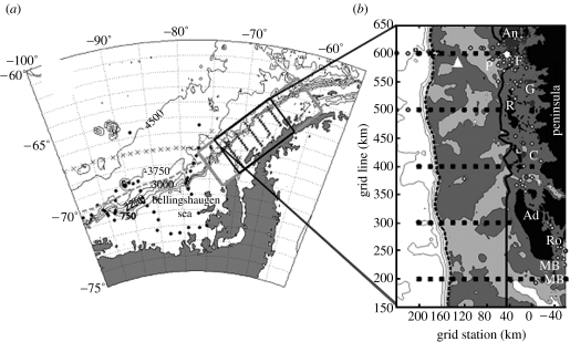
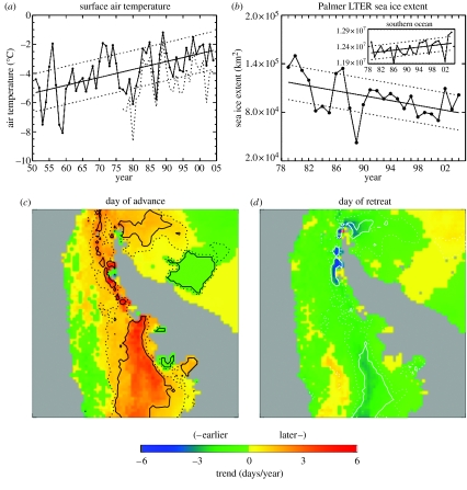
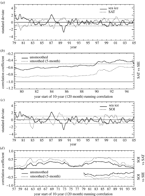
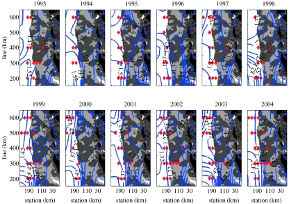
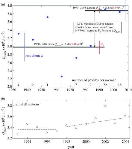
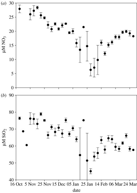
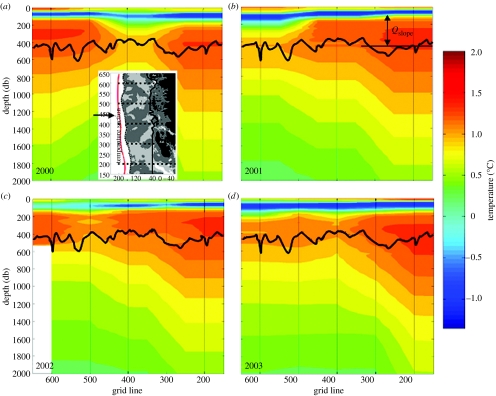
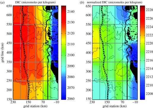
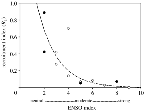
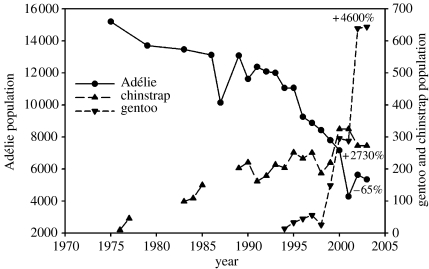
The marine ecosystem of the West Antarctic Peninsula (WAP) extends from the Bellingshausen Sea to the northern tip of the peninsula and from the mostly glaciated coast across the continental shelf to the shelf break in the west. The glacially sculpted coastline along the peninsula is highly convoluted and characterized by deep embayments that are often interconnected by channels that facilitate transport of heat and nutrients into the shelf domain. The ecosystem is divided into three subregions, the continental slope, shelf and coastal regions, each with unique ocean dynamics, water mass and biological distributions. The WAP shelf lies within the Antarctic Sea Ice Zone (SIZ) and like other SIZs, the WAP system is very productive, supporting large stocks of marine mammals, birds and the Antarctic krill, Euphausia superba. Ecosystem dynamics is dominated by the seasonal and interannual variation in sea ice extent and retreat. The Antarctic Peninsula is one among the most rapidly warming regions on Earth, having experienced a 2 degrees C increase in the annual mean temperature and a 6 degrees C rise in the mean winter temperature since 1950. Delivery of heat from the Antarctic Circumpolar Current has increased significantly in the past decade, sufficient to drive to a 0.6 degrees C warming of the upper 300 m of shelf water. In the past 50 years and continuing in the twenty-first century, the warm, moist maritime climate of the northern WAP has been migrating south, displacing the once dominant cold, dry continental Antarctic climate and causing multi-level responses in the marine ecosystem. Ecosystem responses to the regional warming include increased heat transport, decreased sea ice extent and duration, local declines in icedependent Adélie penguins, increase in ice-tolerant gentoo and chinstrap penguins, alterations in phytoplankton and zooplankton community composition and changes in krill recruitment, abundance and availability to predators. The climate/ecological gradients extending along the WAP and the presence of monitoring systems, field stations and long-term research programmes make the region an invaluable observatory of climate change and marine ecosystem response.


Figures

Figure 1
Figure 1
(a) Palmer LTER study region along the WAP showing sampling grid (filled squares with labelled contoured bathymetry (750 m intervals) and climatological southern edge of Antarctic Circumpolar Current (ACC; dashed grey line). (b) The main sampling grid occupied each January since 1993 consists of stations (small squares 10 km apart) arranged in 10 onshore to offshore lines spaced 100 km apart, with line 000 to the south and 900 to the north along the peninsula (only lines 200–600 shown); stations proceed offshore from an arbitrary 0 line defining the peninsular coastline. Bathymetry shaded (white≥750 m, 750 m<light-grey≤450 m, dark-grey<450 m) and contoured (greater than or equal to 1500 m at 750 m intervals); white diamond, Palmer Station; white triangle, long-term sediment trap mooring; F, Faraday (Vernadsky) base; P, Palmer Deep region on shelf; Ro, Rothera Station; G and C, Grandidier Channel and Crystal Sound; MB, Marguerite Bay; An, R and Ad, Anvers, Renaud and Adelaide Islands, respectively; continental shelf break indicated by dashed bold line (slope to left); shelf-coastal subregions separated by solid bold line; and small white circles, various stations ‘inside’ the islands and channels with distinct hydrography influenced by glacial ice melt.
Figure 2
Figure 2
(a) Annual average air temperature recorded at Faraday/Vernadsky Station (65°15′ S, 64°16′ W) from 1951 to 2004. The linear regression fit (solid) and ±1 standard deviation (dotted) about this fit are included. Annual average air temperature recorded at Rothera Station (67°34′ S, 68°08′ W) from 1977 to 2004 is shown by the dotted curve. The standard error and significance were determined using the effective degrees of freedom (Neff=24.8) present in the regression residuals (see Smith et al. 1996a for methods). Also included are the ±1 standard deviation lines (dotted). (b) Annual average sea ice extent for the Palmer LTER region and for the Southern Ocean (inset) from 1979 to 2004. The linear regression fit (solid) and ±1 s.d. (dotted) about this fit are included. Spatial maps of linear trends (1979–2004) in (c) day of advance and (d) day of retreat in the greater AP region.
Figure 3
Figure 3
Monthly standard deviates (smoothed by 5-month running means) from January 1979 to December 2004. Monthly standard deviates were determined by dividing the anomaly (for the month and year in question) by the standard deviation of the anomaly (for the month in question). (a) Faraday/Vernadsky air temperature (dotted) and Palmer LTER sea ice extent (solid); (b) 10-year (120 month) running correlations between unsmoothed (solid) and smoothed (dotted) time-series of Faraday/Vernadsky air temperature and Palmer LTER sea ice extent: the smoothing was by 5-month running means; (c) Palmer LTER sea ice extent (solid) and the Southern Oscillation Index (SOI; dotted); and (d) 10-year (120 month) running correlations between unsmoothed (solid) and smoothed (dotted) time-series of Faraday/Vernadsky air temperature and SOI (positive correlations from 1957 to 1995), and between unsmoothed (solid) and smoothed (dotted) time-series of Palmer LTER sea ice extent and the SOI (negative correlations from 1979 to 1995).
Figure 4
Figure 4
Annual dynamic topography as blue contours superimposed on a tripartite grey-scale bathymetry (dark grey≤450 m; 450 m750 m). Locations where ACC-core UCDW appears anywhere in water column shown by red triangles. Note frequent occurrence of UCDW on shelf at the 300 line, in mouth of trough west of Adelaide Island (Marguerite Trough).
Figure 5
Figure 5
(a) Heat content (relative to freezing) of ACC slope water that has direct access to LTER grid on continental shelf, serving as source of ocean heat on shelf (and shown in Martinson et al. (in press), to be linearly related to shelf heat flux through 2003). A considerable jump in this heat content occurs before 1990. Specifically, Qslope averages (2.98±0.16)×109 J m−2 for the 17 stations pre-1990 versus 40 (3.83±0.07)×109 J m−2 post-1990 stations (uncertainty in mean value shown about horizontal means as red lines; scatter about means given by blue vertical bars). This is equivalent to a uniform warming of the approximately 300 m thick layer by 0.7°C, comparable to a jump in heat flux (according to linear relationship between heat flux and heat content shown in Martinson et al. (in press)) of more than 3 W m−2. (b) More directly, heat content of this water on shelf, which has been shown to be linearly related to the ocean heat flux, shows a jump in 1998, comparable to a 3 W m−2 heat flux, followed by a linearly increasing trend of another 3 W m−2 per year (excluding 2002 which is an unusually large outlier).
Figure 6
Figure 6
Surface layer nutrient utilization. (a) Nitrate and (b) silicate depletion at inshore time-series station near Palmer Station, 1993–2004. Error bars show standard errors. The number of data points for each 5-day interval ranges from 1 (no bars) to 12.
Figure 7
Figure 7
Temperature sections along the red line shown in inset of (a) off Palmer LTER sampling region. Heavy black line shows average depth of shelf break. UCDW is the warmest (orange–red) water in each panel. Note that UCDW has direct access to shelf, providing considerable heat and nutrients.
Figure 8
Figure 8
(a) Total and (b) salinity-normalized (to salinity=35) mean dissolved inorganic carbon (DIC) concentrations in the surface layer in the Palmer LTER sampling region (figure 1) for 1993–2004.
Figure 9
Figure 9
Sea ice extent, chlorophyll at Palmer Station, and sedimentation rate for 1996–1997. Note that chlorophyll was high for about five months following the ice retreat, while the annual sedimentation was concentrated in a brief episode during January–February.
Figure 10
Figure 10
Annual sedimentation at 150 m in the Pal-LTER study area, 64.5° S, 66° W (see figure 1). The annual integrals are based on 21 individual samples collected over the course of each year, with an interval ranging from 7 to 30 days, depending on season and expected flux (data for 1993–2000 collected by D. M. Karl and C. J. Carrillo, Univ. Hawaii for Pal-LTER).
Figure 11
Figure 11
Monthly mean chlorophyll a time-series (coloured areas, mg m−3, based on 7 years of SeaWiFS data with the Southern Ocean algorithm developed by Dierssen & Smith 2000) for the Palmer LTER study area (pink box). The grey and pink dotted lines show the mean ice edge position at the start and end of each month, respectively. White areas denote regions where cloud or ice cover precluded firm chlorophyll estimates.
Figure 12
Figure 12
Spatial variability in average January integrated production across the shelf. Estimated from 6 January cruises between 1994 and 2000 (mean and 95% confidence intervals). Solid circles, 600 line stations off Anvers Island; open circles, 200 line off Marguerite Bay (figure 1a).
Figure 13
Figure 13
Depth profiles from the LTER study grid (figure 1) showing the relative proportion of picoplankton cells identified as Archaea or Bacteria using poly-fluorescent in situ hybridization (FISH) probes (Church et al. 2003). Filled circles, winter samples (June–July, 1999); open circles, summer samples (January, 1999).
Figure 14
Figure 14
The ratio of bacterial to heterotrophic nanoflagellate (bacteriovore, HNAN) abundance in the Gerlache Strait, WAP (open symbols) and the Ross Sea (closed symbols). The dotted lines indicate fixed ratios of 100, 1000 and 10 000 bacteria per HNAN. Gerlache data courtesy of D. Bird, Université de Québec à Montréal.
Figure 15
Figure 15
Gradients in abundance of Euphausia superba within the Palmer LTER region in January. Mean abundance (1993–2004) with standard error for abundance within standard grid cells 100 km alongshore and 20 km on/offshore. Abundance estimates from the delta distribution (Ross et al. in press). Abundance data shown for the 600 line (inverted triangles) just south of Anvers Island, and the 200 line (open circles) which enters Marguerite Bay just south of Adelaide Island.
Figure 16
Figure 16
Time-series of recruitment index (R1, filled circles, solid line) and abundance of AC1s (open circles, dashed line) calculated from length-frequency distributions of Euphausia superba with the maximum likelihood fitting procedure of de la Mare (1994) as used in the program CMIX. Krill were sampled in the full summer Pal-LTER study region in January of the years 1993–2004, and in a restricted sampling region in November 1991. The year class is identified from the year of the January of the spawning season. Series extended from that presented in Quetin & Ross (2003). The two estimates of R1 for year class 1990 and 1991 were estimated either from R2 (YC1990) or from a restricted sampling region (YC1991). Strong year classes are denoted either by high R1s (greater than 0.4) and/or high abundance of AC1s (greater than 40×1000 m−3).
Figure 17
Figure 17
Euphausia superba. Relationship between the recruitment index (R1) and the absolute value of a seasonal index of the ENSO cycle based on the three months running mean of ERSST.v2 SST anomalies (1971–2000 base period) in the Nino3.4 region. See http://www.cpc.ncep.noaa.gov/products/analysis_monitoring/ensostuff/ensoyears.html. The temperature anomalies were used to categorize three-month periods (JFM, AMJ, JAS and OND) as neutral (0) or as a strong (3), moderate (2) or weak (1). Sequential spring, summer (spawning), autumn and winter indices were summed. Open circles are dominated by El Niño and filled circles by La Niña. Series extended from that presented in Quetin & Ross (2003). R2=0.775.
Figure 18
Figure 18
Population trends for three penguin species in the Anvers Island vicinity, 1975–2003. The numbers on the graph indicate percentage change from initial sampling year for each species.

References

    1. Ackley S.F, Sullivan C.W. Physical controls on the development and characteristics of Antarctic sea ice biological communities—a review and synthesis. Deep-Sea Res. I. 1994;41:1583–1604. doi:10.1016/0967-0637(94)90062-0 - DOI
    1. Ainley D.G. Columbia University Press; New York, NY: 2002. The Adélie penguin: bellwether of climate change.
    1. Anadon R, Estrada M. The Fruela cruises: a carbon flux study in productive areas of the Antarctic Peninsula (December 1995–February 1996) Deep-Sea Res. II. 2002;49:567–583. doi:10.1016/S0967-0645(01)00112-6 - DOI
    1. Anadon R, Alvarez-Marques F, Fernandez E, Varela M, Zapata M, Gasol J.M, Vaque D. Vertical biogenic particle flux during austral summer in the Antarctic Peninsula area. Deep-Sea Res. II. 2002;49:883–901. doi:10.1016/S0967-0645(01)00129-1 - DOI
    1. Anderson J.B.Antarctic marine geology2002Cambridge University Press; Cambridge, UK

Publication types