Review
. 2007 Oct;76(6):1223-43.
doi: 10.1007/s00253-007-1128-0. Epub 2007 Aug 23.

The state of the art in the analysis of two-dimensional gel electrophoresis images

Affiliations
Review

The state of the art in the analysis of two-dimensional gel electrophoresis images

Matthias Berth et al. Appl Microbiol Biotechnol. 2007 Oct.

Erratum in

  • Appl Microbiol Biotechnol. 2008 May;79(2):329

Abstract

Software-based image analysis is a crucial step in the biological interpretation of two-dimensional gel electrophoresis experiments. Recent significant advances in image processing methods combined with powerful computing hardware have enabled the routine analysis of large experiments. We cover the process starting with the imaging of 2-D gels, quantitation of spots, creation of expression profiles to statistical expression analysis followed by the presentation of results. Challenges for analysis software as well as good practices are highlighted. We emphasize image warping and related methods that are able to overcome the difficulties that are due to varying migration positions of spots between gels. Spot detection, quantitation, normalization, and the creation of expression profiles are described in detail. The recent development of consensus spot patterns and complete expression profiles enables one to take full advantage of statistical methods for expression analysis that are well established for the analysis of DNA microarray experiments. We close with an overview of visualization and presentation methods (proteome maps) and current challenges in the field.


Figures

Fig. 1
Fig. 1
Analysis work flow of a 2-D-gel-based proteomics experiment in Delta2D. 1 Sample preparation; 2 2-D gel electrophoresis; 3 2-D gels are stained/detected and digitized; 4 spot positions are aligned across gel images by warping; 5 a proteome map/fusion gel image is generated by combining the images using a union fusion; 6 the union fusion image serves as basis for constructing the consensus spot pattern for the whole experiment; 7 the consensus spot pattern is transferred to all images and subsequently remodeled; 8 expression profiles are extracted and analyzed to find relevant proteins
Fig. 2
Fig. 2
Consensus spot pattern applied to four gel images (ad), before remodeling of spot shapes. The consensus spot pattern is generated by spot detection on the synthetic fusion image (e) which was computed from the original images
Fig. 3
Fig. 3
Protein labeling, staining, and tagging techniques for the selective detection of proteins. By multiplexing detection approaches, image analysis may relate different subsets of the proteome such as phosphorylated or glycosylated proteins
Fig. 4
Fig. 4
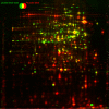
Protein amount (green) and protein synthesis (red) in a heat shock experiment of Bacillus subtilis 168. The synthesis patterns can differ dramatically between different stimuli but can be easily related using the protein amount patterns
Fig. 5
Fig. 5
Flamingo-stained protein amount (green), Diamond ProQ Phosphoprotein staining (red), and 33P in vivo phosphoprotein labeling (blue) in an exponentially growing B. subtilis 168 sample. While the green and blue subimages seem to be almost complementary, the red subimage highlights spots from the protein level pattern as well as from the phosphate autoradiograph, so it can be used to find correspondences
Fig. 6
Fig. 6
Decomposition of the raw image into background, noise, and cleaned images. Image filters can be used to determine background and noise, leaving the quantitative protein spot information in the cleaned image. a Raw image, b speckles and noise, c background, d cleaned image
Fig. 7
Fig. 7
2-D gel image registration by warping. Two images are combined pixel by pixel using a false color display (a). Vectors connecting corresponding points (spots) on both images are determined automatically (b). Transforming the image geometry (warping) according to the vectors produces an exact overlay (c). Corresponding spots (black color) as well as differences in spot patterns can be easily identified. Data about differences in spot position are used in later image analysis steps (image fusion, transfer of consensus spot pattern)
Fig. 8
Fig. 8
Spot boundaries for high (a) and low abundance (b) spots
Fig. 9
Fig. 9
Spot boundaries produced by segmentation (a) and subsequent modeling (b)
Fig. 10
Fig. 10
Example of a gray level calibration curve that is used in special image file formats. Gray levels found in the image file have to be interpreted according to the curve before being summed up for quantitation. The curve has lower slope in the low intensity range resulting in better quantitative resolution for weak signals
Fig. 11
Fig. 11
Background subtraction using the rolling ball approach
Fig. 12
Fig. 12
Scatter plot (a) of logarithmic spot quantities on two gels from different samples. Spots were normalized based on total spot quantity. b The quantile–quantile plot (QQ plot) of the same data. Spots are sorted by quantity separately on each gel; spots of corresponding ranks are plotted. The QQ plot makes it easier to compare the spot volume distributions; in an ideal experiment, all points would lie on the diagonal line. The diagram shows that the quantity distributions on both gels are nearly equal, indicating a successful normalization
Fig. 13
Fig. 13
By using a consensus spot pattern in Delta2D (a), complete expression profiles (b) are generated. Profiles can be imported into DNA array analysis software (here: TIGR MultiExperiment Viewer, TMEV). With appropriate data transformations and normalization, many approaches for data analysis known from DNA arrays can be used for 2-D-gel-based proteome data. Hierarchical clustering (c) and self-organizing maps (d) group proteins by similarity of their expression profiles. Template matching (e) can be used to find proteins that conform to an expression pattern given by the user. Terrain maps (f) can give a high level overview of a data set where correlations of protein expression profiles are shown as distances in two dimensions, and protein density is shown in the third dimension (height)
Fig. 14
Fig. 14
Section of a heat map of a hierarchical clustering of an experiment consisting of 11 individuals with 5 replicate gels each, and 1 average fusion image per individual. Clustering was done for gels (columns) and expression profiles (rows) simultaneously. Gels are color coded by sample, replicates have the same color, sample A is colored in shades of blue, sample B is colored in shades of red. The clusterdendrogram for gels shows that replicates were clustered together, and samples are roughly grouped in the higher level clusters. The clustering did not use any sample or replicate information. The left-most replicate group is probably an outlier, as it branches off early in the dendrogram. Notice also the cluster structure in the rows, grouping proteins with similar expression profiles (row dendrogram not shown). Expression profiles were generated by spot transfer, hence the absence of missing values. Only about 20% of all expression profiles are shown
Fig. 15
Fig. 15
PCA of 54 gels from 11 patients. Gels are color coded according to sample (sample a: shades of blue; sample b: shades of red). Notice how replicate gels are grouped closely together. We have chosen the projection onto the second and third principal components because it shows a good separation between samples
Fig. 16
Fig. 16
Gel image tiles before (a) and after (b) multiway histogram equalization. After the equalization, the difference in the highlighted spot (middle row, left and right images) is clearly visible as shown in the expression profile (c)
Fig. 17
Fig. 17
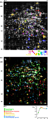
Proteome maps with spot color coding. a Stress proteome map of B. subtilis 168 (compare Tam le et al. 2006). Spots were color coded according to their induced expression in response to different stress factors. b Proteome map of B. subtilis 168 in a glucose starvation time course experiment. Spots were color coded according to the growth phase

Similar articles

Cited by

References

    1. Aittokallio T, Salmi J, Nyman TA, Nevalainen OS. Geometrical distortions in two-dimensional gels: applicable correction method. J Chromatogr B. 2005;815:25–37. - PubMed
    1. Alban A, Davis SO, Bjorkesten L, Andersson C, et al. A novel experimental design for comparative two-dimensional gel analysis: two dimensional difference gel electrophoresis incorporating a pooled internal standard. Proteomics. 2003;3:36–44. - PubMed
    1. Alter O, Brown PO, Botstein D. Singular value decomposition for genome-wide expression data processing and modeling. Proc Natl Acad Sci U S A. 2000;97:10101–10106. - PMC - PubMed
    1. Amemiya Y, Miyahara J. Imaging plate illuminates many fields. Nature. 1988;336(6194):89–90. - PubMed
    1. Anderson NL, Taylor J, Scandora AE, Coulter BP, Anderson NG. The TYCHO system for computer analysis of two-dimensional gel electrophoresis patterns. Clin Chem. 1981;27:1807–1820. - PubMed

MeSH terms