. 2007 Oct;3(10):2032-42.
doi: 10.1371/journal.pcbi.0030206.

Construction, visualisation, and clustering of transcription networks from microarray expression data

Affiliations

Construction, visualisation, and clustering of transcription networks from microarray expression data

Tom C Freeman et al. PLoS Comput Biol. 2007 Oct.

Abstract

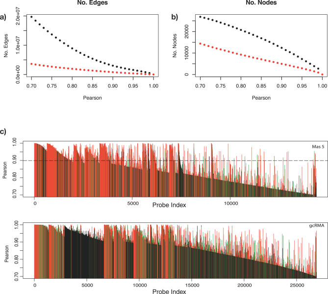
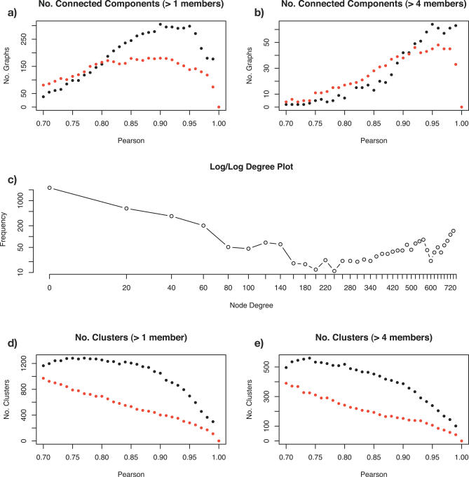
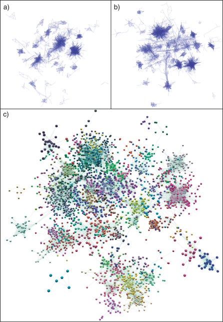
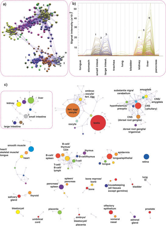
Network analysis transcends conventional pairwise approaches to data analysis as the context of components in a network graph can be taken into account. Such approaches are increasingly being applied to genomics data, where functional linkages are used to connect genes or proteins. However, while microarray gene expression datasets are now abundant and of high quality, few approaches have been developed for analysis of such data in a network context. We present a novel approach for 3-D visualisation and analysis of transcriptional networks generated from microarray data. These networks consist of nodes representing transcripts connected by virtue of their expression profile similarity across multiple conditions. Analysing genome-wide gene transcription across 61 mouse tissues, we describe the unusual topography of the large and highly structured networks produced, and demonstrate how they can be used to visualise, cluster, and mine large datasets. This approach is fast, intuitive, and versatile, and allows the identification of biological relationships that may be missed by conventional analysis techniques. This work has been implemented in a freely available open-source application named BioLayout Express(3D).


Conflict of interest statement

Competing interests. The authors have declared that no competing interests exist.

Figures

Figure 1
Figure 1. Relationship between Pearson Correlation Coefficient of Expression Profiles and Node Inclusion into Networks
As the Pearson threshold decreases, the number of (nonsingleton) nodes (A) and edges connecting these nodes (B) increases, resulting in larger networks. The red dotted lines show this relationship for MAS5 scaled data, and black dotted lines show gcRMA normalised data. “Landscape” plots (C–D) also demonstrate the inherent structure within the data and the effect of different normalisation methods. All probe-set pairs with a Pearson correlation coefficient ≥0.7 have been plotted, each probe-set joining the graph nearest to the probe-set(s) to which it shares this relationship. The resultant “landscape” shows a number of peaks corresponding to groups of genes sharing similar expression profiles. The data corresponding to individual probe-sets have been coloured according to the maximum signal across all samples: red denotes the top third of transcripts with the highest maximum expression; green, the middle third, and black, the lowest third. The dashed black line (C) denotes the Pearson threshold used for subsequent analyses.
Figure 2
Figure 2. Network Connectivity and Clustering
The relationships are shown (A–B) between the number of connected components in the GNF mouse tissue expression network and Pearson correlation coefficient threshold used. As the threshold increases, the tendency is for the network to fragment into smaller unconnected graphs. However, it can be seen from the difference between graphs (A–B) that many of these unconnected components comprise relatively few nodes. (C) Log–log frequency plot of node degree (i.e., total number of edges for each node) for the 0.9 Pearson threshold graph. These networks show an unusual topography relative to other networks derived from biological data. Here, a relatively large number of nodes show high-degree connectivity. These nodes represent genes forming core structures within the network being highly connected to neighbouring nodes. (D) MCL cluster counts (with inflation threshold set at 2.2) for networks derived at varying Pearson thresholds. Small clusters (≤4) account for a high proportion of the overall number of clusters (E). The red dotted lines show these relationships for MAS5 scaled data; the black dotted lines show gcRMA normalised data.
Figure 3
Figure 3. Untiled (Organic Layout) of GNF1M Network Graphs at Different Pearson Correlation Thresholds
Graphs show the mouse tissue transcription network graphs when the Pearson threshold is a set at (A) 0.98 (1,421 nodes, 69,334 edges), (B) 0.95 (2,860 nodes, 201,724 edges), and (C) 0.90 (5,410 nodes, 447,467 edges). In graphs (A) and (B), nodes have been hidden so as to show the structure of the networks, and in (C) nodes are shown and coloured according to their membership of MCL clusters (inflation value 1.5).
Figure 4
Figure 4. Tiled Graphs of the Network Formed from the GNF Mouse Tissue Data Using a 0.9 Pearson Correlation Threshold
(A) For simplicity, the network is shown as collapsed MCL clusters (inflation value 2.2). A total of 33 disconnected graphs containing 168 clusters (≥4 nodes) are formed, the size (volume) of the node representing each cluster being proportional to the size of the cluster. (B) One graph extracted from a GNF mouse tissue network (highlighted in Figure 3A and demonstrates how individual nodes may be viewed in the context of the network neighbourhood). Plotting the average signal of the major node-clusterings in this graph over the tissues in which they are predominately expressed, one can see how expression profiles of the underlying genes change from one cluster to the next (C). Cluster 6 genes (yellow) for instance show a marked specificity for the kidney expression, whereas cluster 4 (green) genes are predominantly liver-specific. In the middle of these two clusters lies cluster 5 (purple), whose genes are expressed in both organs. The closer genes sit in the network to clusters 4 or 6, the stronger their expression will be in one tissue relative to the other. A similar relationship is true for small intestine (cluster 3)– and large intestine (clusters 1 and 2)–specific genes, with certain intestinally expressed genes also being expressed in the liver and kidney, connecting the expression networks of these two organ systems.

References

    1. Janssen P, Audit B, Cases I, Darzentas N, Goldovsky L, et al. Beyond 100 genomes. Genome Biol. 2003;4:402. - PMC - PubMed
    1. Reed JL, Famili I, Thiele I, Palsson BO. Towards multidimensional genome annotation. Nat Rev Genet. 2006;7:130–141. - PubMed
    1. Kitano H. Computational systems biology. Nature. 2002;420:206–210. - PubMed
    1. Nurse P. Systems biology: Understanding cells. Nature. 2003;424:883. - PubMed
    1. Cassman M. Barriers to progress in systems biology. Nature. 2005;438:1079. - PubMed

Publication types