

Predictability and epidemic pathways in global outbreaks of infectious diseases: the SARS case study
- PMID: 18031574
- PMCID: PMC2213648
- DOI: 10.1186/1741-7015-5-34
Predictability and epidemic pathways in global outbreaks of infectious diseases: the SARS case study
Abstract
Background: The global spread of the severe acute respiratory syndrome (SARS) epidemic has clearly shown the importance of considering the long-range transportation networks in the understanding of emerging diseases outbreaks. The introduction of extensive transportation data sets is therefore an important step in order to develop epidemic models endowed with realism.
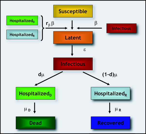
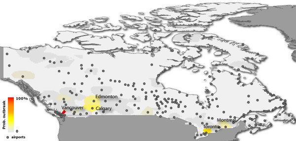
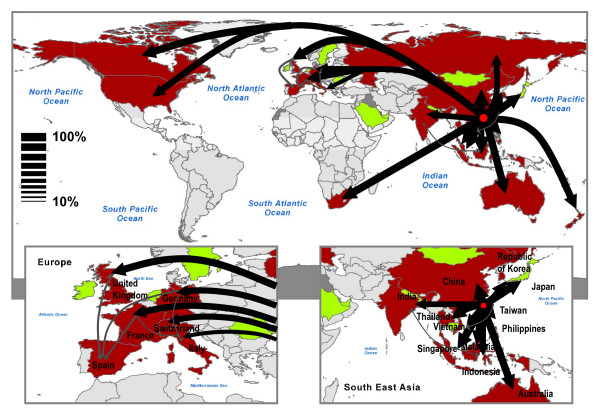
Methods: We develop a general stochastic meta-population model that incorporates actual travel and census data among 3 100 urban areas in 220 countries. The model allows probabilistic predictions on the likelihood of country outbreaks and their magnitude. The level of predictability offered by the model can be quantitatively analyzed and related to the appearance of robust epidemic pathways that represent the most probable routes for the spread of the disease.
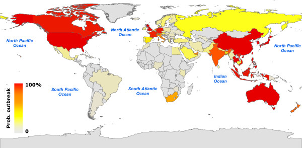
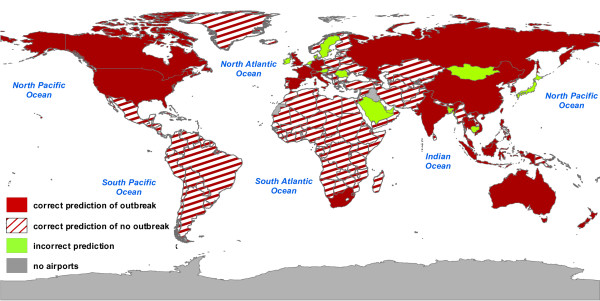
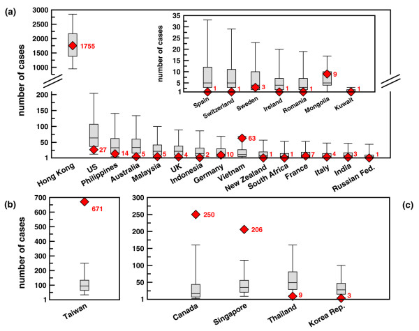
Results: In order to assess the predictive power of the model, the case study of the global spread of SARS is considered. The disease parameter values and initial conditions used in the model are evaluated from empirical data for Hong Kong. The outbreak likelihood for specific countries is evaluated along with the emerging epidemic pathways. Simulation results are in agreement with the empirical data of the SARS worldwide epidemic.
Conclusion: The presented computational approach shows that the integration of long-range mobility and demographic data provides epidemic models with a predictive power that can be consistently tested and theoretically motivated. This computational strategy can be therefore considered as a general tool in the analysis and forecast of the global spreading of emerging diseases and in the definition of containment policies aimed at reducing the effects of potentially catastrophic outbreaks.
Figures
Similar articles
-
The modeling of global epidemics: stochastic dynamics and predictability.Bull Math Biol. 2006 Nov;68(8):1893-921. doi: 10.1007/s11538-006-9077-9. Epub 2006 Jun 20. Bull Math Biol. 2006. PMID: 17086489 Free PMC article.
-
Forecast and control of epidemics in a globalized world.Proc Natl Acad Sci U S A. 2004 Oct 19;101(42):15124-9. doi: 10.1073/pnas.0308344101. Epub 2004 Oct 11. Proc Natl Acad Sci U S A. 2004. PMID: 15477600 Free PMC article.
-
Different epidemic curves for severe acute respiratory syndrome reveal similar impacts of control measures.Am J Epidemiol. 2004 Sep 15;160(6):509-16. doi: 10.1093/aje/kwh255. Am J Epidemiol. 2004. PMID: 15353409 Free PMC article.
-
Anatomy of the epidemiological literature on the 2003 SARS outbreaks in Hong Kong and Toronto: a time-stratified review.PLoS Med. 2010 May 4;7(5):e1000272. doi: 10.1371/journal.pmed.1000272. PLoS Med. 2010. PMID: 20454570 Free PMC article. Review.
-
The GLEaMviz computational tool, a publicly available software to explore realistic epidemic spreading scenarios at the global scale.BMC Infect Dis. 2011 Feb 2;11:37. doi: 10.1186/1471-2334-11-37. BMC Infect Dis. 2011. PMID: 21288355 Free PMC article. Review.
Cited by
-
Temporal percolation of the susceptible network in an epidemic spreading.PLoS One. 2012;7(9):e44188. doi: 10.1371/journal.pone.0044188. Epub 2012 Sep 13. PLoS One. 2012. PMID: 23028498 Free PMC article.
-
Effective distances for epidemics spreading on complex networks.Phys Rev E. 2017 Jan;95(1-1):012313. doi: 10.1103/PhysRevE.95.012313. Epub 2017 Jan 17. Phys Rev E. 2017. PMID: 28208446 Free PMC article.
-
Dynamic Landscape of Mpox Importation Risks Driven by Heavy-Tailed Sexual Contact Networks Among Men Who Have Sex With Men in 2022.J Infect Dis. 2025 Feb 4;231(1):e234-e243. doi: 10.1093/infdis/jiae433. J Infect Dis. 2025. PMID: 39193849 Free PMC article.
-
A Municipality-Based Approach Using Commuting Census Data to Characterize the Vulnerability to Influenza-Like Epidemic: The COVID-19 Application in Italy.Microorganisms. 2020 Jun 16;8(6):911. doi: 10.3390/microorganisms8060911. Microorganisms. 2020. PMID: 32560207 Free PMC article.
-
Mechanistic models of Rift Valley fever virus transmission: A systematic review.PLoS Negl Trop Dis. 2022 Nov 18;16(11):e0010339. doi: 10.1371/journal.pntd.0010339. eCollection 2022 Nov. PLoS Negl Trop Dis. 2022. PMID: 36399500 Free PMC article.
References
-
- McLean AR, May RM, Pattison J, Weiss RA. SARS A Case Study in Emerging Infections. Oxford, UK: Oxford University Press; 2005.
-
- Baroyan OV, Genchikov LA, Rvachev LA, Shashkov VA. An attempt at large-scale influenza epidemic modeling by means of a computer. Bull Internat Epidemiol Assoc. 1969;18:22–31.
-
- Rvachev LA, Longini IM. A mathematical model for the global spread of influenza. Math Biosci. 1985;75:3–22. doi: 10.1016/0025-5564(85)90064-1. - DOI
Publication types
MeSH terms
LinkOut - more resources
Full Text Sources
Other Literature Sources
Medical
Miscellaneous
