. 2007 Nov;3(11):e185.
doi: 10.1371/journal.pgen.0030185.

Genetic variation and population structure in native Americans

Affiliations

Genetic variation and population structure in native Americans

Sijia Wang et al. PLoS Genet. 2007 Nov.

Abstract

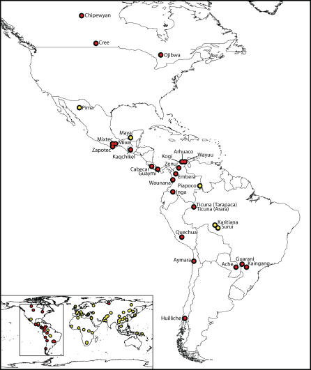
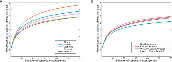
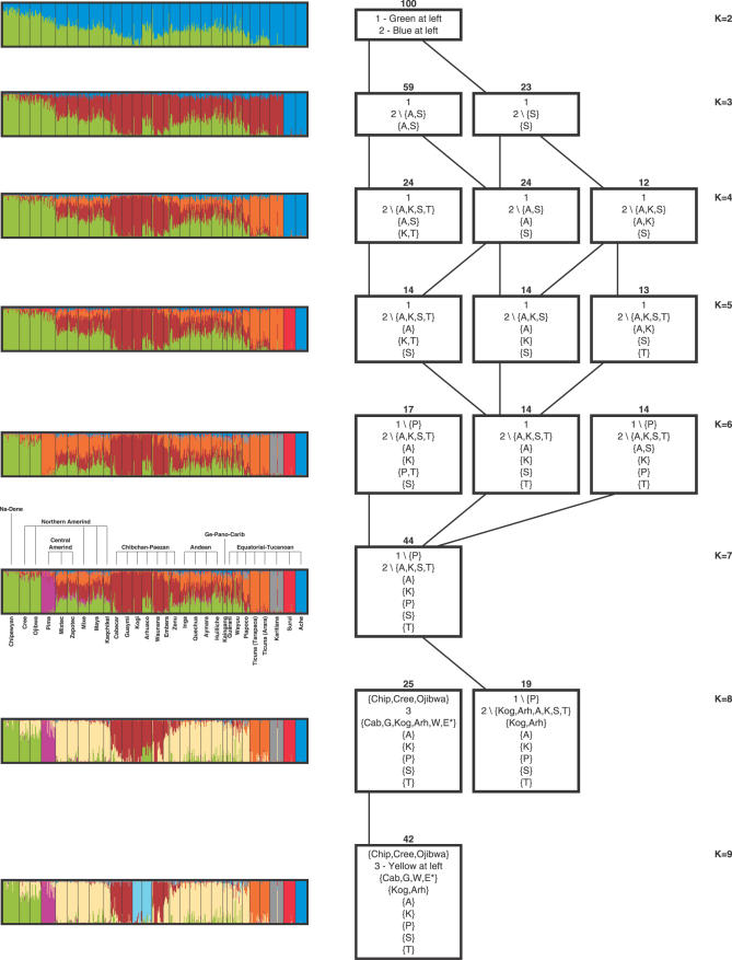
We examined genetic diversity and population structure in the American landmass using 678 autosomal microsatellite markers genotyped in 422 individuals representing 24 Native American populations sampled from North, Central, and South America. These data were analyzed jointly with similar data available in 54 other indigenous populations worldwide, including an additional five Native American groups. The Native American populations have lower genetic diversity and greater differentiation than populations from other continental regions. We observe gradients both of decreasing genetic diversity as a function of geographic distance from the Bering Strait and of decreasing genetic similarity to Siberians--signals of the southward dispersal of human populations from the northwestern tip of the Americas. We also observe evidence of: (1) a higher level of diversity and lower level of population structure in western South America compared to eastern South America, (2) a relative lack of differentiation between Mesoamerican and Andean populations, (3) a scenario in which coastal routes were easier for migrating peoples to traverse in comparison with inland routes, and (4) a partial agreement on a local scale between genetic similarity and the linguistic classification of populations. These findings offer new insights into the process of population dispersal and differentiation during the peopling of the Americas.


Conflict of interest statement

Competing interests. The authors have declared that no competing interests exist.

Figures

Figure 1
Figure 1. Populations Included in This Study
The world map shows the 78 populations investigated in the combined dataset, with the locations of the 29 populations studied in the Americas shown in detail in the larger map. The 25 newly examined populations, including the Siberian Tundra Nentsi, are marked in red, and the previously genotyped HGDP-CEPH populations are marked in yellow.
Figure 2
Figure 2. The Mean and Standard Error Across 678 Loci of the Number of Distinct Alleles as a Function of the Number of Sampled Chromosomes
(A) Geographic regions worldwide. (B) Subregions within the Americas. For a given locus, region, and sample size g, the number of distinct alleles averaged over all possible subsamples of g chromosomes from the given region is computed according to the rarefaction method [24,25]. For each sample size g, loci were considered only if their sample sizes were at least g in each geographic region. Error bars denote the standard error of the mean across loci.
Figure 3
Figure 3. Heterozygosity in Relation to Geography
(A) Relationship between heterozygosity and geographic distance from East Africa. Populations in Sub-Saharan Africa and Oceania are marked with gray triangles and squares, respectively, and the remaining non-American populations from Europe, Asia, and northern Africa are marked with gray pentagons. Within the Americas, populations are color-coded and symbol-coded by language stock (see Figure 8). Denoting heterozygosity by H and geographic distance in thousands of kilometers by D, the regression line for the graph is H = 0.7679 − 0.00658D, with correlation coefficient −0.862. (B) The fit of a linear decline of heterozygosity with increasing distance from a putative source, considering Native American populations only. The color of a point indicates a correlation coefficient r between expected heterozygosity and geographic distance from the point, with darker colors denoting more strongly negative correlations. Across the Americas, the correlation ranges from −0.436 to 0.575, and color bins are set to equalize the number of points drawn in the four colors. From darkest to lightest, the four colors represent points with correlations in (−0.436, −0.424), (−0.424, −0.316), (−0.316, 0.494), and (0.494, 0.575), respectively.
Figure 4
Figure 4. Heterozygosity and Least-Cost Paths in a Coastal Migration Scenario
(A) R 2 (square of the correlation) between heterozygosity H and effective geographic distance (least-cost distance), assuming differential permeability of coastal regions compared to inland regions. Correlations significant at the 0.05 level are indicated by closed symbols, and those that are not significant are indicated by open symbols. (B) Least-cost routes for the scenario with 1:10 coastal/inland cost ratio.
Figure 5
Figure 5. Unsupervised Analysis of Worldwide Population Structure
The number of clusters in a given plot is indicated by the value of K. Individuals are represented as thin vertical lines partitioned into segments corresponding to their membership in genetic clusters indicated by the colors.
Figure 6
Figure 6. Supervised Population Structure Analysis, Using Five Clusters, Four of Which Were Forced to Correspond to Africans, Europeans, East Asians Excluding Siberians, and Siberians
Figure 7
Figure 7. Unsupervised Analysis of Native American Population Structure
The colored plots at the left show the estimated population structure of Native Americans, obtained using STRUCTURE. The number of clusters in a given plot is indicated by the value of K on the right side of the figure. Next to the K = 7 plot, the population names and the major language stocks of the populations are also displayed. The left-to-right order of the individuals is the same in all plots. The diagram on the right summarizes the outcomes of 100 replicate STRUCTURE runs for each of several values of K. Each row represents a value of K, and within each row, each box represents a clustering solution that appeared at least 12 times in 100 replicates (see Methods). The number of appearances of a solution is listed above the box, and the boxes are arrayed from left to right in decreasing order of the frequencies of the solutions to which they correspond. The DISTRUCT plot shown on the left corresponds to the leftmost box on the right side of the figure. An approximate description of the clusters is located inside the box, with each row in the box representing a different cluster. The numbers 1, 2, and 3 are used to refer to the green cluster in the K = 2 DISTRUCT plot, the blue cluster in the K = 2 DISTRUCT plot, and the yellow cluster in the K = 9 DISTRUCT plot, respectively. The following population abbreviations are also used: A, Ache; Arh, Arhuaco; Cab, Cabecar; Chip, Chipewyan; E, Embera; G, Guaymi; K, Karitiana; Kog, Kogi; P, Pima; S, Surui; T, Ticuna (both Ticuna groups combined); W, Waunana. Clusters are indicated using set notation; for example {A} represents a cluster containing Ache only, and 2\{A,S} represents a cluster that corresponds to cluster 2 (the blue cluster for K = 2), excluding Ache and Surui. An asterisk indicates approximately 50% membership of a population in a cluster. A line is drawn from a box representing a solution with K clusters to a box representing a solution with K+1 clusters if the solution with K+1 clusters refines the solution with K clusters—that is, if all of the clusters in the solution with K+1 clusters subdivide the clusters in the solution with K clusters. In case of ties for the highest-frequency solution (K = 4 and K = 5), boxes are oriented in order to avoid the crossing of lines between them.
Figure 8
Figure 8. Neighbor-Joining Tree of Native American Populations
Each language stock is given a color, and if all populations subtended by an edge belong to the same language stock, the clade is given the color that corresponds to that stock. Branch lengths are scaled according to genetic distance, but for ease of visualization, a different scale is used on the left and right sides of the middle tick mark at the bottom of the figure. The tree was rooted along the branch connecting the Siberian populations and the Native American populations, and for convenience, the forced bootstrap score of 100% for this rooting is indicated twice.
Figure 9
Figure 9. The Mean and Standard Error Across 678 Loci of the Number of Private Alleles as a Function of the Number of Sampled Chromosomes
For a given locus, region, and sample size g, the number of private alleles in the region—averaging over all possible subsamples that contain g chromosomes each from the five regions—is computed according to an extension of the rarefaction method [25]. For each sample size g, loci were considered only if their sample sizes were at least g in each geographic region. Error bars denote the standard error of the mean across loci.
Figure 10
Figure 10. Allele Frequency Distribution at Tetranucleotide Locus D9S1120
For each population the sizes of the colored bars are proportional to allele frequencies in the population, with alleles color-coded as in the legend. Alleles are ordered from bottom to top by increase in size, with the smallest allele, a Native American private allele of size 275, shown in red, and the largest allele, 315, shown in dark blue.

References

    1. Cavalli-Sforza LL, Menozzi P, Piazza A. The history and geography of human genes. Princeton: Princeton University Press; 1994.
    1. Cavalli-Sforza LL, Feldman MW. The application of molecular genetic approaches to the study of human evolution. Nature Genet. 2003;33:S266–S275. - PubMed
    1. Jobling MA, Hurles ME, Tyler-Smith C. Human evolutionary genetics: origins, peoples & disease. New York: Garland Science; 2004.
    1. Tishkoff SA, Verrelli BC. Patterns of human genetic diversity: implications for human evolutionary history and disease. Annu Rev Genomics Hum Genet. 2003;4:293–340. - PubMed
    1. Di Rienzo A, Hudson RR. An evolutionary framework for common diseases: the ancestral-susceptibility model. Trends Genet. 2005;21:596–601. - PubMed

Publication types