Graphical presentation of diagnostic information
- PMID: 18405357
- PMCID: PMC2394529
- DOI: 10.1186/1471-2288-8-20
Graphical presentation of diagnostic information
Abstract
Background: Graphical displays of results allow researchers to summarise and communicate the key findings of their study. Diagnostic information should be presented in an easily interpretable way, which conveys both test characteristics (diagnostic accuracy) and the potential for use in clinical practice (predictive value).
Methods: We discuss the types of graphical display commonly encountered in primary diagnostic accuracy studies and systematic reviews of such studies, and systematically review the use of graphical displays in recent diagnostic primary studies and systematic reviews.
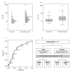
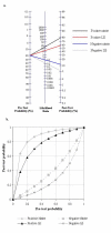
Results: We identified 57 primary studies and 49 systematic reviews. Fifty-six percent of primary studies and 53% of systematic reviews used graphical displays to present results. Dot-plot or box-and- whisker plots were the most commonly used graph in primary studies and were included in 22 (39%) studies. ROC plots were the most common type of plot included in systematic reviews and were included in 22 (45%) reviews. One primary study and five systematic reviews included a probability-modifying plot.
Conclusion: Graphical displays are currently underused in primary diagnostic accuracy studies and systematic reviews of such studies. Diagnostic accuracy studies need to include multiple types of graphic in order to provide both a detailed overview of the results (diagnostic accuracy) and to communicate information that can be used to inform clinical practice (predictive value). Work is required to improve graphical displays, to better communicate the utility of a test in clinical practice and the implications of test results for individual patients.
Figures


References
-
- Wieand S, Gail MH, James BR, James KL. A Family of Nonparametric Statistics for Comparing Diagnostic Markers with Paired Or Unpaired Data. Biometrika. 1989;76:585–592. doi: 10.1093/biomet/76.3.585. - DOI
-
- Armitage P, Berry G, Matthews JNS. Statistical Methods in Medical Research. Fourth. Oxford, Blackwell Science Ltd; 2002.
-
- Zweig MH, Campbell G. Receiver-operating characteristic (ROC) plots: a fundamental evaluation tool in clinical medicine. Clin Chem. 1993;39:561–577. - PubMed

