. 2008 Aug;179(4):2275-89.
doi: 10.1534/genetics.108.088427. Epub 2008 Aug 9.

Bayesian quantitative trait loci mapping for multiple traits

Affiliations

Bayesian quantitative trait loci mapping for multiple traits

Samprit Banerjee et al. Genetics. 2008 Aug.

Abstract

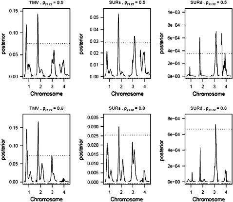
Most quantitative trait loci (QTL) mapping experiments typically collect phenotypic data on multiple correlated complex traits. However, there is a lack of a comprehensive genomewide mapping strategy for correlated traits in the literature. We develop Bayesian multiple-QTL mapping methods for correlated continuous traits using two multivariate models: one that assumes the same genetic model for all traits, the traditional multivariate model, and the other known as the seemingly unrelated regression (SUR) model that allows different genetic models for different traits. We develop computationally efficient Markov chain Monte Carlo (MCMC) algorithms for performing joint analysis. We conduct extensive simulation studies to assess the performance of the proposed methods and to compare with the conventional single-trait model. Our methods have been implemented in the freely available package R/qtlbim (http://www.qtlbim.org), which greatly facilitates the general usage of the Bayesian methodology for unraveling the genetic architecture of complex traits.


Figures

F<sc>igure</sc> 1.—
Figure 1.—
(A) 2 logBF profile for n = 100 and formula image for all four methods. Shaded curves represent 2 logBF profile for y1 and solid curves that for y2; the shaded dotted lines denotes the 95% threshold for y1 for the null model and the solid dotted lines denote the same for y2. On the x-axis, large tick marks represent chromosomes and small tick marks represent markers. (B) 2 logBF profile for n = 100 and formula image for all four methods. Shaded curves represent 2 logBF profile for y1 and solid curves that for y2; shaded dotted lines denote the 95% threshold for y1 for the null model and solid dotted lines denote the same for y2. On the x-axis, large tick marks represent chromosomes and small tick marks represent markers.
F<sc>igure</sc> 2.—
Figure 2.—
(A) 2 logBF profile for n = 200 and formula image for all four methods. Shaded curves represent 2 logBF profile for y1 and solid curves that for y2; the shaded dotted line denotes the 95% threshold for y1 for the null model and the solid dotted lines denote the same for y2. On the x-axis, large tick marks represent chromosomes and small tick marks represent markers. (B) 2 logBF profile for n = 200 and formula image for all four methods. Shaded curves represent 2 logBF profile for y1 and solid curves that for y2; shaded dotted lines denote the 95% threshold for y1 for the null model and solid dotted lines denote the same for y2. On the x-axis, large tick marks represent chromosomes and small tick marks represent markers.
F<sc>igure</sc> 3.—
Figure 3.—
(A) 2 logBF profile for n = 500 and formula image for all four methods. Shaded curves represent 2 logBF profile for y1 and solid curves that for y2; shaded dotted lines denote the 95% threshold for y1 for the null model and solid dotted lines denote the same for y2. On the x-axis, large tick marks represent chromosomes and small tick marks represent markers. (B) 2 logBF profile for n = 500 and formula image for all four methods. Shaded curves represent the 2 logBF profile for y1 and solid curves that for y2; shaded dotted lines denote the 95% threshold for y1 for the null model and solid dotted lines denote the same for y2. On the x-axis, large tick marks represent chromosomes and small tick marks represent markers.
F<sc>igure</sc> 4.—
Figure 4.—
Profile of posterior inclusion probabilities for the test of pleiotropy for n = 100. The dotted line represents the 95% threshold for the null model. On the x-axis, large tick marks represent chromosomes and small tick marks represent markers.
F<sc>igure</sc> 5.—
Figure 5.—
Profile of posterior inclusion probabilities for the test of pleiotropy for n = 200. The dotted line represents the 95% threshold for the null model. On the x-axis, large tick marks represent chromosomes and small tick marks represent markers.
F<sc>igure</sc> 6.—
Figure 6.—
Profile of posterior inclusion probabilities for the test of pleiotropy for n = 500. The dotted line represents the 95% threshold for the null model. On the x-axis, large tick marks represent chromosomes and small tick marks represent markers.

References

    1. Ball, R. D., 2001. Bayesian methods for quantitative trait loci mapping based on model selection: approximate analysis using the Bayesian information criterion. Genetics 159 1351–1364. - PMC - PubMed
    1. Broman, K. W., and T. Speed, 2002. A model selection approach for the identification of quantitative trait loci in experimental crosses. J. R. Stat. Soc. B 64(4): 641–656. - PMC - PubMed
    1. Broman, K. W., H. Wu, Ś. Sen and G. A. Churchill, 2003. R/qtl: QTL mapping in experimental crosses. Bioinformatics 19 889–890. - PubMed
    1. Burnham, K. P., and D. R. Anderson, 2002. Model Selection and Multi-Model Inference. Springer-Verlag, New York.
    1. Gelman, A., J. Carlin, H. Stern and D. Rubin, 2004. Bayesian Data Analysis. Chapman & Hall/CRC, London.

Publication types