. 2008 Nov;4(11):e1000223.
doi: 10.1371/journal.pcbi.1000223. Epub 2008 Nov 14.

Quantification of local morphodynamics and local GTPase activity by edge evolution tracking

Affiliations

Quantification of local morphodynamics and local GTPase activity by edge evolution tracking

Yuki Tsukada et al. PLoS Comput Biol. 2008 Nov.

Abstract

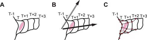
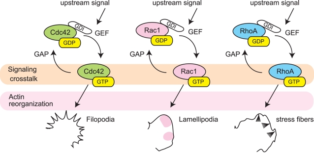
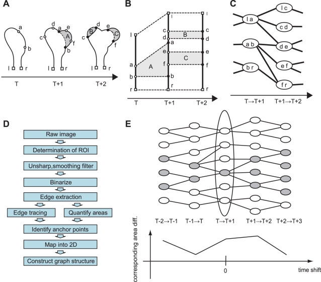
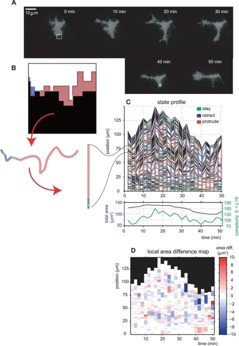
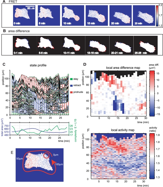
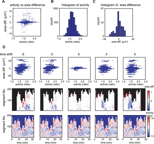
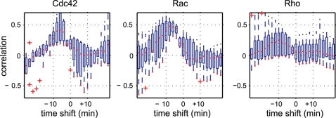
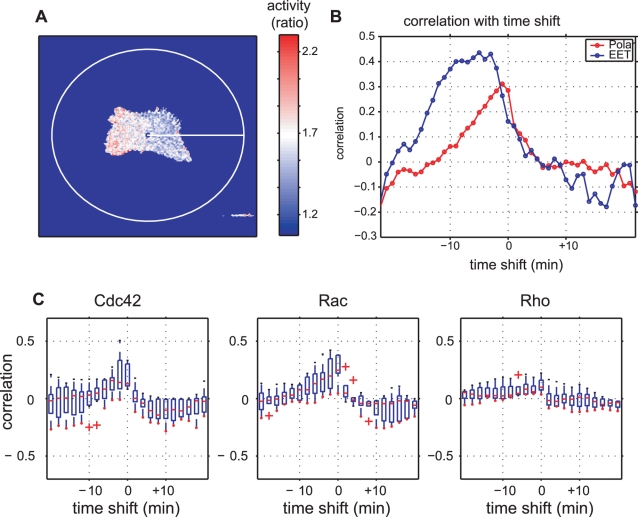
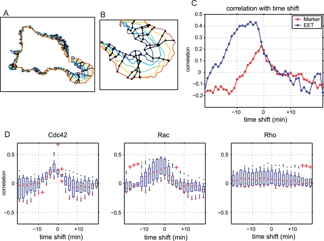
Advances in time-lapse fluorescence microscopy have enabled us to directly observe dynamic cellular phenomena. Although the techniques themselves have promoted the understanding of dynamic cellular functions, the vast number of images acquired has generated a need for automated processing tools to extract statistical information. A problem underlying the analysis of time-lapse cell images is the lack of rigorous methods to extract morphodynamic properties. Here, we propose an algorithm called edge evolution tracking (EET) to quantify the relationship between local morphological changes and local fluorescence intensities around a cell edge using time-lapse microscopy images. This algorithm enables us to trace the local edge extension and contraction by defining subdivided edges and their corresponding positions in successive frames. Thus, this algorithm enables the investigation of cross-correlations between local morphological changes and local intensity of fluorescent signals by considering the time shifts. By applying EET to fluorescence resonance energy transfer images of the Rho-family GTPases Rac1, Cdc42, and RhoA, we examined the cross-correlation between the local area difference and GTPase activity. The calculated correlations changed with time-shifts as expected, but surprisingly, the peak of the correlation coefficients appeared with a 6-8 min time shift of morphological changes and preceded the Rac1 or Cdc42 activities. Our method enables the quantification of the dynamics of local morphological change and local protein activity and statistical investigation of the relationship between them by considering time shifts in the relationship. Thus, this algorithm extends the value of time-lapse imaging data to better understand dynamics of cellular function.


Conflict of interest statement

The authors have declared that no competing interests exist.

Figures

Figure 1
Figure 1. Obstacles to quantifying cell morphological changes.
(A) General scheme of cellular morphological changes. The diagram shows part of a cell's edge expanding continuously over time (frame number) T−1 to T+3. We focus on the correlation timing between morphological change and a regulation signal (red region). (B) The kymograph approaches, including polar coordinate-based analysis, encounters problem caused by the fixed direction of the axis. Although it describes morphodynamics along the proper direction of the axis (solid arrow), lateral movements against this assigned direction (dotted arrow) cannot be quantified. (C) Marker-based analysis rearranges the marker positions depending on the rate and direction of morphological changes, so that the marker density cannot be conserved. Therefore, it is not suitable for persistently changing cell morphology such as neurite outgrowth.
Figure 2
Figure 2. GTPase cascades involved in morphological regulation and cytoskeleton organization.
Various upstream signals trigger the activation of Cdc42, Rac, and Rho GTPases and induce morphological and cytoskeletal changes such as formation of filopodia, lamellipodia, and stress fibers, respectively. The ratio of the inactive GDP-bound state to active GTP-bound state is regulated by guanine nucleotide exchange factors (GEFs) and the GTPase-activating proteins (GAPs). Many studies have shown crosstalk between these GTPases; however, direct links between these GTPases are still to be clarified.
Figure 3
Figure 3. Schematic view of edge evolution tracking.
(A) Identification of morphodynamic properties. Solid lines denote cellular edge at each frame and the shaded regions A, B, and C indicate area differences between consecutive frames. We define two properties for a local morphological status transition: segments and anchor points. The segments are subdivided along the cellular edges, which are determined by the area differences between neighboring frames. The anchor points are segment terminals (closed circles) and are projected into the previous frame (open circles). Open squares l and r represent the edge terminals. (B) All of the segments identified and anchor points are mapped two-dimensionally. Horizontal and vertical axes denote the time and position along the cell edge, respectively. Connections between anchor points (dashed lines) illustrate the corresponding points between neighboring frames. (C) We can then construct a graph to represent segment evolution. A node and link denote each segment and the connection between temporally consecutive segments. (D) Flow chart of the EET algorithm. (E) All colored nodes show the ancestry of the colored node at ‘TT+1.’ The ancestry nodes in the different frames are identified by referring to the graph shown in (C); therefore, the time course of area differences stemming from a specific segment can be identified by applying simple algebra to the ancestry node map at each time point (see Materials and Methods). The plot shows the time course of area differences corresponding to the colored ancestry. Each node includes a time course of area difference that we have defined.
Figure 4
Figure 4. The EET profile of a branching PC12 cell.
(A) Time-lapse fluorescence images of a PC12 cell. (B) Expanding, retracting, and stationary regions of the cell edge boundary in the subsection of (A) (white square) are colored red, blue and green, respectively. Each colored region along the cell edge corresponds to a single segment in panel (C). Red arrows show the correspondence between colored regions in (B) and segments in (C). (C) The cell boundary state profile of (A), in which each segment is colored red, blue and green according to the status of expansion, retraction and stasis, respectively. Black lines connect the corresponding anchor points to represent the correspondence between subdivided regions in successive frames. The plot shows the total cell area and complexity {(total cell boundary length)2 /(total cell area)} of the cell. Note that the total cell area and the total length of the cell boundary are highly independent. (D) Local area difference map of (C), in which the magnitude of area difference for each segment is depicted by a color gradation from protrusion (red) to retraction (blue).
Figure 5
Figure 5. FRET and area difference images, and EET profiles, of a motile HT1080 cell.
(A) Time-lapse FRET images of an HT1080 cell. The colored bar illustrates the FRET/CFP ratio, which is assumed to indicate Rac1 activity. (B) Area difference images are acquired by subtracting neighboring frames (see Materials and Methods). Red and blue denote expansion and retraction, respectively. This cell moves by approximately 60 µm in 60 min and many of other active cells are free to move to a similar extent. (C) Edge state profile for the same motile HT1080 cell, and (below) global characteristics (total area and cell complexity). (D) Area difference map for (C). (E, F) We define the local activity as the mean of the intensities inside a circle of radius r. (E) A schematic view is shown with the circle (red circle) and direction of the position axis (red arrow) in (F). Although the length of r was chosen arbitrarily, this does not substantially affect the result (see Figure S1). The extracellular region is excluded for the mean calculation. In (F), the local activities along the cellular edge are mapped into a time-position representation as in (D) (see Materials and Methods). The colored bar shows the FRET/CFP ratio. Spatio-temporal activity patterns resemble those in the local area difference map.
Figure 6
Figure 6. Local activity and local morphological change distribution properties.
(A) A scatter plot of the local activity and area difference of each segment. Each point represents the local activity and area difference of a single segment identified by EET. The overall property of all the segments in the dataset is portrayed, excluding temporal and positional information. (B) Histogram of GTPase activities (YFP/CFP ratio) approximated by Gaussian distribution. Vertical and horizontal axes denote the number of segments and local activity within each segment, respectively. (C) Histogram of area differences in each segment. Zero values occur frequently because the majority of edge segments do not move. (D) Time-shifted relationship between local area differences and GTPase activity. The top panels show the time-shifted scatter plots of the local area difference and the GTPase activity. Each point represents the mean local activity and summation of the area difference of the ancestry segments (see Materials and Methods). The same data are exhibited in different scales in (A) and (D) depending on the context; that is, (A) shows the detailed distribution of the activities and the area differences to provide clear comparisons with (B) and (C), while the upper panels in (D) show the differences between various time-shifts. The middle panels show the time-shifted area difference maps of the corresponding scatter plot in the top panel. The colored areas denote summation of the corresponding area differences at each shifted time. The numbers of columns are reduced with time-shifts because time-shift produces non-corresponding frames. GTPase activity maps without time-shifts are displayed in the bottom panels to illustrate their relation with the corresponding time-shifted area difference maps. Note that all activity maps in the bottom row are identical. A linear correlation appears with negative time-shifts (time-shift: −5 and −3 in the top scatter plots), whereas no correlation is observed with positive time-shifts (time-shift: 3 and 5 in the top scatter plots).
Figure 7
Figure 7. Time-shifted cross-correlation between GTPase activities and area differences.
Rho family small GTPases Cdc42, Rac1 and RhoA were analyzed in terms of the time-shifted cross-correlation. We examined several cells for each GTPase. Each boxplot shows the first quartile (bottom of the box), third quartile (top of the box), median (red line) and outliers (red plus marks) for several cells (N = 9 for Cdc42, N = 6 for Rac1 and N = 6 for RhoA). Where there were no outliers, a red dot is shown at the bottom of the whisker. For Cdc42 and Rac1, the time-shifted correlation is significantly increased with negative time-shifts (results of the permutation test are shown in Table S1).
Figure 8
Figure 8. Comparison of morphodynamic analysis by EET with polar coordinate-based analysis.
(A) Polar coordinate-based analysis was performed by setting the origin of coordinates at the mean mass center of the binary images. (B) Time-shifted cross-correlation analysis by polar coordinates and EET for the cell depicted in Figure 5. Both of the correlation profiles show positive correlations with negative time-shifts and low correlations with positive time-shifts. However, EET yields a higher correlation than the polar coordinate-based method for the negative time-shifts. (C) The same cells in Figure 7 were also analyzed by polar coordinate-based analysis. All panels show similar shapes to that in Figure 7; however, peaks in Cdc42 and Rac were lower with polar coordinate-based analysis than with EET.
Figure 9
Figure 9. Comparison of morphodynamic analysis by EET with marker-tracking-based analysis.
Marker-tracking-based analysis was performed using virtually-defined markers, and their movements perpendicular to the cellular edge were measured. (A) Cellular edges changing with time (blue: 6 min; indigo: 7 min; light blue: 8 min; green: 9 min; yellow: 10 min; red: 11 min). The cell analyzed was the same as that used in Figure 5. Black lines show traces of virtually defined markers. (B) Closed subsection of the lower right area in (A). Black dots show the positions of the markers. The uniform distribution of the markers (dots on the blue line) changed into a non-uniform distribution accompanied by persistent protrusion (dots on the red line). (C) Time-shifted cross-correlation analysis by the marker-tracking-based method and EET on the cell in Figure 5. Both of the correlation profiles show strong positive correlations in negative time-shifts and weak correlations in positive time-shifts. However, EET yielded higher correlations than the marker-tracking-based method in the negative time-shifts. (D) The same cells as in Figures 7 and 8 were also analyzed by the marker-tracking-based analysis. All three panels show similar shapes to those in Figures 7 and 8, but the peaks in Cdc42 and Rac were lower with marker-tracking-based analysis than with EET.

Similar articles

Cited by

References

    1. Lecuit T, Lenne PF. Cell surface mechanics and the control of cell shape, tissue patterns and morphogenesis. Nat Rev Mol Cell Biol. 2007;8:633–644. - PubMed
    1. Samsonovich AV, Ascoli GA. Morphological homeostasis in cortical dendrites. Proc Natl Acad Sci U S A. 2006;103:1569–1574. - PMC - PubMed
    1. Bray D, Chapman K. Analysis of microspike movements on the neuronal growth cone. J Neurosci. 1985;5:3204–3213. - PMC - PubMed
    1. Bakal C, Aach J, Church G, Perrimon N. Quantitative morphological signatures define local signaling networks regulating cell morphology. Science. 2007;316:1753–1756. - PubMed
    1. Sugimura K, Shimono K, Uemura T, Mochizuki A. Self-organizing mechanism for development of space-filling neuronal dendrites. PLoS Comput Biol. 2007;3:e212. doi:10.1371/journal.pcbi.0030212. - PMC - PubMed

Publication types