. 2008 Nov 15:9:482.
doi: 10.1186/1471-2105-9-482.

CellProfiler Analyst: data exploration and analysis software for complex image-based screens

Affiliations

CellProfiler Analyst: data exploration and analysis software for complex image-based screens

Thouis R Jones et al. BMC Bioinformatics. .

Abstract

Background: Image-based screens can produce hundreds of measured features for each of hundreds of millions of individual cells in a single experiment.

Results: Here, we describe CellProfiler Analyst, open-source software for the interactive exploration and analysis of multidimensional data, particularly data from high-throughput, image-based experiments.

Conclusion: The system enables interactive data exploration for image-based screens and automated scoring of complex phenotypes that require combinations of multiple measured features per cell.


Figures

Figure 1
Figure 1
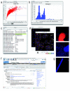
Four types of plots can be created. Four types of plots created by CellProfiler Analyst are shown. (a) A histogram of per-image data (the mean area of all cells in the image). (b) Scatterplot of image data (X-axis = mean area of all cells in the image; Y-axis = mean area of all nuclei in the image). One particular sample and its replicates are highlighted as blue data points, and the blue lines indicate +/- two standard deviations from the mean, although because the data is non-Gaussian, the left standard deviation line is not visible. (c) Density plot of individual cell data (X-axis = area of the cell; Y-axis = area of the nucleus. (d) Parallel coordinate plot where 6 features are plotted, one on each numbered axis as labeled in the table shown below the plot. The four selected blue data points in the scatterplot are also highlighted in the parallel coordinate plot as blue lines. From this plot, it is apparent that these four data points have high cell and nuclear area (two left-most coordinates) but low cell count (right-most coordinate).
Figure 2
Figure 2
Relationships among data can be explored. Data points representing images with high nuclear area (averaged over the cells in the image) and high DNA intensity (averaged over the cells in the image) are highlighted in blue by brushing the scatterplot shown in (a). Immediately, the corresponding points appear blue in the other open scatterplot (b), allowing the relationship between all of the plotted features to be examined. As well, a DNA content histogram (c) shows individual cell data from the selected image data points (blue), relative to all cells in the experiment (red). In this case, the selected blue data points indeed have an unusual cell cycle distribution (fewer 2N cells relative to 4N cells) as compared to all cells in the experiment. Finally, the sample names (d, "Hairpin" column, for this particular RNA interference experiment) corresponding to the selected blue data points can be displayed in a table to see which samples are present in the selected points. The first two columns of the table show other information about those data points based on the axes of the scatterplot shown in (a). The "ImageNumber" and "well" columns provide additional information about the samples the researcher is investigating.
Figure 3
Figure 3
Data points can be investigated. The data points highlighted in blue in the scatterplot (a) represent replicates of a particular treatment condition with high mean cell area and nuclear area. To examine the cell cycle distribution of these samples, a DNA content histogram based on individual cells within those four images was plotted (b). For one of the four data points, the researcher displayed a table of all measurements in the database (c), the raw image (d), or with outlines overlaid (e). Each staining/channel (red, green, blue) can be toggled on or off to allow close examination of the relationships between them. Information from a public website describing the gene tested in one of the samples has been displayed (f) by clicking the data point. Outlier data points for certain measured features (e.g., high mean cell actin intensity, high mean cell area, high segmentation threshold, or percent of pixels that are saturated) can indicate images with severe artifacts (g) that should be excluded from analysis. These images can be identified by their aberrant measurements and excluded from further analysis by gating (i.e., selecting only a subset of data to be plotted and analyzed further).
Figure 4
Figure 4
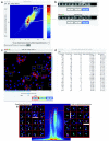
Cell subpopulations can be identified, examined, and scored. (a) On a density plot of individual cell data (log scale: X-axis = integrated intensity of nuclear DNA; Y-axis = nuclear area), two populations were gated (white boxes) and a random selection of cells within each subpopulation is shown in the montages on the right (b); all gated cells present in a particular sample can also be marked (c). Samples can be scored (d) for the number of gated cells and total cells in each sample, the enrichment of that percentage relative to the overall percentage of positive cells in the entire experiment (“Enrichment”; for example, the first image listed in the table has 19.311-fold more cells in the subpopulation than typical in the experiment overall), and the left- and right-tail log10 p-values (a measure of the statistical significance of the enrichment, based on the number of cells in the sample). (e) Gates for anaphase/telophase and late prophase/metaphase (data is plotted for all human HT29 cells in the experiment [7]. X-axis = integrated nuclear intensity of DNA, log scale; Y-axis = mean nuclear intensity of phospho-histone H3). Random cells falling within the gates are shown in the center of each 34 x 34 mm subimage.
Figure 5
Figure 5
Drosophila cell microarrays. (a) Phospho-histone H3 staining is often dim for metaphase nuclei (left and middle vs. right). Scale bar = 5 μm. (b) One cell array, DNA-stained and contrast-enhanced (5× lens). Scale bar = 5 mm. (c) Small section of (a), with circles denoting 4 spots on the array. Scale bar = 100 μm. (d) High-resolution image (40× lens) from within a spot of the array, stained with Hoechst (blue, DNA) and phalloidin (green, actin). Scale bar = 5 μm.
Figure 6
Figure 6
Screen revealed RNA interference samples enriched in telophase- and metaphase-stage nuclei. (a) Composite images of handpicked Drosophila Kc167 nuclei that were measured to guide feature selection and provide the starting point for developing the gates. Other nuclei at the edges of each sub-panel of the composite image were excluded from analysis. (b) A random sample of automatically scored nuclei from the cell microarrays. The scored cell is in the center of each panel unless the cell was near the edge of the image. Scale bars = 5 μm. (c) Genes whose dsRNAs significantly increase the proportion of cells in telophase (first four rows) or metaphase (last row). We excluded one gene (CG3245) that originally scored as a telophase hit because visual examination revealed that one image contained debris that disrupted proper analysis. Note that CG8878 should not be considered telophase-specific (see text). The fourth column shows the fold-change in the percentage of cells with each DNA content (2N, 4N, or 8N) and the fold-change in the total cell count overall, with significant differences from all genes tested on the array marked with a star. See Materials and Methods section for details on this image-based analysis of the cell cycle distribution. The fifth column indicates the fold-enrichment for the percentage of cells that were phospho-histone H3-positive, using the mean intensity of staining in the nucleus, based on the average of two replicates. References cited in the last column: A [17], B [42], C [43], D [44], E [45], F [20], G [36].
Figure 7
Figure 7
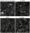
Unusual phenotypes were found for telophase hits CG2028 and CG8878. Top: CG2028 knockdown produces many telophase-like nuclei that appear less condensed than typical telophase nuclei but more condensed than interphase nuclei. Bottom: Nearly all nuclei from the CG8878 sample are more condensed than controls. See text for discussion of both genes. Scale bar = 20 μm.
Figure 8
Figure 8
The widerborst RNA interference metaphase arrest phenotype is confirmed in Drosophila and human cells. (a) A sampling of metaphase nuclei produced by widerborst knockdown in Drosophila Kc167 cells (top). Scale bar = 5 μm. Quantitative confirmation of the increased percentage of metaphase nuclei, as scored by two blinded observers (bottom). Bars are starred if p < 0.05. Error bars = SEM. Controls are nearby spots lacking dsRNA. (b) A sampling of metaphase nuclei produced by PPP2R5E knockdown in human HT29 cells (top). Scale bar = 10 μm. Quantitative confirmation (bottom). Bars are starred if p < 0.001. Error bars = SEM. The infection rate is the ratio of the number of cells with/without puromycin, the selection agent. The control shRNA is FLJ25006 (NMid = NM_144610).

References

    1. Wollman R, Stuurman N. High throughput microscopy: from raw images to discoveries. J Cell Sci. 2007;120:3715–3722. doi: 10.1242/jcs.013623. - DOI - PubMed
    1. Carpenter AE. Image-based chemical screening. Nat Chem Biol. 2007;3:461–465. doi: 10.1038/nchembio.2007.15. - DOI - PubMed
    1. Carpenter AE, Sabatini DM. Systematic genome-wide screens of gene function. Nat Rev Genet. 2004;5:11–22. doi: 10.1038/nrg1248. - DOI - PubMed
    1. Carpenter AE, Jones TR, Lamprecht MR, Clarke C, Kang IH, Friman O, Guertin DA, Chang JH, Lindquist RA, Moffat J, et al. CellProfiler: image analysis software for identifying and quantifying cell phenotypes. Genome Biol. 2006;7:R100. doi: 10.1186/gb-2006-7-10-r100. - DOI - PMC - PubMed
    1. Lamprecht MR, Sabatini DM, Carpenter AE. CellProfiler: free, versatile software for automated biological image analysis. Biotechniques. 2007;42:71–75. doi: 10.2144/000112257. - DOI - PubMed

Publication types

LinkOut - more resources