

doi: 10.1016/S0065-2806(06)33002-0.
Physiological Diversity in Insects: Ecological and Evolutionary Contexts
Affiliations
- PMID: 19212462
- PMCID: PMC2638997
- DOI: 10.1016/S0065-2806(06)33002-0
Item in Clipboard
Physiological Diversity in Insects: Ecological and Evolutionary Contexts
Adv In Insect Phys.
2006.
No abstract available
Figures
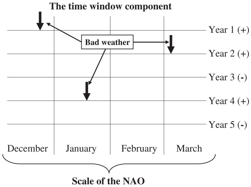
Climate indices such as the North Atlantic Oscillation (NAO) integrate a variety of weather variables across spatial and temporal scales. Here, poor weather in years two, three, and four takes place in different months. However, the sign of the climate index (in this case NAO) indicates that these years have been poor irrespective of when the worst conditions have been experienced. Redrawn from Stenseth and Mysterud (2005, p. 1196) with permission from the British Ecological Society.
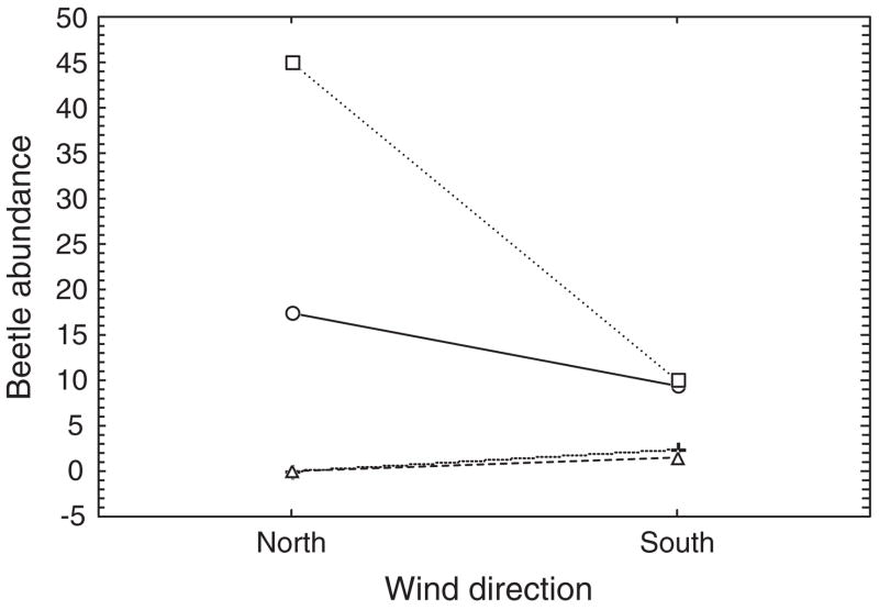
Interaction plot of mean numbers of adult Bothrometopus brevis weevils active at a site on sub-Antarctic Heard Island for each combination of weather conditions prevailing at the site over the course of a summer, including the two major wind directions (north or south) and either no precipitation (○), light rain (□), snow (+), or heavy precipitation of either kind (△). Redrawn from Chown et al. (2004c).
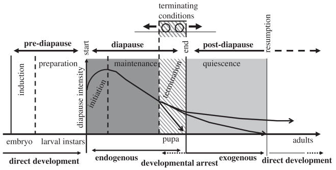
Schematic depiction of the major phases of diapause, viz. pre-diapause, diapause, and post-diapause, as defined by Koštál (2006). Further division into subphases, viz. induction, preparation, initiation, maintenance, termination, and quiescence is indicated by vertical lines. Redrawn with permission from Elsevier.
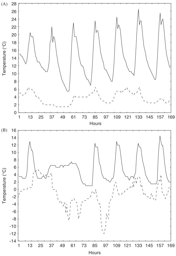
Hourly temperatures at the soil surface over a week long period in August 2002 for (A) a sea-level site at Lambert’s Bay on the west coast of South Africa (solid line) and a sea-level site at sub-Antarctic Marion Island (dashed line), and (B) a site (Sneeukop) at 1960 m above sea level 50 km distant from the Lambert’s Bay site (solid line) and at 800 m on Marion Island (dashed line). Note the difference in predictability of temperatures for the Lambert’s Bay and Marion Island sites.
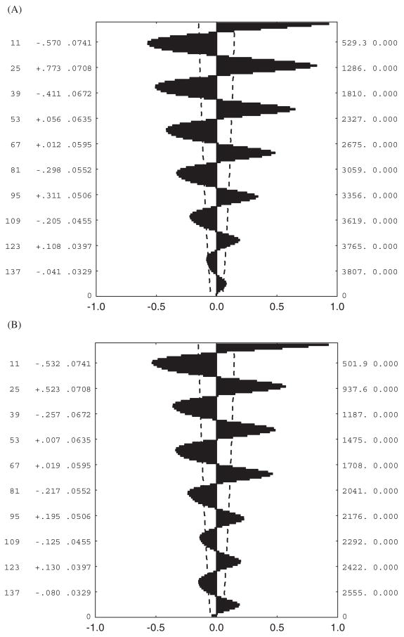
Autocorrelation plots for hourly temperatures shown in Fig. 4. (A) Lambert’s Bay sea-level data, (B) Sneeukop close to Lambert’s Bay, (C) Marion Island sea level, (D) Marion Island 800- m site. The dashed lines on each figure represent the 95% confidence intervals, while the values reported to the right of the lags on the y-axis are the autocorrelation coefficients and their standard errors.
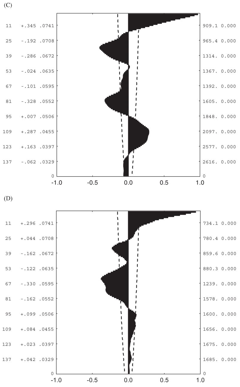
Autocorrelation plots for hourly temperatures shown in Fig. 4. (A) Lambert’s Bay sea-level data, (B) Sneeukop close to Lambert’s Bay, (C) Marion Island sea level, (D) Marion Island 800- m site. The dashed lines on each figure represent the 95% confidence intervals, while the values reported to the right of the lags on the y-axis are the autocorrelation coefficients and their standard errors.
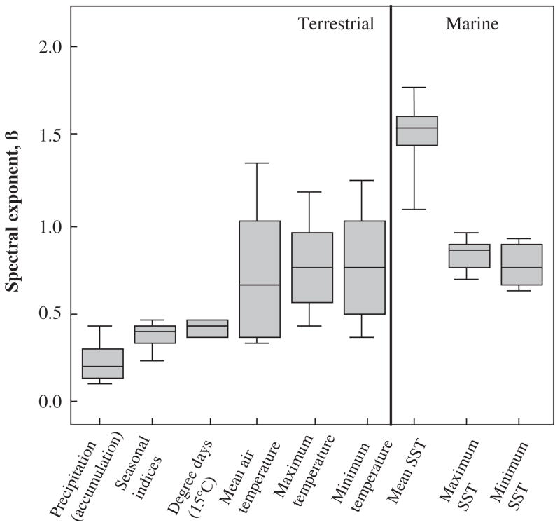
Box plots of the spectral components for several environmental variables, including sea surface temperature (SST) for terrestrial and marine systems. Lines indicate the median, 75th and 90th percentiles. Redrawn from Vasseur and Yodzis (2004, p. 1149) with permission from the Ecological Society of America.
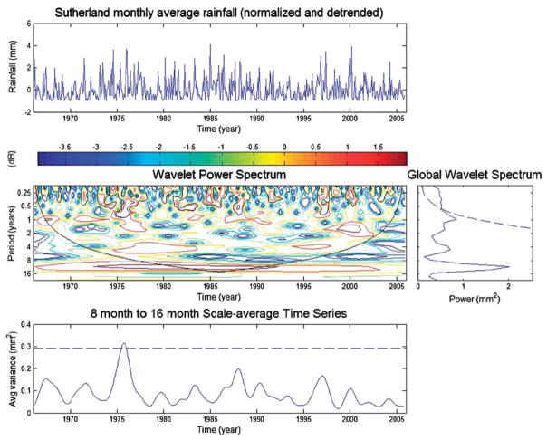
Wavelet analysis (see Torrence and Compo, 1998) of monthly rainfall data from Sutherland, a high altitude, semi-arid area in the Karoo of South Africa. The upper panel shows the detrended normalized data. The central panel, the wavelet power spectrum with period on the y-axis and years on the x-axis, and the dark line the cone of influence (with no zero padding), and the global power wavelet spectrum shown to the right thereof. The averaged time series is shown in the lower panel.
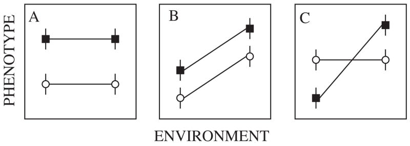
Reaction norms for two families (circles and squares, mean and standard errors for the phenotypes are shown) demonstrating (A) significant genetic variance, (B) significant genetic and environmental variance, (C) significant genetic, environmental, and genetic by environmental interaction variance. Based on De-Witt and Scheiner (2004, p. 4).
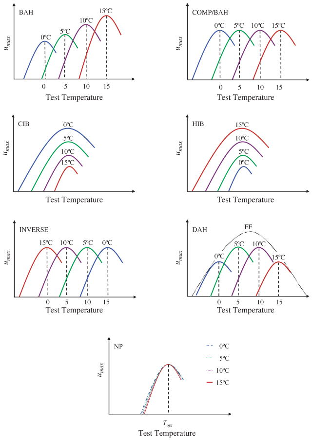
Predictions from each of the major hypotheses for the response of individual performance curves to acclimation. In each case four acclimation temperatures from low to high are indicated (blue (0 °C), green (5 °C), purple (10 °C), red (15 °C)), and in one case the expectation for field fresh (FF) individuals is also shown. BAH = beneficial acclimation hypothesis, COMP/BAH = complete temperature compensation (an instance of BAH), CIB = colder is better, HIB = hotter is better, IAH = inverse acclimation hypothesis, DAH = deleterious acclimation hypothesis, NP = no plasticity. Redrawn from Deere and Chown (2006).
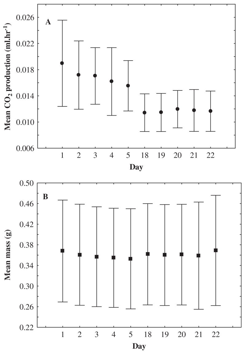
A rapid decline is found in whole-animal metabolic rate (A) but not in body mass (B) with introduction to stable laboratory conditions in the scorpion Uroplectes carinatus. Mean standard metabolic rate (CO2 ml h−1±95% confidence intervals) recorded using flow-through respirometry at 25 °C and body mass (in g) from each trial day during acclimation to constant conditions (25 °C) in the laboratory.
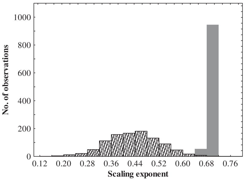
Variation induced by laboratory acclimation around a hypothetical metabolic rate-body mass scaling relationship. The solid bars represent a hypothetical metabolic rate-body mass scaling relationship for animals (n = 50 individuals, using 1000 random numbers re-sampled with replacement using Microsoft Excel) that are all in the same acclimation state (i.e. only field collected). An exponential decay function (y = MR e −0.15t,where t = hypothetical time in the laboratory) was applied to these data to simulate a possible acclimation-induced decline in metabolic rate and how this may affect the scaling exponents (hatched bars). A random series of time intervals were generated (ranging from 0 to 5) and applied to metabolic rate data using the exponential decay function.
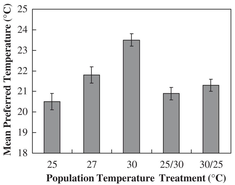
Mean preferred temperatures (± SE) in Drosophila melanogaster. Values represent tenth generation 25, 27, and 30°C-reared populations and reverse temperature treatment populations (i.e. reversible plastic component), 25/30 °C and 30/25 °C (females only). The 25, 27, and 30 °C groups are significantly different, while the 25/30 °C and 30/25 °C do not differ (although both of the latter reverse treatments differ from the 30 °C group). Figure redrawn from Good (1993) with permission from Elsevier.
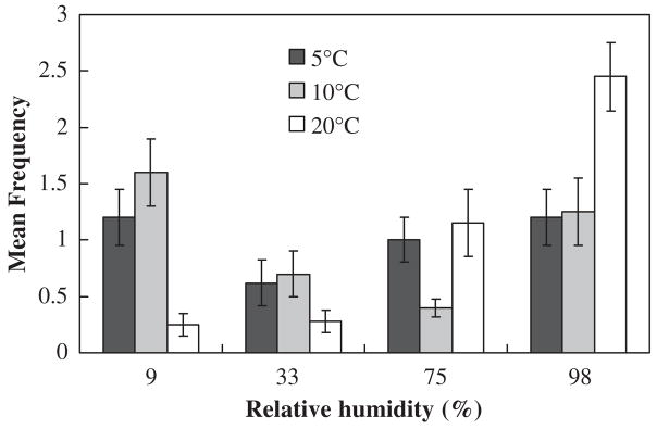
Mean frequencies (± SE) indicating the distribution of Cryptopygus antarcticus within a linear humidity gradient at 5, 10, and 20 °C. These data show that at higher temperatures C. antarcticus prefers higher relative humidity. Figure redrawn from Hayward et al. (2001) with permission from Elsevier.
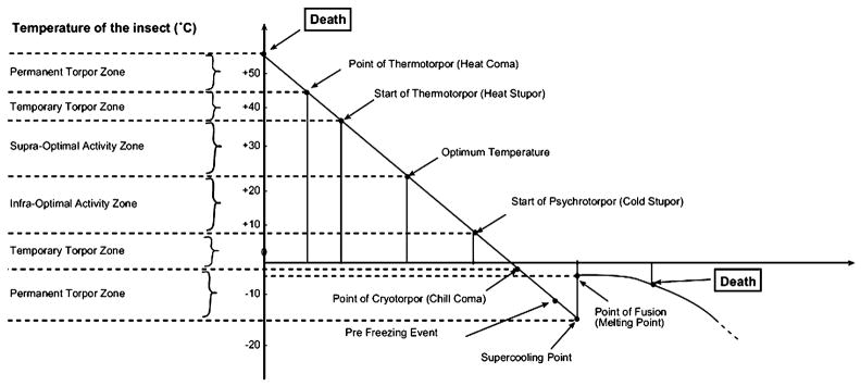
The thermobiological scale proposed by Vannier (1994). Redrawn with permission from Elsevier.
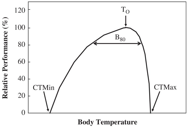
An idealized thermal performance curve showing the optimum(To), performance breadth(B80), and critical limits. Redrawn from Angilletta et al. (2002, p. 250) with permission from Elsevier.
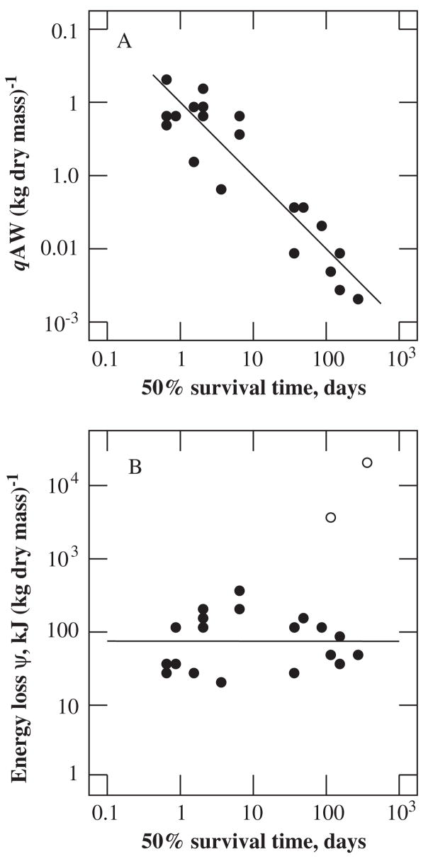
Metabolic rate, energy loss, and survival time under anoxic conditions. (A) Mass-specific rates, qA, of energy dissipation by organisms capable of surviving more than half a day of anoxia. (B) Energy loss ψ during anoxia is independent of survival time (filled circles). The open circles indicate normoxic energy losses of bears during hibernation and ticks during prolonged starvation. Redrawn from Makarieva et al. (2006, p. 90).
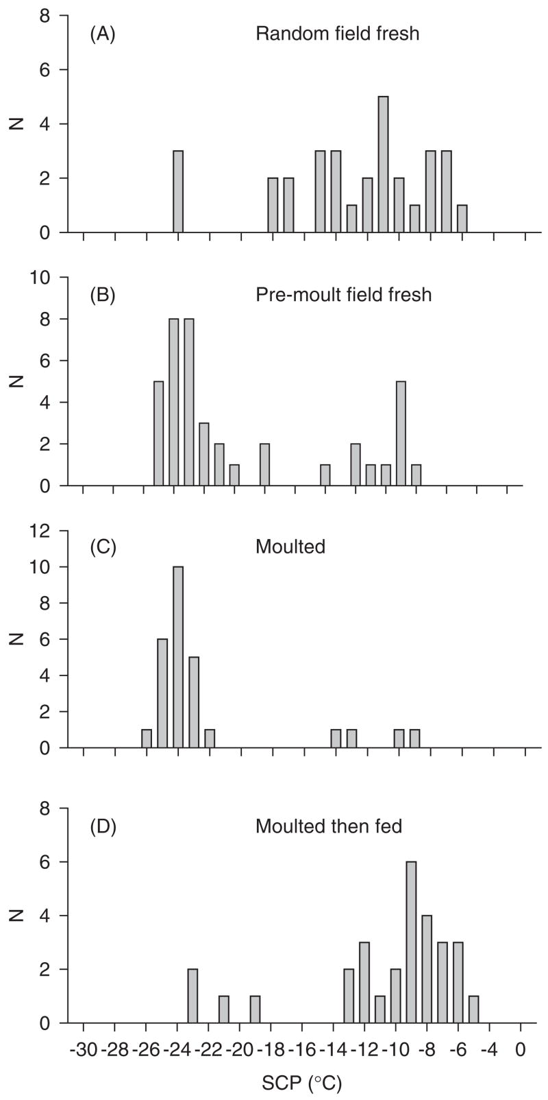
Supercooling point (SCP) distributions from the springtail Ceratophysella denticulata on sub-Antarctic Marion Island from (A) an ‘arbitrary’ field sample, (B) pre-moulting animals from the same main sample, (C) recently moulted animals, and (D) recently moulted animals that had been fed for one day (10 °C). Note the substantial decline in supercooling point associated with the moulting process and the increase thereof following feeding. Redrawn from Worland et al., 2006. result in unfolding. In this unfolded state, exposed amino acid side groups, especially hydrophobic residues, can lead to interactions between these ‘non-native’ proteins and folded proteins, inducing the latter to unfold. The result is irreversible aggregations of unfolded proteins. These unfolded proteins reduce the cellular pool of functional proteins and may also be cytotoxic (Feder, 1996, 1999; Feder and Hofmann, 1999; Kregel, 2002; Korsloot et al., 2004).
References
-
- Addo-Bediako A, Chown SL, Gaston KJ. Revisiting water loss in insects: a large scale view. J Insect Physiol. 2001;47:1377–1388. - PubMed
-
- Addo-Bediako A, Chown SL, Gaston KJ. Metabolic cold adaptation in insects: a large-scale perspective. Funct Ecol. 2002;16:332–338.
-
- Agrawal AA. Phenotypic plasticity in the interaction and evolution of species. Science. 2001;294:321–326. - PubMed
-
- Alleaume-Benharira M, Pen IR, Ronce O. Geographical patterns of adaptation within a species’ range: interactions between drift and gene flow. J Evol Biol. 2006;19:203–215. - PubMed
Grants and funding
LinkOut - more resources
Full Text Sources