

Endemicity response timelines for Plasmodium falciparum elimination
- PMID: 19405974
- PMCID: PMC2686731
- DOI: 10.1186/1475-2875-8-87
Endemicity response timelines for Plasmodium falciparum elimination
Abstract
Background: The scaling up of malaria control and renewed calls for malaria eradication have raised interest in defining timelines for changes in malaria endemicity.
Methods: The epidemiological theory for the decline in the Plasmodium falciparum parasite rate (PfPR, the prevalence of infection) following intervention was critically reviewed and where necessary extended to consider superinfection, heterogeneous biting, and aging infections. Timelines for malaria control and elimination under different levels of intervention were then established using a wide range of candidate mathematical models. Analysis focused on the timelines from baseline to 1% and from 1% through the final stages of elimination.
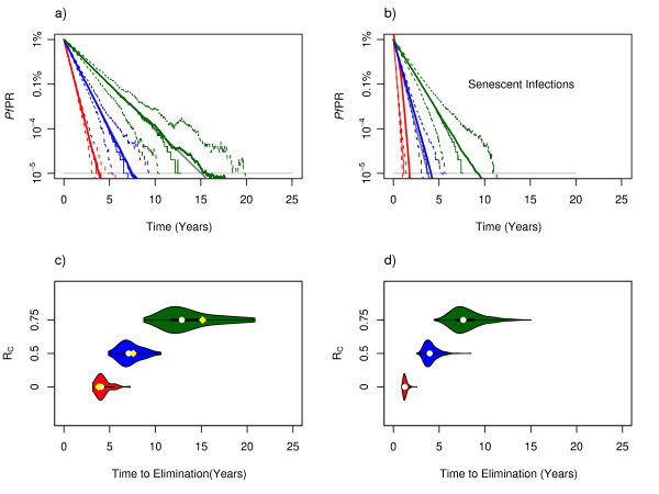
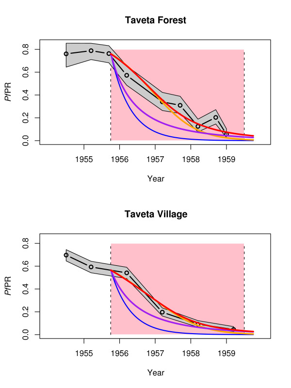
Results: The Ross-Macdonald model, which ignores superinfection, was used for planning during the Global Malaria Eradication Programme (GMEP). In models that consider superinfection, PfPR takes two to three years longer to reach 1% starting from a hyperendemic baseline, consistent with one of the few large-scale malaria control trials conducted in an African population with hyperendemic malaria. The time to elimination depends fundamentally upon the extent to which malaria transmission is interrupted and the size of the human population modelled. When the PfPR drops below 1%, almost all models predict similar and proportional declines in PfPR in consecutive years from 1% through to elimination and that the waiting time to reduce PfPR from 10% to 1% and from 1% to 0.1% are approximately equal, but the decay rate can increase over time if infections senesce.
Conclusion: The theory described herein provides simple "rules of thumb" and likely time horizons for the impact of interventions for control and elimination. Starting from a hyperendemic baseline, the GMEP planning timelines, which were based on the Ross-Macdonald model with completely interrupted transmission, were inappropriate for setting endemicity timelines and they represent the most optimistic scenario for places with lower endemicity. Basic timelines from PfPR of 1% through elimination depend on population size and low-level transmission. These models provide a theoretical basis that can be further tailored to specific control and elimination scenarios.
Figures
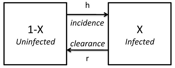
 = h(1 - X) - rX, where the superdot represents the derivative with respect to time.
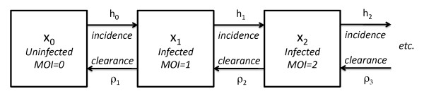
 = -h0x0 + rx1. Changes in the fraction of people who are already infected with a given MOI are described by a set of equations:
  = -hmxm + hm-1xm-1 - ρmxm + ρm+1xm+1. These equations describe a family of queuing models: each queuing model makes different assumptions about infection and clearance. In "infinite strain" models, hm = h, and in "finite strain" models where M denotes the maximum number of types, hm = h(1-m/M). Models considered parasite types that cleared independently, or with competition or facilitation. For independent clearance, individual types were unaffected by concurrent infection with other parasite types, so ρm = rm. Competition and facilitation were modelled by letting ρm = rmσ, where σ >1 described competition and σ <1 implies facilitation. Compared with independent clearance, per-strain clearance rates are faster with competition (i.e. ρm> rm), and slower with facilitation (i.e. ρm<rm). Clearance rates per person increase with MOI in all the models; if no new infections occurred, the expected waiting time to lose all the existing infections would be the sum of times to progressively decrement MOI: 1/r+1/ρ2+1/ρ3+...+1/ρm.
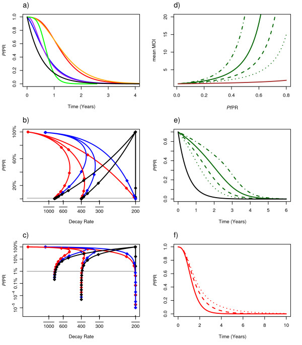
References
-
- RBMP . The global malaria action plan for a malaria free world. Geneva, Switzerland: Roll Back Malaria Partnership, World Health Organization; 2008.
-
- Pampana EJ. A textbook of malaria eradication. London: Oxford University Press; 1969.
Publication types
MeSH terms
Grants and funding
LinkOut - more resources
Full Text Sources
