Needles in the haystack: identifying individuals present in pooled genomic data
- PMID: 19798441
- PMCID: PMC2747273
- DOI: 10.1371/journal.pgen.1000668
Needles in the haystack: identifying individuals present in pooled genomic data
Abstract
Recent publications have described and applied a novel metric that quantifies the genetic distance of an individual with respect to two population samples, and have suggested that the metric makes it possible to infer the presence of an individual of known genotype in a sample for which only the marginal allele frequencies are known. However, the assumptions, limitations, and utility of this metric remained incompletely characterized. Here we present empirical tests of the method using publicly accessible genotypes, as well as analytical investigations of the method's strengths and limitations. The results reveal that the null distribution is sensitive to the underlying assumptions, making it difficult to accurately calibrate thresholds for classifying an individual as a member of the population samples. As a result, the false-positive rates obtained in practice are considerably higher than previously believed. However, despite the metric's inadequacies for identifying the presence of an individual in a sample, our results suggest potential avenues for future research on tuning this method to problems of ancestry inference or disease prediction. By revealing both the strengths and limitations of the proposed method, we hope to elucidate situations in which this distance metric may be used in an appropriate manner. We also discuss the implications of our findings in forensics applications and in the protection of GWAS participant privacy.
Conflict of interest statement
The authors have declared that no competing interests exist.
Figures
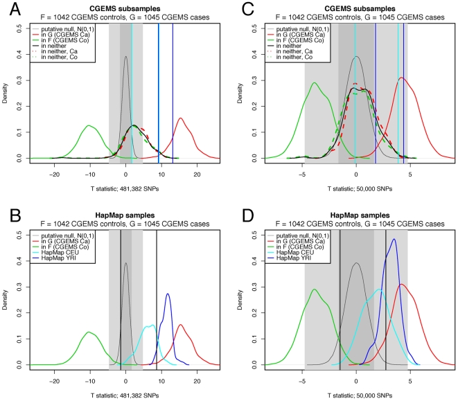
 (1042 CGEMS controls) is shown as a solid green curve,
true positive
(1042 CGEMS controls) is shown as a solid green curve,
true positive  (1045 CGEMS cases) is shown as a solid red curve, and
the putative null
(1045 CGEMS cases) is shown as a solid red curve, and
the putative null  is given as a thin grey curve. The dark and light grey
regions represent the areas for which the null hypothesis would be
accepted at
is given as a thin grey curve. The dark and light grey
regions represent the areas for which the null hypothesis would be
accepted at  and
and  , respectively. In plots (A,C), CGEMS test samples in
neither
, respectively. In plots (A,C), CGEMS test samples in
neither  nor
nor  (100 CGEMS cases and 100 CGEMS controls) are given by
a heavy black curve. The CGEMS case and CGEMS control distributions
within this group are shown as dashed red and green lines, respectively.
In plots (B,D),
(100 CGEMS cases and 100 CGEMS controls) are given by
a heavy black curve. The CGEMS case and CGEMS control distributions
within this group are shown as dashed red and green lines, respectively.
In plots (B,D),  distributions are given for HapMap CEPHs (cyan) and
YRIs (blue). Vertical lines mark the 0.05 and 0.95 quantiles of the
negative CGEMS samples (black), HapMap CEPHs (cyan), and HapMap YRIs
(blue).
distributions are given for HapMap CEPHs (cyan) and
YRIs (blue). Vertical lines mark the 0.05 and 0.95 quantiles of the
negative CGEMS samples (black), HapMap CEPHs (cyan), and HapMap YRIs
(blue).
 .
.
Comment in
-
Public access to genome-wide data: five views on balancing research with privacy and protection.PLoS Genet. 2009 Oct;5(10):e1000665. doi: 10.1371/journal.pgen.1000665. Epub 2009 Oct 2. PLoS Genet. 2009. PMID: 19798440 Free PMC article. No abstract available.
References
-
- Homer N, Szelinger S, Redman M, Duggan D, Tembe W, et al. Resolving individuals contributing trace amounts of DNA to highly complex mixtures using high-density SNP genotyping microarrays. PLoS Genet. 2008;4:e1000167. doi: 10.1371/journal.pgen.1000167. - DOI - PMC - PubMed
-
- The International HapMap Consortium. The International HapMap Project. Nature. 426:789–796. - PubMed
-
- R Development Core Team. A language and environment for statistical computing. Vienna, Austria: 2004.
Publication types
MeSH terms
Grants and funding
LinkOut - more resources
Full Text Sources
Research Materials