

A comprehensive sensitivity analysis of microarray breast cancer classification under feature variability
- PMID: 19941644
- PMCID: PMC2789744
- DOI: 10.1186/1471-2105-10-389
A comprehensive sensitivity analysis of microarray breast cancer classification under feature variability
Abstract
Background: Large discrepancies in signature composition and outcome concordance have been observed between different microarray breast cancer expression profiling studies. This is often ascribed to differences in array platform as well as biological variability. We conjecture that other reasons for the observed discrepancies are the measurement error associated with each feature and the choice of preprocessing method. Microarray data are known to be subject to technical variation and the confidence intervals around individual point estimates of expression levels can be wide. Furthermore, the estimated expression values also vary depending on the selected preprocessing scheme. In microarray breast cancer classification studies, however, these two forms of feature variability are almost always ignored and hence their exact role is unclear.
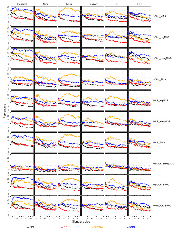
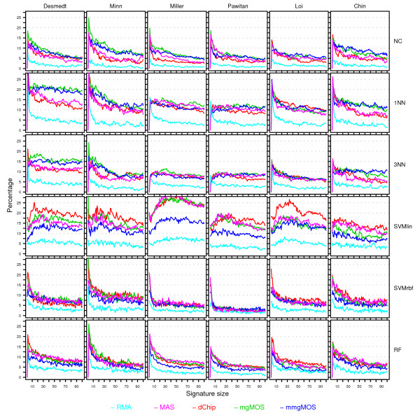
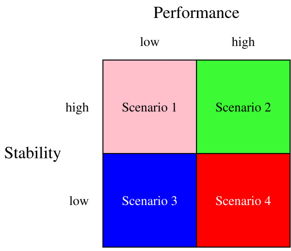
Results: We have performed a comprehensive sensitivity analysis of microarray breast cancer classification under the two types of feature variability mentioned above. We used data from six state of the art preprocessing methods, using a compendium consisting of eight different datasets, involving 1131 hybridizations, containing data from both one and two-color array technology. For a wide range of classifiers, we performed a joint study on performance, concordance and stability. In the stability analysis we explicitly tested classifiers for their noise tolerance by using perturbed expression profiles that are based on uncertainty information directly related to the preprocessing methods. Our results indicate that signature composition is strongly influenced by feature variability, even if the array platform and the stratification of patient samples are identical. In addition, we show that there is often a high level of discordance between individual class assignments for signatures constructed on data coming from different preprocessing schemes, even if the actual signature composition is identical.
Conclusion: Feature variability can have a strong impact on breast cancer signature composition, as well as the classification of individual patient samples. We therefore strongly recommend that feature variability is considered in analyzing data from microarray breast cancer expression profiling experiments.
Figures
 and between
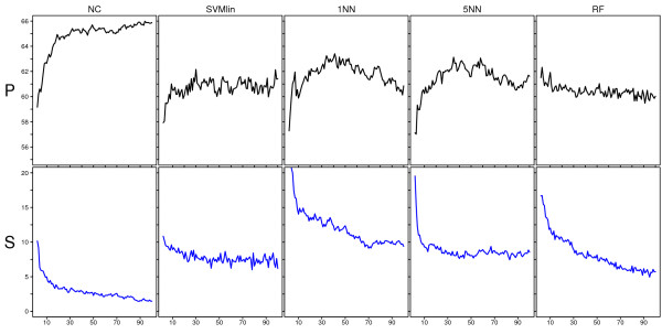
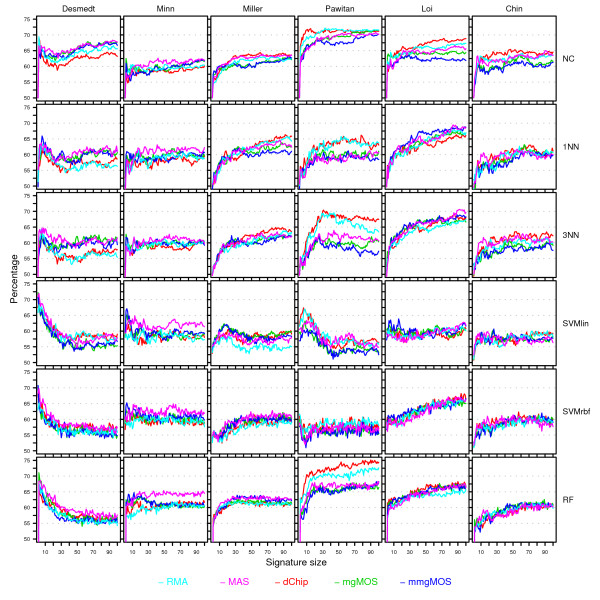
  and F2n, m, k was determined, yielding 50·50·2 = 5000 overlap estimates for each list size n. The blue curves provide for each n ∈ {1,...,100} the mean overlap taken over all corresponding estimates. The red curves indicate the associated average relative strengths between the feature sets Fn, m, k and .
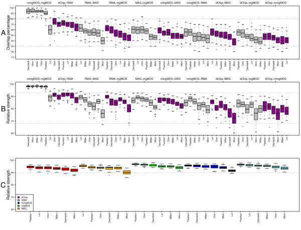
References
-
- Amaratunga D, Cabrera J. Exploration and analysis of DNA microarray and protein array data. John Wiley Hoboken, NJ; 2004.
MeSH terms
LinkOut - more resources
Full Text Sources
Medical
