. 2009:5:331.
doi: 10.1038/msb.2009.87. Epub 2009 Dec 1.

Discrete logic modelling as a means to link protein signalling networks with functional analysis of mammalian signal transduction

Affiliations

Discrete logic modelling as a means to link protein signalling networks with functional analysis of mammalian signal transduction

Julio Saez-Rodriguez et al. Mol Syst Biol. 2009.

Abstract

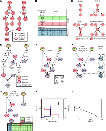
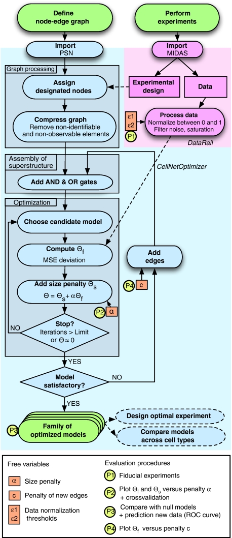
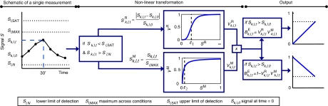
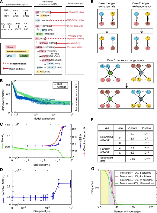
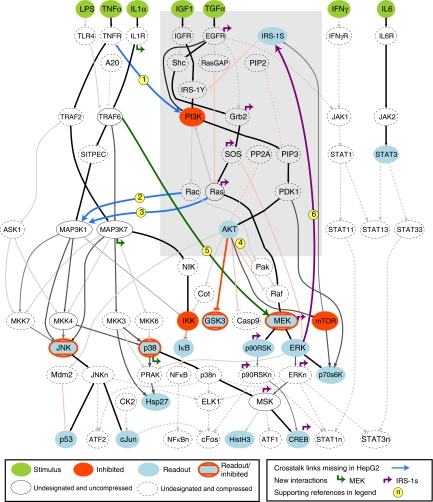
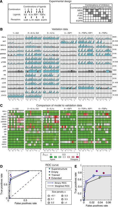
Large-scale protein signalling networks are useful for exploring complex biochemical pathways but do not reveal how pathways respond to specific stimuli. Such specificity is critical for understanding disease and designing drugs. Here we describe a computational approach--implemented in the free CNO software--for turning signalling networks into logical models and calibrating the models against experimental data. When a literature-derived network of 82 proteins covering the immediate-early responses of human cells to seven cytokines was modelled, we found that training against experimental data dramatically increased predictive power, despite the crudeness of Boolean approximations, while significantly reducing the number of interactions. Thus, many interactions in literature-derived networks do not appear to be functional in the liver cells from which we collected our data. At the same time, CNO identified several new interactions that improved the match of model to data. Although missing from the starting network, these interactions have literature support. Our approach, therefore, represents a means to generate predictive, cell-type-specific models of mammalian signalling from generic protein signalling networks.


Conflict of interest statement

The authors declare that they have no conflict of interest.

Figures

Figure 1
Figure 1
Assembly, calibration, and analysis of a toy signalling model. (A) Signed directed graph representing a simple pathway as visualized using Cytoscape (Shannon et al, 2003). The topology of the reactions downstream of TGFα and TNFα receptors is imaginary, but it includes real molecules such as Shc, Ras, Raf, MEK, ERK, PI3K, AKT, GSK3, IκK, IκB, NFκB, TRADD, caspase 8 (denoted C8), and the Grb–Sos complex (denoted GrbSos). (B) The design of the synthetic experiments used to train the graph in panel A. Each column represents an experiment and each row a different designated species as follows: green denotes ligands, red denotes the protein targets of kinase inhibitors, and blue denotes the proteins whose states were assayed (readouts). The presence or absence of ligand or an inhibitor specific to a node is denoted with ‘+' and ‘−', respectively. The 0/1 value for the readouts corresponds to the result obtained from simulating the reference model under specific conditions of ligand and inhibitor exposure. (C) Rules applied to graphs to create compressed representations. (D) The experimental design (B) determines which nodes in the graph are designated and which are undesignated. This information, in combination with the rules in panel C was used to create a compressed graph, with nodes eliminated by compression indicated by dashed lines. (E) Superstructure of all models compatible with the graph in panel A. (F) Optimal models for size penalties of 0⩽α⩽0.23. The highlighted panels to the right (boxed with dashed lines) show three different logical structures recovered during model calibration with α=0. The fit to data was perfect for all models (Θf=0). (G) Optimal model for 0.23⩽α⩽0.75. The matrix below shows the single mismatch (in red) between model-based simulations and the training data. (H, I) Balance between the fit of the data Θf (the MSE deviation from data; see text for details) and size ΘS for models recovered using different values of the size penalty, α.
Figure 2
Figure 2
Workflow for creating and calibrating Boolean models using CNO software. Signed directed graphs are imported into CNO (a set of software routines implemented in MATLAB) and data are imported into DataRail (Saez-Rodriguez et al, 2008). The experimental design defines which nodes in the graph are designated and which are undesignated. The graph is then compressed based on three procedures operating on undesignated nodes (see Figure 1C). The compressed graph is transformed into a superstructure that represents a superposition of all Boolean models compatible with the graph. An optimization algorithm then searches the superstructure for those models that minimize the value of the objective function Θ for a specific value of the size penalty, α; typically this calibration procedure is repeated for multiple values of α (see text for details). Optimization is terminated when a predetermined criterion is fulfilled; typically the number of times optimization is performed or when a threshold value for Θ is reached. Optimization can then be terminated or new routines initiated to add new edges to the optimized model, followed by another round of calibration aimed at decreasing the value of the objective function. During edge addition, a higher size penalty (ci) is assigned to edges absent from the initial graph to reflect the fact they are not supported by prior knowledge. Once a model has been found, different types of analyses can be performed, such as designing new experiments based on model predictions or comparing models between different cell types. Moreover, a series of evaluation procedures should be performed that include cross-validation, ROC curve, and comparison to null models (indicated in yellow; see text for details).
Figure 3
Figure 3
Procedure for data normalization. If the measured signal Sk,l,t for readout l at time t under the kth experimental condition is either above the saturation limit (Sl,SAT) or below the limit of detection (Sl,N) of the lth measurement method, the value is not reliable and is therefore ignored; values for Sl,SAT and Sl,N are obtained from serial dilution experiments. Otherwise, the scaled measurements are computed relative to the value of the measurement at the start of the experiment Sk,l,tR=∣(Sk,l,tSk,l,0)∣/Sk,l,0 and transformed using a non-linear normalization function (Hill function; upper part of the schematic) into a value 0<Vk,l,tR<1. To impose a penalty on measured values that are very low relative to other time points and experimental conditions, the value is scaled relative to the maximum (Sk,l,tM=Sk,l,t/Sl,MAX) and transformed 0<Vk,l,tM<1 using a saturation curve (e.g., Langmuir function; lower part of the schematic). Values for adjustable parameters ɛ1 and ɛ2 specifying midpoints of the data normalization functions are determined from a ‘fiducial' subset of data as described in the text. The two-scaled and normalized values for each data point are then multiplied, Bk,l,tE=Vk,l,tM·Vk,l,tR, to yield the value used for model calibration. Calibration involves minimizing the MSE deviation between all experimental measurements Bk,l,tE and model outputs Bk,l,tM. The data normalization procedure is embedded in DataRail and is a generalization of the discretization algorithm described by Saez-Rodriguez et al (2008).
Figure 4
Figure 4
The selection of models of HepG2 hepatocellular carcinoma cells. (A) Design of experiments in the training data set depicting the use of seven ligands and seven drugs. The 16 proteins that were measured are depicted by coloured boxes with specific states of modification (shown in parentheses) that were assayed by xMAP technology. The red inhibitory arrows depict the seven small-molecule drugs that were used to block protein kinases; drugs were added to HepG2 cells at concentrations two- to four-fold above their measured IC50s 60 min prior to ligand addition (see Alexopoulos et al, in preparation, for details). (B) Evolution of model calibration with a genetic algorithm run 100 times. For each run, a set of 100 models (chosen at random from all possible models compatible with the superstructure) was analysed. At each generation in the genetic algorithm, the average (green) and best (blue) value of Θ across the set of 100 models was evaluated. Sufficient numbers of evaluations were performed (∼105) to obtain stable solutions. (C) Trade-off between fit of data and size of model. The total objective function Θ (red line), MSE deviation of model from data Θf (blue line), and model size ΘS (green line) are shown for the best model recovered at 19 different values of the size penalty, α. With α=0, multiple solutions were recovered having an equal value of Θf but different values of ΘS; this is depicted in the figure by multiple converging green lines. (D) Predictive power as estimated by 10-fold cross-validation. For each value of α, ∼150 trainings were performed, leaving out one-tenth of the data randomly chosen. The plot shows the mean and standard deviation of the prediction of the left-out data. Predictive power is best for α<0.1. (E) Different approaches used to scramble prior knowledge encoded in the LD-PSN. In scrambled networks of type-1, edges are divided into two random and equally sized groups; edges in the first group exchange their head (input node) with edges in the second group; the process is iterated over all nodes. Type-2 of scrambling is equivalent, but edges exchange tails (output nodes). In type-3, nodes are divided in two random groups and exchange all incoming edges as a group. (F) Statistical evaluation of the training of the randomized and scrambled models to the real data, and of the Ingenuity network to the scrambled data. (G) Distribution of hyperedges across families of calibrated models as a measure of model identifiability. Each curve represents a sorted histogram depicting the frequency with which a hyperedge was recovered based on the allowable tolerance between models under consideration and the best model where tolerance is defined as the increase in Θf relative to the lowest value achieved (Θf=0.081) as follows: blue line, 0% tolerance—3 models; brown line, 1% tolerance (0.081⩽Θf<0.083)—4 models; red line, 10% tolerance (0.081⩽Θf<0.089)—11 models; and green line, 50% tolerance (0.081⩽Θf<0.122)—189 models. For the 11 best models (10% tolerance), a yellow band denotes hyperedges present in all models, the grey band hyperedges present in some models, and the white band hyperedges absent from all models.
Figure 5
Figure 5
Family of calibrated models recovered for immediate-early signalling downstream of seven transmembrane receptors in HepG2 cells. The graph represents the nodes and edges present in a set of calibrated Boolean models considered to be indistinguishable based on the data (see text for details). The graph was created using a routine in CNO based on a GraphViz visualization engine (www.graphviz.org), followed by manual annotation using Adobe Illustrator. Green ellipses denote stimuli, red ellipses species blocked by kinase inhibitors, and blue ellipses denote readouts. Ellipses with red borders and blue filling were both measured and subjected to inhibition using small-molecule drugs. Ellipses with dashed borders were compressed during graph processing, and empty ellipses were not designated but were not compressed since they did not fulfill the three rules for compression (Figure 1C). Positive interactions are denoted in grey and black and inhibitory interactions in red. We did not recover any AND gate; this is, however, not an artefact of the model, but rather a feature extracted from the data (in other data sets using data from other cell types, calibrated models contain AND gates). Colour and line thickness denote the frequency with which each hyperedge was present in the models; hyperedges represented by solid black lines were present in all models, grey hyperedges were present in some models, and dashed grey (activating) hyperedges or dashed red (inhibitory) hyperedges were absent from all the models. CNO automatically determined that none of the proteins downstream of IFN-γ were assayed or inhibited and thus, this input remains isolated; model decompression introduces the possible connections making it possible to visualize the calibrated model in the context of prior knowledge. Blue arrows highlight key interactions present in the starting, literature-derived PSN, but excluded from calibrated models, and connecting growth factor signalling pathways downstream of IGF-1 and TGFα (shadowed in grey) and inflammatory pathways. The existence of these interactions has been documented in the literature (with numbering indicated by the yellow circles) (1) by Marchetti et al (2004); (2) by Fanger et al (1997), and (3) by Russell et al (1995). Moreover, in a preliminary model using data from Huh7, another liver cancer cell line, interactions (1) and (3) were present. Crosstalk between AKT and ERK (4), described by Guan et al (2000) was not observed in models of either HepG2 or Huh7 cells. Green and purple arrows denote hyperedges that impinge on either MEK or phospho IRS-1(S636/S639) that were absent from the LD-PSN but were identified during model extension as improving fit to data. The short arrowheads depict alternative origins for links that are indistinguishable because of model non-identifiability: each model would contain only one green and one purple link. TRAF6 has been reported to be an upstream regulator of MEK (interaction 5) by Hers and Tavaré (2005), and support for the role of ERK in the phosphorylation of some serine residues in IRS-1 (interaction 6) can be found in reference Rhee et al (2004).
Figure 6
Figure 6
Summary statistics for Boolean modelling of HepG2 signalling. (A) Average deviation from data for the untrained model superstructure (blue bars), best-fit calibrated model (green bars), and extended model having two added hyperedges (pink bars) sorted by ligand. (B) Average deviation as in panel A but sorted by intracellular signalling protein. (C) Size and fit to data during model assembly and optimization starting with full superstructure (blue), empty model (dark blue), calibrated model (green), and extended model containing two new hyperedges (pink). For simplicity, only one model of the family of solutions is represented. The left panels depict model size (ΘS; left vertical axis) the and right panel shows the normalized number of false positives, false negatives, and the MSE deviation from data (right vertical axis). False-positive values arise when the model incorrectly predicts induction of signal and false-negative values when the model does not predict induction of signal that is found in the data. The empty model has no hyperedges and thus all states but IκB are zero. (D) MSE error Θf recovered upon training of the extended network with different values of the weight for the new hyperedges (ckN). (E) Computational cost of successive steps in model assembly and calibration, and the average value of the objective function achieved.
Figure 7
Figure 7
Model validation involving prediction of a set of measurements not present in the training data. (A) Design of experiments in the validation data set depicting the use of four ligands in six combinations and five drugs in 11 combinations. Measurements were performed following the scheme outlined for the training data in Figure 4A. (B) The CSR data set obtained in HepG2 cells. Rows represent the measures of 15 intracellular signals assayed at the time of stimulation and 30 min later. For each combination of ligands and readout, a combination of the four inhibitors was used as described in panel A. Data are coded in blue to highlight induction. The data were processed using the DataRail software (Saez-Rodriguez et al, 2008). (C) Comparison of model prediction Bk,l,tM to normalized experimental data Bk,l,tE. If the absolute value of the difference Δk,l,t=∣Bk,l,tMBk,l,tE∣=1 (strongest disagreement), the corresponding box is coloured in red; if Δk,l,t=0 (best agreement) it is in green; if Δk,l,t=0.5 it is in white. Intermediate values of Δk,l,t were mapped to shades of red and green as shown. (D, E) The ROC curve of the trained model showing the ratio of true positives (1−the ratio of false negatives) and false positives. In panel E, the region of the ROC curve between 0 and 0.07 false-positive rate is shown in expanded form for clarity. The dots in the black curve correspond to the binary rates for models recovered over a range of size penalties (from α=0 to 10, keyed to the legend). The complete superstructure is designated as a blue circle. The set of models shown in Figure 5 (α=0.0001) is marked with a green circle and the extended model having two additional inferred links, with a red circle. The blue lines and circles correspond to the weighted ratio of false positives and negatives as described in the text. Source data is available for this figure at www.nature.com/msb.

Similar articles

Cited by

References

    1. Akaike H (1974) A new look at the statistical model identification. Automat Contr 19: 716–723
    1. Aldridge B, Saez-Rodriguez J, Muhlich J, Sorger P, Lauffenburger DA (2009) Fuzzy logic analysis of kinase pathway crosstalk inTNF/EGF/insulin-induced signaling. PLoS Comput Biol 5: e1000340. - PMC - PubMed
    1. Aldridge BB, Burke JM, Lauffenburger DA, Sorger PK (2006) Physicochemical modelling of cell signalling pathways. Nat Cell Biol 8: 1195–1203 - PubMed
    1. Bader G, Cary MP, Sander C (2006) Pathguide: a pathway resource list. Nucleic Acids Res 34: D504–D506 - PMC - PubMed
    1. Bansal M, Belcastro V, Ambesi-Impiombato A, di Bernardo D (2007) How to infer gene networks from expression profiles. Mol Syst Biol 3: 78. - PMC - PubMed

Publication types