

doi: 10.1056/NEJMsb0911104.
Epub 2010 Jan 6.
Comparative effectiveness and health care spending--implications for reform
Affiliations
- PMID: 20054039
- PMCID: PMC2819079
- DOI: 10.1056/NEJMsb0911104
Item in Clipboard
Comparative effectiveness and health care spending--implications for reform
N Engl J Med.
.
No abstract available
Figures
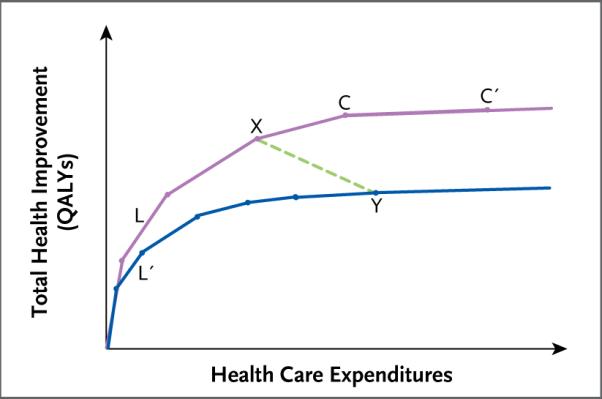
Shown is the relationship between expenditures and health gains (as measured in quality-adjusted life-years [QALYs] gained) in two hypothetical health care delivery systems. The purple upper curve represents an allocation of expenditures to health interventions that maximizes health improvements for any level of expenditure. The blue lower curve represents an allocation that is inefficient in the sense that it falls short of the maximum attainable health gain for any level of expenditure. The line segments that make up the curves represent incremental additions of health interventions or substitutions of more beneficial but more expensive interventions for less expensive but less beneficial alternatives. For example, line segments L and L′ both represent a hypothetical intervention that is very cost-effective relative to the other interventions to the right. However, in the inefficient allocation (lower curve), this highly cost-effective intervention is underutilized, as represented by the shorter length of L′ as compared with L. The line segments become progressively less steep from left to right, reflecting diminishing health value as expenditures increase. The points on the curves represent possible allocations of health expenditures. For example, point X on the upper curve represents an allocation that achieves more health gains at a lower cost than the allocation represented by point Y on the lower curve. The shallow slope of the line segment connecting points C and C′ reflects the fact that the intervention it represents is a relatively cost-ineffective one, although it is still beneficial.
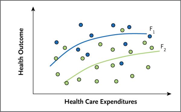
Shown is the relationship between expenditures and outcomes among various providers (circles) in managing a hypothetical condition. The blue circles represent providers who use a comparatively cost-effective mix of interventions for this condition, albeit at different levels of intensity (expenditure), and the green circles represent providers who use a less cost-effective mix of services. The curves F1 and F2 show the associations between expenditures and outcomes among providers who practice more (F1) or less (F2) cost-effective medicine.
Comment in
-
Comparative effectiveness and health care spending.N Engl J Med. 2010 May 13;362(19):1845-6. doi: 10.1056/NEJMc1002540. N Engl J Med. 2010. PMID: 20463349 No abstract available.
References
-
- American College of Physicians Information on cost-effectiveness: an essential product of a national comparative effectiveness program. Ann Intern Med. 2008;148:956–61. - PubMed
-
- Garber AM. A menu without prices. Ann Intern Med. 2008;148:964–6. - PubMed
-
- U.S. to compare medical treatments. New York Times. 2009 Feb 15;:A1.
-
- Fisher ES, Wennberg DE, Stukel TA, Gottlieb DJ, Lucas FL, Pinder EL. The implications of regional variations in Medicare spending. Part 2: Health outcomes and satisfaction with care. Ann Intern Med. 2003;138:288–98. - PubMed
-
- Baicker K, Chandra A. Medicare spending, the physician workforce, and beneficiaries' quality of care. Health Aff (Millwood) 2004;(Suppl Web Exclusives):W184–W197. - PubMed
Publication types
MeSH terms
Grants and funding
LinkOut - more resources
Full Text Sources
Other Literature Sources
Medical