Classification of genes and putative biomarker identification using distribution metrics on expression profiles
- PMID: 20140228
- PMCID: PMC2816221
- DOI: 10.1371/journal.pone.0009056
Classification of genes and putative biomarker identification using distribution metrics on expression profiles
Abstract
Background: Identification of genes with switch-like properties will facilitate discovery of regulatory mechanisms that underlie these properties, and will provide knowledge for the appropriate application of Boolean networks in gene regulatory models. As switch-like behavior is likely associated with tissue-specific expression, these gene products are expected to be plausible candidates as tissue-specific biomarkers.
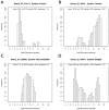
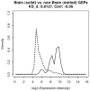
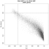
Methodology/principal findings: In a systematic classification of genes and search for biomarkers, gene expression profiles (GEPs) of more than 16,000 genes from 2,145 mouse array samples were analyzed. Four distribution metrics (mean, standard deviation, kurtosis and skewness) were used to classify GEPs into four categories: predominantly-off, predominantly-on, graded (rheostatic), and switch-like genes. The arrays under study were also grouped and examined by tissue type. For example, arrays were categorized as 'brain group' and 'non-brain group'; the Kolmogorov-Smirnov distance and Pearson correlation coefficient were then used to compare GEPs between brain and non-brain for each gene. We were thus able to identify tissue-specific biomarker candidate genes.
Conclusions/significance: The methodology employed here may be used to facilitate disease-specific biomarker discovery.
Conflict of interest statement
Figures


Similar articles
-
Expression profiles of switch-like genes accurately classify tissue and infectious disease phenotypes in model-based classification.BMC Bioinformatics. 2008 Nov 17;9:486. doi: 10.1186/1471-2105-9-486. BMC Bioinformatics. 2008. PMID: 19014681 Free PMC article.
-
Towards precise classification of cancers based on robust gene functional expression profiles.BMC Bioinformatics. 2005 Mar 17;6:58. doi: 10.1186/1471-2105-6-58. BMC Bioinformatics. 2005. PMID: 15774002 Free PMC article.
-
INCLUSive: integrated clustering, upstream sequence retrieval and motif sampling.Bioinformatics. 2002 Feb;18(2):331-2. doi: 10.1093/bioinformatics/18.2.331. Bioinformatics. 2002. PMID: 11847086
-
Discovering disease-specific biomarker genes for cancer diagnosis and prognosis.Technol Cancer Res Treat. 2010 Jun;9(3):219-30. doi: 10.1177/153303461000900301. Technol Cancer Res Treat. 2010. PMID: 20441232
-
Inferring regulatory networks.Front Biosci. 2008 Jan 1;13:263-75. doi: 10.2741/2677. Front Biosci. 2008. PMID: 17981545 Review.
Cited by
-
Dynamic gene expression patterns in animal models of early and late heart failure reveal biphasic-bidirectional transcriptional activation of signaling pathways.Physiol Genomics. 2014 Oct 15;46(20):779-87. doi: 10.1152/physiolgenomics.00054.2014. Epub 2014 Aug 26. Physiol Genomics. 2014. PMID: 25159852 Free PMC article.
-
MMP1 bimodal expression and differential response to inflammatory mediators is linked to promoter polymorphisms.BMC Genomics. 2011 Jan 19;12:43. doi: 10.1186/1471-2164-12-43. BMC Genomics. 2011. PMID: 21244711 Free PMC article.
References
Publication types
MeSH terms
Substances
LinkOut - more resources
Full Text Sources
Other Literature Sources
Research Materials

