

Modelling seasonality and viral mutation to predict the course of an influenza pandemic
- PMID: 20158932
- PMCID: PMC3779923
- DOI: 10.1017/S0950268810000300
Modelling seasonality and viral mutation to predict the course of an influenza pandemic
Abstract
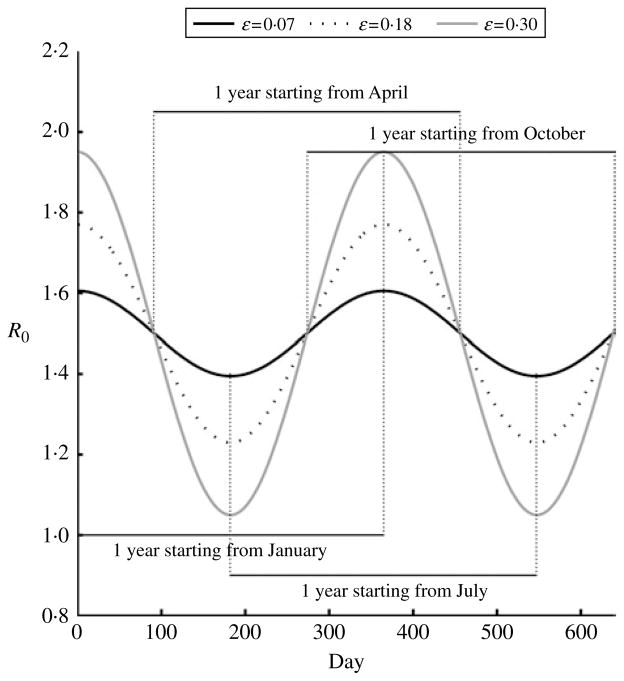
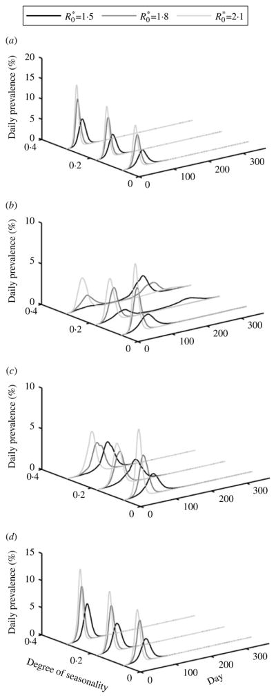
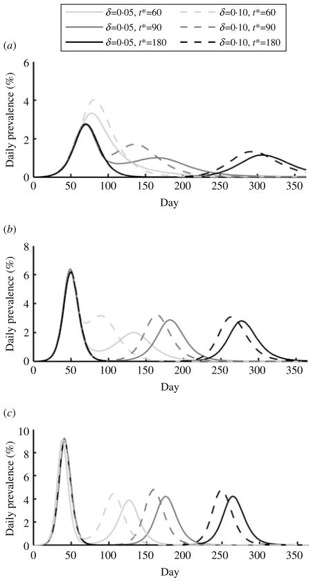
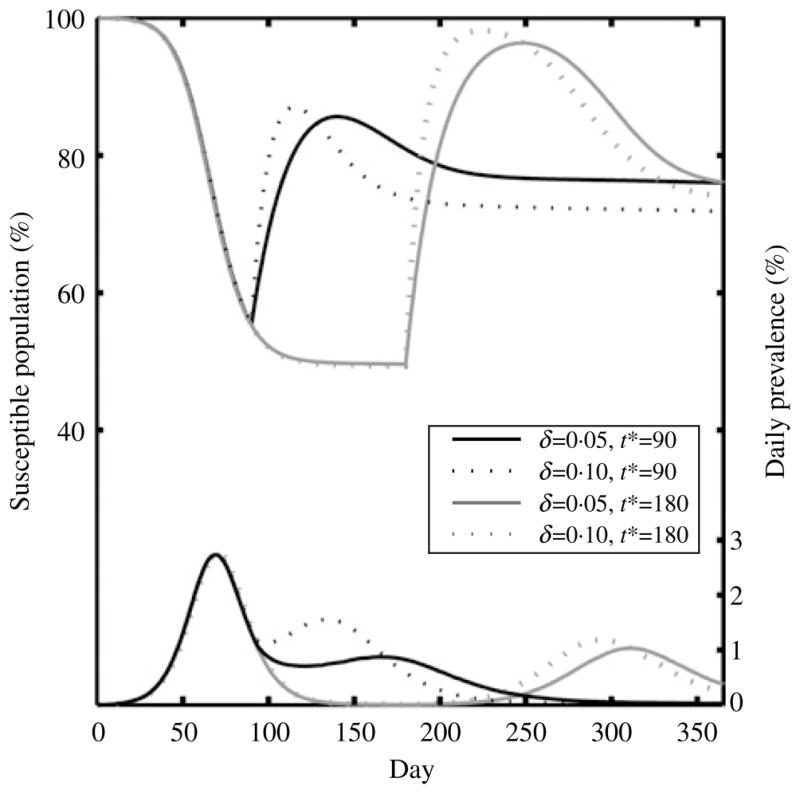
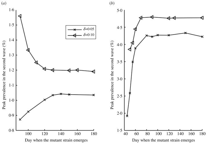
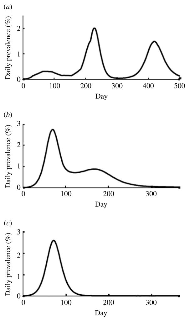
As the 2009 H1N1 influenza pandemic (H1N1) has shown, public health decision-makers may have to predict the subsequent course and severity of a pandemic. We developed an agent-based simulation model and used data from the state of Georgia to explore the influence of viral mutation and seasonal effects on the course of an influenza pandemic. We showed that when a pandemic begins in April certain conditions can lead to a second wave in autumn (e.g. the degree of seasonality exceeding 0.30, or the daily rate of immunity loss exceeding 1% per day). Moreover, certain combinations of seasonality and mutation variables reproduced three-wave epidemic curves. Our results may offer insights to public health officials on how to predict the subsequent course of an epidemic or pandemic based on early and emerging viral and epidemic characteristics and what data may be important to gather.
Conflict of interest statement
None.
Figures
Similar articles
-
Seasonal transmission potential and activity peaks of the new influenza A(H1N1): a Monte Carlo likelihood analysis based on human mobility.BMC Med. 2009 Sep 10;7:45. doi: 10.1186/1741-7015-7-45. BMC Med. 2009. PMID: 19744314 Free PMC article.
-
The impact of mass gatherings and holiday traveling on the course of an influenza pandemic: a computational model.BMC Public Health. 2010 Dec 21;10:778. doi: 10.1186/1471-2458-10-778. BMC Public Health. 2010. PMID: 21176155 Free PMC article.
-
Prior immunity helps to explain wave-like behaviour of pandemic influenza in 1918-9.BMC Infect Dis. 2010 May 25;10:128. doi: 10.1186/1471-2334-10-128. BMC Infect Dis. 2010. PMID: 20497585 Free PMC article.
-
Seasonal, avian and pandemic influenza.Nurs Times. 2007 Sep 18-24;103(38):38, 40. Nurs Times. 2007. PMID: 17944253 Review. No abstract available.
-
Emerging, novel, and known influenza virus infections in humans.Infect Dis Clin North Am. 2010 Sep;24(3):603-17. doi: 10.1016/j.idc.2010.04.001. Infect Dis Clin North Am. 2010. PMID: 20674794 Free PMC article. Review.
Cited by
-
Mathematical Modeling of Influenza Dynamics: Integrating Seasonality and Gradual Waning Immunity.Bull Math Biol. 2025 May 16;87(6):75. doi: 10.1007/s11538-025-01454-w. Bull Math Biol. 2025. PMID: 40379989 Free PMC article.
-
Worldwide transmission and seasonal variation of pandemic influenza A(H1N1)2009 virus activity during the 2009-2010 pandemic.Influenza Other Respir Viruses. 2013 Nov;7(6):1328-35. doi: 10.1111/irv.12106. Epub 2013 Mar 30. Influenza Other Respir Viruses. 2013. PMID: 23551904 Free PMC article.
-
Agent-Based Simulation for Seasonal Guinea Worm Disease in Chad Dogs.Am J Trop Med Hyg. 2020 Nov;103(5):1942-1950. doi: 10.4269/ajtmh.19-0466. Am J Trop Med Hyg. 2020. PMID: 32901603 Free PMC article.
-
Vaccination deep into a pandemic wave potential mechanisms for a "third wave" and the impact of vaccination.Am J Prev Med. 2010 Nov;39(5):e21-9. doi: 10.1016/j.amepre.2010.07.014. Am J Prev Med. 2010. PMID: 20965375 Free PMC article.
-
Association of Simulated COVID-19 Vaccination and Nonpharmaceutical Interventions With Infections, Hospitalizations, and Mortality.JAMA Netw Open. 2021 Jun 1;4(6):e2110782. doi: 10.1001/jamanetworkopen.2021.10782. JAMA Netw Open. 2021. PMID: 34061203 Free PMC article.
References
-
- Altizer S, et al. Seasonality and the dynamics of infectious diseases. Ecology Letters. 2006;9:467–484. - PubMed
-
- Bjornstad ON, Finkenstadt BF, Grenfell BT. Dynamics of measles epidemics: Estimating scaling of transmission rates using a time series SIR model. Ecological Monographs. 2002;72:169–184.
-
- Bolker B, Grenfell B. Space, persistence and dynamics of measles epidemics. Biological Sciences. 1995;348:309–320. - PubMed
Publication types
MeSH terms
Grants and funding
LinkOut - more resources
Full Text Sources
Medical
Research Materials
Miscellaneous
