. 2010 Mar;13(3):369-78.
doi: 10.1038/nn.2501. Epub 2010 Feb 21.

Stimulus onset quenches neural variability: a widespread cortical phenomenon

Affiliations

Stimulus onset quenches neural variability: a widespread cortical phenomenon

Mark M Churchland et al. Nat Neurosci. 2010 Mar.

Abstract

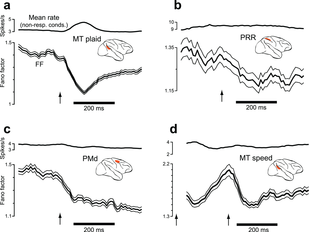
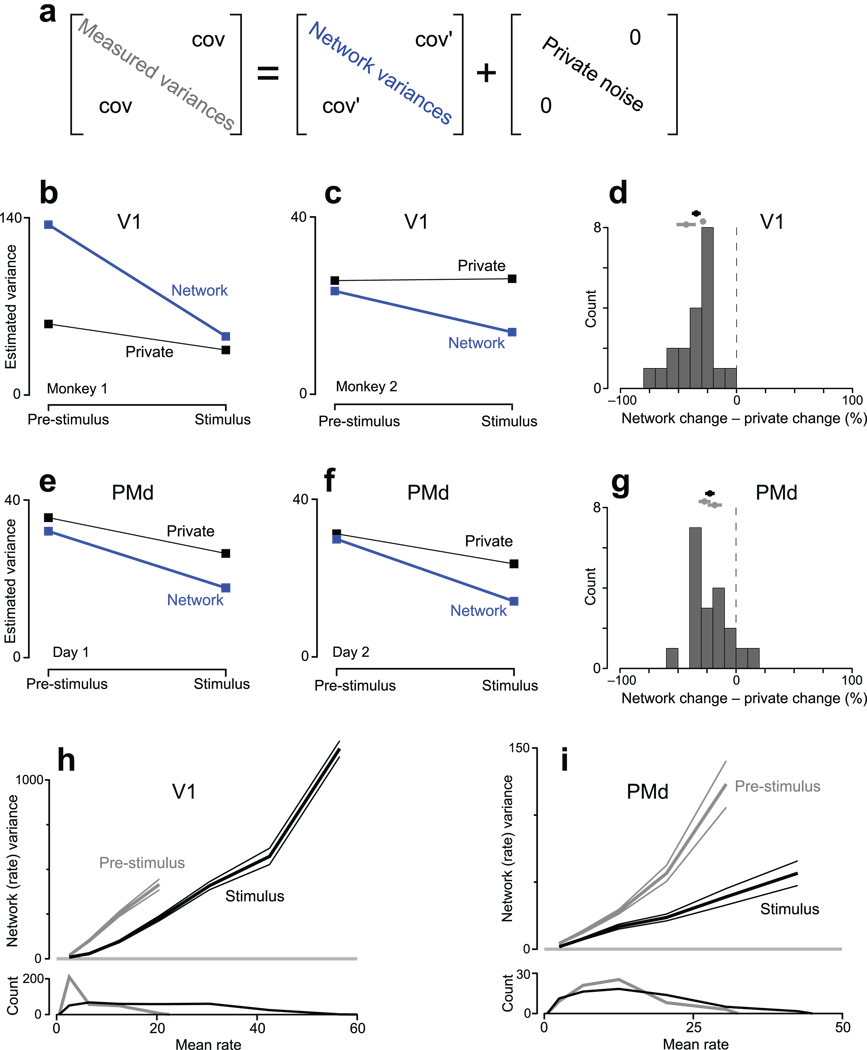
Neural responses are typically characterized by computing the mean firing rate, but response variability can exist across trials. Many studies have examined the effect of a stimulus on the mean response, but few have examined the effect on response variability. We measured neural variability in 13 extracellularly recorded datasets and one intracellularly recorded dataset from seven areas spanning the four cortical lobes in monkeys and cats. In every case, stimulus onset caused a decline in neural variability. This occurred even when the stimulus produced little change in mean firing rate. The variability decline was observed in membrane potential recordings, in the spiking of individual neurons and in correlated spiking variability measured with implanted 96-electrode arrays. The variability decline was observed for all stimuli tested, regardless of whether the animal was awake, behaving or anaesthetized. This widespread variability decline suggests a rather general property of cortex, that its state is stabilized by an input.


Figures

Figure 1
Figure 1
Schematic illustration of possible types of across-trial firing rate variability. In each panel, we suppose that the same stimulus is delivered four times (four trials) yielding four different responses. Panels a and b were constructed to have the same mean response across the four trials. a. Stimulus-driven decline in variability. b. Stimulus-driven rise in variability. c. Stimulus-driven decline in variability with little change in mean rate.
Figure 2
Figure 2
Analysis of intracellularly-recorded membrane potential from cat V1. Stimuli were drifting sine-wave gratings presented at different orientations / frequencies. Analysis employed a 50 ms sliding window (box filter) to match the 50 ms window used for the FF analysis. Similar results were obtained with a shorter (5 ms) or longer (100 ms) window. a. Data from one example neuron. Vm for individual trials (black) is plotted on top of the mean (gray). Data are shown when no stimulus was delivered, for a non-preferred stimulus, and for a preferred stimulus. The arrow marks stimulus onset. b. Similar plot for a second example neuron. c. The mean and variance of Vm across all 52 neurons and all stimuli. Flanking traces give SEMs.
Figure 3
Figure 3
Changes in firing-rate variance for eight datasets (one per panel). Insets indicate stimulus type. Data are aligned on stimulus onset (arrow). For the two bottom panels (MT-area/direction and MT-speed) the dot pattern appeared at time zero (first arrow) and began moving at the second arrow. The mean rate (gray) and the FF (black with flanking SEs) were computed using a 50 ms sliding window. For OFC, where response amplitudes were small, a 100 ms window was used to gain statistical power. Analysis included all conditions, including non-preferred. The FF was computed after mean-matching (Fig. 4). The resulting stabilized means are shown in black. The mean number of trials/condition was 100 (V1), 24 (V4), 15 (MT plaids), 88 (MT dots), 35 (LIP), 10 (PRR), 31 (PMd), 106 (OFC), 125 (MT-direction/area), and 14 (MT-speed).
Figure 4
Figure 4
Illustration of how the mean-matched FF was computed. Data are from the MT-plaids dataset. a. Spike rasters for the 46 trials (one per line) recorded from one MT neuron (127) for one stimulus condition (upwards-moving plaid). Shaded areas show 4 locations of the sliding window, which moved in 10 ms increments. For each window location, the spike count was computed for each trial. The mean and variance (across trials) of that count then contributed one data-point to the subsequent analysis (next panel). b. The FF was computed based on scatterplots of the spike-count variance versus mean. Each scatterplot corresponds to a window in a. Each point plots data for one neuron/condition (red indicates the neuron/condition from a). The orange line has unity slope: the expected variance-to-mean relationship for Poisson spiking. Data above the orange line is consistent with the presence of underlying-rate variability. Grey dots show all data. Gray lines are regression fits to all data (constrained to pass through zero, weighted according to the estimated SE of each variance measurement). Gray distributions are of mean counts. These appear to have different areas because of the vertical log scale. Black points are those preserved by mean-matching (methods). Black distributions are thus identical within the bin resolution. Black lines are regression slopes for the mean-matched data. c. The FF versus time. Arrows indicate time-points from the panels above. The gray trace (with flanking SEs) plots the ‘raw’ FF: the slope of the grey lines from panel b. The black trace plots the ‘mean-matched’ FF: the slope of the black lines.
Figure 5
Figure 5
Changes in the FF after restricting the analysis to neurons / conditions with little change in mean rate (e.g., non-preferred conditions). Of the original ‘neuron-conditions’ (the response of one neuron to one condition), this analysis preserved 28% (MT, panel a), 49% (PRR, panel b), 27% (PMd, panel c), and 41% (MT-speed, panel d). A 100 ms window (rather than 50 ms) was employed to regain lost statistical power. The trace at the top of each panel shows the mean rate, averaged across all included neurons/conditions. The trace with flanking standard errors shows the FF, computed with no further mean matching. Arrows indicate stimulus onset. For the MT-speed dataset (panel d) the stimulus appeared at the very start of the record (first arrow) and began moving 256 ms later (second arrow).
Figure 6
Figure 6
Application of FA to data from V1 and PMd. See methods and Supplementary Figure 6 for a description of datasets. a. FA was applied to covariance matrices (#neurons × #neurons) of spike counts, taken in an analysis window that either ended at stimulus onset (pre-stimulus) or began just after stimulus onset (stimulus). The measured covariance matrix was approximated as the sum of a ‘network’ covariance matrix and a diagonal matrix of private noise. To produce the plots in b–g, network variances were averaged across the subset of neurons/conditions (48% and 30% for V1, 74% and 79% for PMd) whose distribution of mean rates was matched before and after stimulus onset (similar to Fig. 4). b. Estimated variances for one V1 dataset. Network variability declined more than private variability in both absolute (p<10−7) and relative (percent of initial value, p<10−7) terms (paired t-tests across conditions). c. similar plot for a V1 dataset from a second monkey: p<0.002 (absolute) and p<0.002 (relative). d. Summary comparison for V1. Changes in variability (stimulus minus pre-stimulus) were expressed in percentage terms. Data to the left of zero indicate that network variability underwent the larger decline. The distribution includes all conditions and both datasets. The mean and standard error is given by the black symbol at top (p<10−7 compared to zero, paired t-test). Gray symbols give individual means for each dataset. e. Same as b,c but for one PMd dataset (G20040123). Network variability declined more in absolute (p<0.005) and relative (p<0.001) terms. f. Similar plot for a second PMd dataset (G20040122): p<0.05 (absolute) and p<0.02 (relative). g. Summary comparison for PMd (distribution mean <0; p<10−4). h. Relationship between mean firing rate and network-level (shared firing-rate) variance. Data (same dataset as panel b) were binned by mean rate, and the average network variance (±SE) was computed for each bin. This was done both pre-stimulus (gray) and after stimulus onset (black). The average was taken across neurons and conditions (each datum being averaged was, for one condition, one element of the blue diagonal in panel a). Distributions of mean rates are shown at bottom. The analysis in b was based on the overlapping (mean-matched) portion of these distributions. i. Similar plot for PMd (same dataset as panel e).
Figure 7
Figure 7
Individual-trial neural trajectories, computed using GPFA. a. Projections of PMd activity into a 2-dimensional state space. Each black point represents the location of neural activity on one trial. Gray traces show trajectories from 200 ms before target onset until the indicated time. The stimulus was a reach target (135°, 60mm distant), with no reach allowed until a subsequent go cue (see b,c). Fifteen (of 47) randomly-selected trials are shown. Same dataset as in Figure 6e. b. Trajectories are plotted until movement onset. Blue dots indicate 100 ms before stimulus (reach target) onset. No reach was allowed until after the go cue (green dots), 400–900 ms later. Activity between the blue and green dots thus relates to movement planning. Movement onset (black dots) was ~300 ms after the go cue. For display, eighteen randomly-selected trials are plotted, plus one hand-selected trial (red, trialID211). Covariance ellipses were computed across all 47 trials. This is a 2-dimensional projection of a 10 dimensional latent space. In the full space, the black ellipse is far from the edge of the blue ellipse. This projection was chosen to accurately preserve the relative sizes (on a per dimension basis) of the true 10-dimensional volumes of the ellipsoids. G20040123 dataset. c. Same presentation and target location as in b, but for data from another day’s dataset (G20040122, red trial: trialID793).
Figure 8
Figure 8
Projections of V1 activity into a 2-dimensional space. Blue, black and red traces show activity before, during and after stimulus presentation (a drifting 45° grating). Same dataset as Figure 6c. a. The mean trajectory and three trials picked by hand. The grey spot shows the average location of pre-stimulus activity. In a few cases (e.g., upper left portion of the rightmost panel), traces were moved very slightly apart to make it clear that they traveled in parallel rather than crossed. b. Trajectories after data were shuffled to remove correlated variability. 25 randomly-selected trials are plotted (lighter traces) along with the mean (saturated traces). c. Same as in b, but for the original unshuffled data.

Comment in

  • Whither variability?
    Fairhall AL. Fairhall AL. Nat Neurosci. 2019 Mar;22(3):329-330. doi: 10.1038/s41593-019-0344-0. Nat Neurosci. 2019. PMID: 30742118 No abstract available.

References

    1. Briggman KL, Abarbanel HD, Kristan WB., Jr. Optical imaging of neuronal populations during decision-making. Science. 2005;307:896–901. - PubMed
    1. Arieli A, Sterkin A, Grinvald A, Aertsen A. Dynamics of ongoing activity: explanation of the large variability in evoked cortical responses. Science. 1996;273:1868–1871. - PubMed
    1. Monier C, Chavane F, Baudot P, Graham LJ, Fregnac Y. Orientation and direction selectivity of synaptic inputs in visual cortical neurons: a diversity of combinations produces spike tuning. Neuron. 2003;37:663–680. - PubMed
    1. Finn IM, Priebe NJ, Ferster D. The emergence of contrast-invariant orientation tuning in simple cells of cat visual cortex. Neuron. 2007;54:137–152. - PMC - PubMed
    1. Kohn A, Zandvakili A, Smith MA. Correlations and brain states: from electrophysiology to functional imaging. Curr Opin Neurobiol. 2009;19:434–438. doi:S0959-4388(09)00063-4 [pii] 10.1016/j.conb.2009.06.007. - PMC - PubMed

Publication types