

Review
doi: 10.1038/nmeth.1431.
Visualization of image data from cells to organisms
Affiliations
- PMID: 20195255
- PMCID: PMC3650473
- DOI: 10.1038/nmeth.1431
Item in Clipboard
Review
Visualization of image data from cells to organisms
Nat Methods.
2010 Mar.
Abstract
Advances in imaging techniques and high-throughput technologies are providing scientists with unprecedented possibilities to visualize internal structures of cells, organs and organisms and to collect systematic image data characterizing genes and proteins on a large scale. To make the best use of these increasingly complex and large image data resources, the scientific community must be provided with methods to query, analyze and crosslink these resources to give an intuitive visual representation of the data. This review gives an overview of existing methods and tools for this purpose and highlights some of their limitations and challenges.
Figures
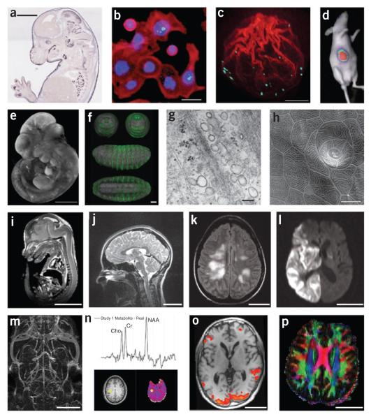
Imaging techniques. (a) Brightfield microscopy: mouse embryo, in situ expression pattern of Irx1, Eurexpress; scale bar, 2 mm. (b) Fluorescence microscopy: HT29 cells stained for DNA (blue), actin (red) and phospho-histone H3 (green); scale bar, 20 μm. (c) Confocal microscopy: actin polymerization along the breaking nuclear envelope during meiotic maturation of a starfish oocyte. Actin filaments, red (rhodamine-phalloidin stain); chromosomes, cyan (Hoechst 33342 stain). Projection of confocal sections, (image courtesy P. Lénárt); scale bar, 20 μm. (d) Bioluminescence imaging: in vivo bioluminescence imaging of mice after implantation of Gli36-Gluc cells, (figure courtesy B.A. Tannous). (e) Optical projection tomography: mouse embryo, EMAP,; scale bar, 1 mm. (f) Single/selective plane illumination microscopy: late-stage Drosophila embryo probed with anti-GFP antibody and DRAQ5 nuclear marker: frontal, caudal, lateral and ventral views of the same embryo; scale bar, 50 μm. (g) Transmission electron microscopy: human fibroblast, glancing section close to surface (image courtesy R. Parton and M. Floetenmeyer); scale bar, 100 nm. (h) Scanning electron microscopy: zebrafish peridermal skin cells (courtesy R. Parton and M. Floetenmeyer); scale bar, 10 μm. (i) microMRI: mouse embryo (source: http://mouseatlas.caltech.edu/ ); scale bar, 5 mm. (j) T2-weighted MRI: human cervical spine (source: http://www.radswiki.net/ ); scale bar, 5 cm. (k) Fluid attenuation inversion recover (FLAIR) image of a human brain with acute disseminated encephalomyelitis. Bright areas indicate demyelination and possibly some edema (image courtesy N. Salamon); scale bar, 5 cm. (l) Diffusion-weighted image of a human brain after a stroke. Bright areas indicate areas of restricted diffusion (image courtesy N. Salamon); scale bar, 5 cm. (m) Maximum intensity projection image of a magnetic resonance angiogram of a C57BL/6J mouse brain acquired in vivo using blood pool contrast (image courtesy G. Howles); scale bar, 5 mm. (n) 3D proton magnetic resonance spectroscopic imaging study of normal human brain. Graph shows proton spectrum for the brain location identified by yellow markers on the T1-weighted MRI (lower left) and N-acetylaspartate (NAA; lower right) images. Data acquired using the MIDAS/EPSI methodology (image courtesy J. Alger); scale bar, 5 cm. (o) Functional MRI activation map overlaid on a T1-weighted MRI: human brain (image courtesy L. Foland-Ross); scale bar, 5 cm. (p) Direction-encoded color map computed from DTI. Red, left–right directionality; green, anterior–posterior; blue, superior–inferior; scale bar, 5 cm.
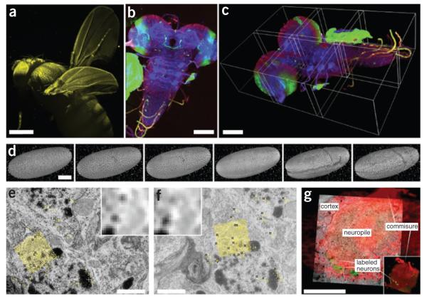
Visualization of high–dimensional image data. (a) SPIM scan of autofluorescent adult Drosophila female gives an impression of 3D rendering in maximum intensity projection (image courtesy D.J. White); scale bar, 100 μm. (b) Maximum-intensity projection of tiled 3D multichannel acquisition of Drosophila larval nervous system; scale bar, 400 μm. (c) The corresponding 3D rendering in Fiji 3D viewer; borders of the tiles are highlighted; scale bar, 100 μm. (d) Visualization of gastrulation in Drosophila expressing His-YFP in all cells by time-lapse SPIM microscopy. The images show six reconstructed time points covering early Drosophila embryonic development rendered in Fiji 3D viewer. Fluorescent beads visible around sample were used as fiduciary markers for registration of multi-angle SPIM acquisition; scale bar, 100 μm. (e,f) Two consecutive slices from serial section transmission electron microscopy dataset of first-instar larval brain. Yellow marks, corresponding SIFT features that can be used for registration; yellow grid, position and orientation of one of the SIFT descriptors; inset, corresponding pixel intensities in the area covered by the descriptor; scale bar, 1 μm. (g) Multimodal acquisition of Drosophila first-instar larval brain by confocal (red, green) and electron microscopy (underlying gray). The two separate specimens were registered using manually extracted corresponding landmarks (not shown). Main anatomical landmarks of the brain correspond in the two modalities after registration (white labels). (Electron microscopy images courtesy A. Cardona; confocal image courtesy V. Hartenstein). Scale bar, 20 μm.

Visualization of anatomical features in MRI. (a) Volume rendering of a difference image computed from a pre- and post-gadolinium contrast scan. Brighter areas indicate a concentration of gadolinium, emphasizing the vasculature. (b) Time-lapse imaging of a subpopulation with Alzheimer’s disease showing loss of cortical gray matter density at 0, 6, 12 and 18 months. Blue, no significant difference in cortical thickness from elderly control subjects; red and white, significant differences in cortical thickness (image courtesy P. Thompson). (c) Cardiac MRI analysis using anatomical scans and DTI of an ex vivo rat heart. Color encoding of the DTI indicates the direction of the primary eigenvector: x direction, green; y, red; z, blue. (d) Visualization of a human brain DTI field during a fluid deformation process for image registration. Orientation and shape of each ellipsoid indicate the pattern of diffusion at that location. Color encoding: low diffusion, green, to high diffusion, red. (e) Interactive visualization of high angular resolution diffusion imaging (HARDI) data using spherical harmonics. Each shape represents the orientation distribution function measured at that point, which indicates the probability of diffusion in each angular direction. Colors indicate direction of maximum probability: red, lateral; blue, inferior–superior; green, anterior–posterior. Visible in this frame are portions of corpus callosum (central red area) and corticospinal tracts (blue vertical areas near edges). (f) White matter tracts computed from diffusion spectral imaging (DSI) data using Diffusion Toolkit (http://www.trackvis.org/dtk/ ). The tracts were then clustered automatically into bundles based on shape similarity measures and finally rendered using BrainSuite. Each color indicates a different bundle. (g) 3D orthogonal views of an MRI volume, displayed with an automatically extracted surface mesh model of the surface of the cerebral cortex (BrainSuite). (h) 3D surface reconstructions (Amira) from micro-MRI data: left hindlimb of a mouse with peroneal muscular atrophy. (i) Surgical planning visualization for assessment of white matter integrity: tumor model (green mass), ventricles (blue), local diffusion for one slice plane (ellipsoid scale and orientation indicating local diffusion tensor: red, low anisotropy; blue, high) and white matter fiber tracts shaded red to blue with increasing local anisotropy (thin lines, peri-tumoral; thick lines, corticospinal tracts). 3D Slicer: http://wiki.na-mic.org/Wiki/index.php/IGT:ToolKit/Neurosurgical-Planning .
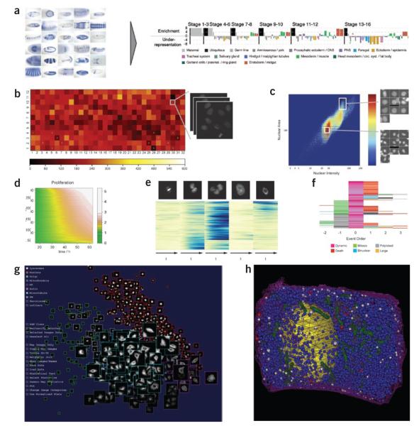
Visualization of high–throughput data. (a) By analogy with the ‘eisengram’ for microarray data, the discrete spatial gene expression (left) annotation data can be summarized by a so-called ‘anatogram’ (right), wherein anatomical structures are color coded, grouped temporally (vertical black lines) and ordered consistently within the temporal groups. Over- or under-representation of anatomical term in a group of genes is expressed by height of the color-coded bar; width of the bar is proportional to the frequency of the anatomical term in the annotation dataset. (b) Typical visualizing and browsing of high-throughput data at experiment level: color-coded cell density on a 384-well plate with link to raw data. (c) Typical visualizing and browsing of high-throughput data at the level of exploratory analysis: density plots of nuclear features (area and intensity), linked to the single segmented nuclei. (d) Joint visualization of 2,600 time-lapse experiments with one-dimensional readout (here proliferation curves): values are color-coded; each row corresponds to one experiment. (e) Time-resolved heat map for multidimensional read-out (here percentages of nuclei in the different morphological classes shown at the top): values are color-coded; each row corresponds to one RNAi experiment. Rows are arranged according to trajectory clustering. (f) Event order map visualizing the relative order of phenotypic events in cell populations: events are color-coded and centered around one phenotype (here dynamic). (g) Visualizing high-throughput subcellular localization data (iCluster): images of ten subcellular localizations (indicated by outline color) spatially arranged by statistical similarity to identify outliers and representative images. (h) Visualization of spatially mapped simulation results (The Visible Cell): simulation of insulin secretion within a beta cell based on electron microscope tomography data (resolution, 15 nm). Blue granules are primed for insulin release, white are docked into the membrane (releasing insulin) and red are returning to the cytoplasm after having been docked.
References
-
- Moore J, et al. Open tools for storage and management of quantitative image data. Methods Cell Biol. 2008;85:555–570. - PubMed
-
- Cox R, et al. A (sort of) new image data format standard: NifTI-1. Neuroimage. 2004;22:99.
Publication types
MeSH terms
Grants and funding
- U54 EB005149/EB/NIBIB NIH HHS/United States
- E003443/BB_/Biotechnology and Biological Sciences Research Council/United Kingdom
- P41 RR013218/RR/NCRR NIH HHS/United States
- U54 RR021813/RR/NCRR NIH HHS/United States
- BS/06/001/BHF_/British Heart Foundation/United Kingdom
- WT_/Wellcome Trust/United Kingdom
- MC_U127527203/MRC_/Medical Research Council/United Kingdom
- RL1 CA133834/CA/NCI NIH HHS/United States
- BB/G000883/1/BB_/Biotechnology and Biological Sciences Research Council/United Kingdom
- R01 EB004155/EB/NIBIB NIH HHS/United States
- P41 RR013642/RR/NCRR NIH HHS/United States
- R01 EB004155-03/EB/NIBIB NIH HHS/United States
- 5 RL1 CA133834-03/CA/NCI NIH HHS/United States
- P41 RR13218/RR/NCRR NIH HHS/United States
LinkOut - more resources
Full Text Sources
Other Literature Sources
