. 2010 Jun 15;26(12):i79-87.
doi: 10.1093/bioinformatics/btq203.

Assessing the functional coherence of gene sets with metrics based on the Gene Ontology graph

Affiliations

Assessing the functional coherence of gene sets with metrics based on the Gene Ontology graph

Adam J Richards et al. Bioinformatics. .

Abstract

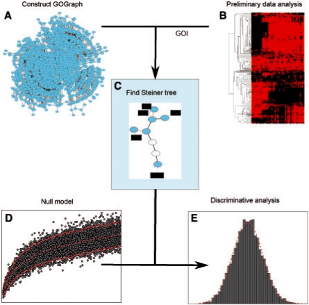
Motivation: The results of initial analyses for many high-throughput technologies commonly take the form of gene or protein sets, and one of the ensuing tasks is to evaluate the functional coherence of these sets. The study of gene set function most commonly makes use of controlled vocabulary in the form of ontology annotations. For a given gene set, the statistical significance of observing these annotations or 'enrichment' may be tested using a number of methods. Instead of testing for significance of individual terms, this study is concerned with the task of assessing the global functional coherence of gene sets, for which novel metrics and statistical methods have been devised.

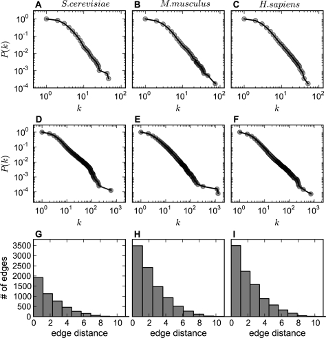
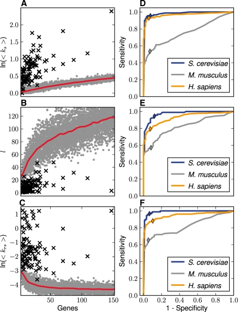
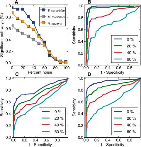
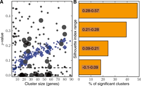
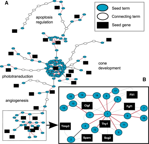
Results: The metrics of this study are based on the topological properties of graphs comprised of genes and their Gene Ontology annotations. A novel aspect of these methods is that both the enrichment of annotations and the relationships among annotations are considered when determining the significance of functional coherence. We applied our methods to perform analyses on an existing database and on microarray experimental results. Here, we demonstrated that our approach is highly discriminative in terms of differentiating coherent gene sets from random ones and that it provides biologically sensible evaluations in microarray analysis. We further used examples to show the utility of graph visualization as a tool for studying the functional coherence of gene sets.

Availability: The implementation is provided as a freely accessible web application at: http://projects.dbbe.musc.edu/gosteiner. Additionally, the source code written in the Python programming language, is available under the General Public License of the Free Software Foundation.

Supplementary information: Supplementary data are available at Bioinformatics online.


Figures

Fig. 1.
Fig. 1.
Conceptual overview of graph-based functional coherence evaluation. (A) A graph representation of the GO is constructed and referred to as a GOGeneGraph, in which a node is a GO term or a gene, and an edge reflects the semantic relationship between a pair of GO terms or gene-term relationship. (B) A GOI is produced by high-throughput technology or other methods. (C) A GO Steiner tree is extracted and several types of network statistics of the GO Steiner tree are collected. (D) Through simulation experiments, the distributions of the network statistics from randomly grouped gene sets are estimated. (E) The hypothesis that the GOI belongs to the population of the random gene sets is tested and a P-value is returned. In addition, users may choose from several visualization tools to discover more about the functional relationships between the GOI.
Fig. 2.
Fig. 2.
Comparison of GOGraph network topology of different species. (AC) The log–log plots for the cumulative term degree distributions of GOGraphs for S.cerevisiae, M.musculus and H.sapiens. The horizontal axis is node degree k, and the vertical axis is cumulative probability P(k), where k corresponds to the number edges connecting to a node, and P(k) is the probability that a node has k or more degree. (DF) The cumulative degree distributions for GOGeneGraphs augmented by adding all annotated genes from the three species, respectively. (GI) The distributions (histograms) of edge distances of GOGraphs for the species.
Fig. 3.
Fig. 3.
Network statistics of random and coherent gene sets. (AC) The network statistics corresponding to 8850 randomly sampled gene sets (gray dots) and 90 pathways (black crosses) from the KEGG database for S.cerevisiae are shown as functions of gene set size n for the three metrics, <ks>, l and <krs>. The red lines in (AC) are the means of the random gene sets as functions of n fitted with the Nadaraya–Watson method (see Section 2). (DF) The ROC curves for the network statistics, where AUC values are shown in Table 2. (DF) illustrate the discriminative performance for <ks>, l and <krs>, respectively. The colors indicate the species and the colored diamonds show the sensitivity and false positive rates of the metrics when the P-value threshold is set at 0.05.
Fig. 4.
Fig. 4.
Testing for metric robustness. In a noise simulation experiment, P-values derived from the <krs> method were used to evaluate the robustness of the metrics in the presence of different amounts of simulated noise. (A) With the P≤0.05 as the threshold, the percent of KEGG pathways classified as coherent in the presence of noise was plotted against the percent of simulated noise. The line colors indicate the species. (BD) The ROC curves using <krs> in presence of different degrees of noise are shown for S.cerevisiae, M.musculus and H.sapiens, respectively. Specifically, the AUCs for curves with 0–60% (increasing by 20%) are presented.
Fig. 5.
Fig. 5.
Application to microarray analysis. (A) The relationship between the P-values by the metrics and cluster size. The black circles correspond to results for clusters tested by the <krs> method and the blue diamonds indicate those of the count-based one. The points for each method have two sizes where the larger ones denote differentially expressed clusters that were statistically significant (≤0.05) as determined by a GSA method. (B) The relationship between significance calls by <krs> and silhouette index. According to their silhouette index ranks, the 132 clusters were divided into four evenly sized groups then the percent of clusters classified as significant within each group was plotted.
Fig. 6.
Fig. 6.
Steiner tree visualization. (A) An example of GO Steiner tree visualization for a gene cluster involved in retinal degeneration. Oval nodes are GO term nodes, with cyan ovals representing the seed terms and open ovals denoting the GO terms needed to connect all seed terms. A black edge represents the semantic edge defined in the GOGraph and a red edge is an augmenting edge representing the connection between GO terms that co-annotate proteins. A gene is represented with a black box and the dashed edges denote gene-to-term relationship. Summarizing annotation descriptions are displayed as text. The whole gene expression cluster takes the form of several distinct groups. (B) One group (subgraph) of interest is examined more closely to highlight the characteristics of a more functionally coherent part of the overall GO Steiner tree. The GO terms labeled with a number are further explained in the Supplementary Results.

Similar articles

Cited by

References

    1. Alexa A, et al. Improved scoring of functional groups from gene expression data by decorrelating GO graph structure. Bioinformatics. 2006;22:1600–1607. - PubMed
    1. Ashburner M, et al. Gene ontology: tool for the unification of biology. Nat. Genet. 2000;25:25–29. - PMC - PubMed
    1. Barabási A, Oltvai Z. Network biology: understanding the cell's functional organization. Nat. Rev. Genet. 2004;5:101–114. - PubMed
    1. Brown M, et al. Knowledge-based analysis of microarray gene expression data by using support vector machines. Proc. Natl Acad. Sci. USA. 2000;97:262–267. - PMC - PubMed
    1. Cho R, et al. Transcriptional regulation and function during the human cell cycle. Nat. Genet. 2001;27:48–54. - PubMed

Publication types