Comparative Study
. 2010 Dec;20(12):1730-9.
doi: 10.1101/gr.108217.110. Epub 2010 Nov 2.

Gene expression profiling of human breast tissue samples using SAGE-Seq

Affiliations
Comparative Study

Gene expression profiling of human breast tissue samples using SAGE-Seq

Zhenhua Jeremy Wu et al. Genome Res. 2010 Dec.

Abstract

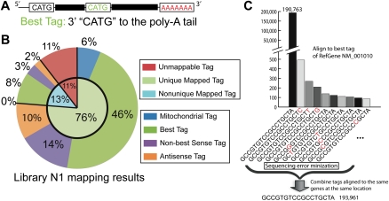
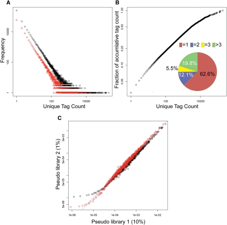
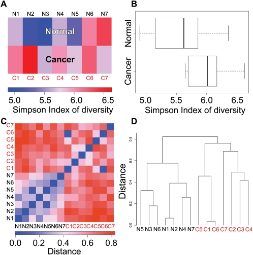
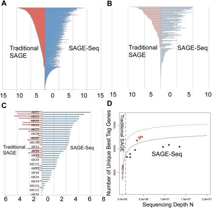
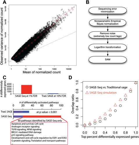
We present a powerful application of ultra high-throughput sequencing, SAGE-Seq, for the accurate quantification of normal and neoplastic mammary epithelial cell transcriptomes. We develop data analysis pipelines that allow the mapping of sense and antisense strands of mitochondrial and RefSeq genes, the normalization between libraries, and the identification of differentially expressed genes. We find that the diversity of cancer transcriptomes is significantly higher than that of normal cells. Our analysis indicates that transcript discovery plateaus at 10 million reads/sample, and suggests a minimum desired sequencing depth around five million reads. Comparison of SAGE-Seq and traditional SAGE on normal and cancerous breast tissues reveals higher sensitivity of SAGE-Seq to detect less-abundant genes, including those encoding for known breast cancer-related transcription factors and G protein-coupled receptors (GPCRs). SAGE-Seq is able to identify genes and pathways abnormally activated in breast cancer that traditional SAGE failed to call. SAGE-Seq is a powerful method for the identification of biomarkers and therapeutic targets in human disease.


Figures

Figure 1.
Figure 1.
SAGE-Seq tag alignment and sequencing error minimization. (A) Best tag is defined as the tag next to the 3′-most NlaIII site (CATG) to the poly(A) tail. (B) Tag alignment statistics of sample N1 according to the tag alignment pipeline in Supplemental Figure S3. Detailed mapping of other data sets is shown in Supplemental spreadsheet 1. (C) Presumed sequencing errors revealed during tag mapping. All of the listed tags are best tags uniquely mapped to the same RefSeq gene “NM_001010.” (Not every tag uniquely mapped to this gene at the same location is listed.) X-axis is the tag sequences listed in descending order of tag count. The one-base difference in sequence most likely due to sequencing error is marked in red. Sequencing error minimization step for this particular example is done in the following way: sum up the count of all these tags and assign it to tag “CATGGCCGTGTCCGCCTGCTA” and remove all the other tags.
Figure 2.
Figure 2.
Frequency plot of unique tag count and nonparametric empirical Bayes method. (A) Frequency of unique tag counts in libraries N1 (black) and N5 (red). X-axis is the observed tag count and y-axis is the frequency that shows the number of unique tags with a specific count. (B) Pie chart depicting the distribution of unique tags in library N1: 62.6% of unique tags has tag count 1, 12.1%, count 2, 5.5%, count 3, and 19.8% counts larger than 3. The outer plot shows the accumulative fraction of unique tag counts. Although 62.6% unique tags have count 1, they only account for 3% of total tag counts. (C) Scatter plot of tag proportion. X-axis is the proportion of tags in pseudo library 1 obtained by randomly sampling 10% of library N1. Y-axis is the average proportion of pseudo library 2 obtained by randomly sampling 1% of library N1. The data points are obtained in the following way. For example, find all of the tags in pseudo library 1 with proportion 1 × 10⁻⁶, then calculate the mean proportion of these tags in pseudo library 2, which gives for example 1 × 10⁻⁵. This gives a data point at (1 × 10⁻⁶, 1 × 10⁻⁵). The dashed line is y = x. Black symbols indicate the proportion using the maximum likelihood estimator, where overestimation in the low and intermediately expressed tags (<100/million) and underestimation in the highly expressed tags (>100/million) are observed. Red symbols mark the proportion calculated using nonparametric empirical Bayes method with improved, more comparable corrected proportions between two libraries with different sequencing depth in both low and highly abundant tags.
Figure 3.
Figure 3.
Diversity of normal and cancer transcriptomes. (A) Simpson index of diversity to measure within-library gene expression diversity. Libraries in the cancer group show higher within-library diversity compared with the normal group. (B) Box plot depicting Simpson index of diversity of normal and cancer samples. P = 0.07284 (Wilcoxon rank-sum test). (C) Distance defined as “1 – Morisita-Horn similarity index” is used to measure gene expression diversity across libraries. Libraries in the normal group are more similar to one another, whereas cancer libraries are more diverse. (D) Hierarchical clustering using “distance” defined in C separates normal and cancer libraries.
Figure 4.
Figure 4.
SAGE-Seq tag mapping and sequencing depths saturation curve. (A–C) Differential coverage of expression profiles in three selected gene families: transcription factors (A), GPCRs (B), and ABC transporters (C). Y-axis lists the genes and x-axis is the mean gene expression index (logarithm of the normalized tag count). Red and blue colors mark traditional SAGE and SAGE-Seq, respectively. SAGE-Seq detects many more genes in these gene families than traditional SAGE does. (D) Number of unique best-tag genes (y-axis) in relation to sequencing depth (x-axis). The number of best-tag genes is the number of unique genes mapped by best tags, counted as one if multiple tags are mapped to the best tag of the same gene. Black and red colors indicate normal and cancer groups, respectively. Symbols “○” and “▴” mark traditional SAGE and SAGE-Seq, respectively. Solid curves (saturation curves) are from simulation by sampling the combination of all libraries in the normal (or cancer) group, which depict the trend with increasing sequencing depth. Traditional SAGE identifies much fewer best-tag genes than the SAGE-Seq. SAGE-Seq shows that cancer samples (red triangles) have a larger number of unique best-tag genes than normal samples (black triangles). This difference is not detected by traditional SAGE (red circles vs. black circles).
Figure 5.
Figure 5.
Differentially expressed genes and their variance. (A) Mean-to-variance plot for the seven normal libraries after removing the noise and normalization. Red dashed line is the best linear fit in log-log plot. The slope gives the exponent αobv ≈ 1.9 Blue dashed line is the mean-to-variance line introduced by sampling. (B) Pipeline for the identification of differentially expressed genes: (1) Sequencing error minimization: After tag alignment, tags that are mapped to the same genes at the same locations are combined together; (2) NEB is used to normalize different libraries with different sequencing depth; (3) filtering to remove tags with counts ≥3 per million in less than two libraries followed by log2 transformation; (4) SAM is used for the detection of differentially expressed genes. (C) Detected differentially expressed genes (top) and activated pathways (bottom) in SAGE-Seq and traditional SAGE. SAGE-Seq identifies approximately 4000 differential genes at 1% FDR, while traditional SAGE identifies <200 at a much looser cut off (10% FDR). At P = 0.001, SAGE-Seq identifies 99 pathways significantly activated in breast cancer, while traditional SAGE only shows 32. The 80 pathways only identified by SAGE-Seq and missed by traditional SAGE are all breast cancer-related pathways. (D) The overlap ratio (defined as the number of overlapping genes divided by the gene number in traditional SAGE in the top x percent differentially expressed genes, where x changes between 0 and 1. The black symbols depict actual data (SAGE-Seq vs. traditional SAGE). It indicates that there is little overlap in the top differentially expressed genes list between SAGE-Seq and traditional SAGE. The red symbols indicate simulation (SAGE-Seq vs. sampled down SAGE-Seq). Sampled down SAGE-Seq means to binomially sample 50 k tags from each SAGE-Seq library; 50,000 is a typical sequencing depth for traditional SAGE. Simulation confirms the same conclusion as that drawn from the actual data: SAGE-Seq gives a different top differentially expressed gene list compared with traditional SAGE. Deeper sequencing reveals that traditional SAGE identifies different sets of top differentially expressed genes than that of SAGE-Seq, confirming our conclusion that traditional SAGE lacks sufficient sequencing depth.

References

    1. Adams MD, Kelley JM, Gocayne JD, Dubnick M, Polymeropoulos MH, Xiao H, Merril CR, Wu A, Olde B, Moreno RF, et al. 1991. Complementary DNA sequencing: Expressed sequence tags and human genome project. Science 252: 1651–1656 - PubMed
    1. Baggerly KA, Deng L, Morris JS, Aldaz CM 2003. Differential expression in SAGE: Accounting for normal between-library variation. Bioinformatics 19: 1477–1483 - PubMed
    1. Baggerly KA, Deng L, Morris JS, Aldaz CM 2004. Overdispersed logistic regression for SAGE: Modelling multiple groups and covariates. BMC Bioinformatics 5: 144 doi: 10.1186/1471-2105-5-144 - PMC - PubMed
    1. Bloushtain-Qimron N, Yao J, Snyder EL, Shipitsin M, Campbell LL, Mani SA, Hu M, Chen H, Ustyansky V, Antosiewicz JE, et al. 2008. Cell type-specific DNA methylation patterns in the human breast. Proc Natl Acad Sci 105: 14076–14081 - PMC - PubMed
    1. Cai L, Huang H, Blackshaw S, Liu JS, Cepko C, Wong WH 2004. Clustering analysis of SAGE data using a Poisson approach. Genome Biol 5: R51 doi: 10.1186/gb-2004-5-7-51 - PMC - PubMed

Publication types

Associated data