. 2010 Dec 1;82(23):9818-26.
doi: 10.1021/ac1021166. Epub 2010 Nov 4.

Metabolomic analysis and visualization engine for LC-MS data

Affiliations

Metabolomic analysis and visualization engine for LC-MS data

Eugene Melamud et al. Anal Chem. .

Abstract

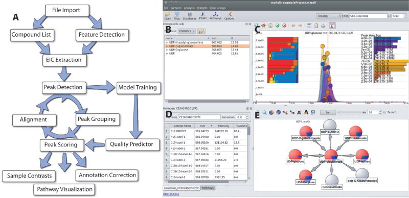
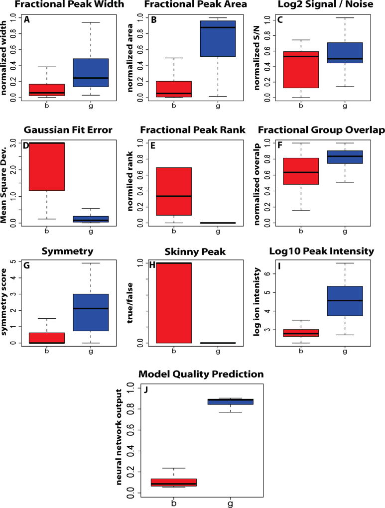
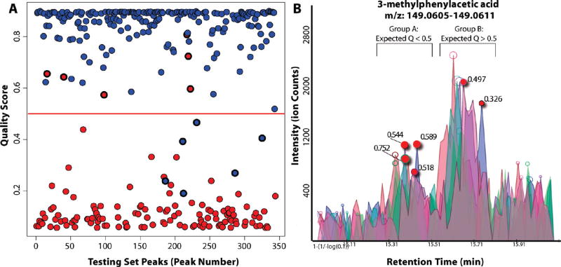
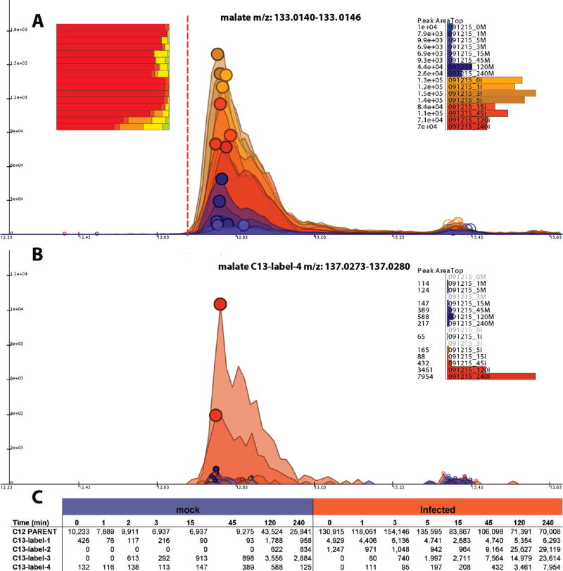
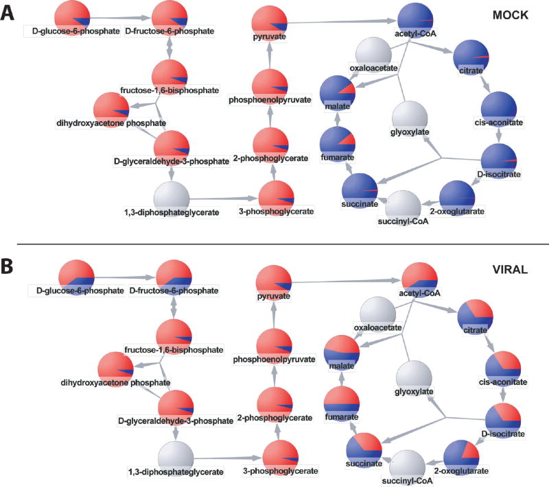
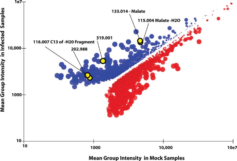
Metabolomic analysis by liquid chromatography-high-resolution mass spectrometry results in data sets with thousands of features arising from metabolites, fragments, isotopes, and adducts. Here we describe a software package, Metabolomic Analysis and Visualization ENgine (MAVEN), designed for efficient interactive analysis of LC-MS data, including in the presence of isotope labeling. The software contains tools for all aspects of the data analysis process, from feature extraction to pathway-based graphical data display. To facilitate data validation, a machine learning algorithm automatically assesses peak quality. Users interact with raw data primarily in the form of extracted ion chromatograms, which are displayed with overlaid circles indicating peak quality, and bar graphs of peak intensities for both unlabeled and isotope-labeled metabolite forms. Click-based navigation leads to additional information, such as raw data for specific isotopic forms or for metabolites changing significantly between conditions. Fast data processing algorithms result in nearly delay-free browsing. Drop-down menus provide tools for the overlay of data onto pathway maps. These tools enable animating series of pathway graphs, e.g., to show propagation of labeled forms through a metabolic network. MAVEN is released under an open source license at http://maven.princeton.edu.


Figures

Figure 1
Figure 1
Software overview. (A) General workflow. The program will automatically extract ion-specific chromatograms (EICs), assign peak quality scores, align peaks, and visually display data. The program is designed to allow an analyst to intervene at all stages. This facilitates correct annotation of detected features to compounds. (B–D) Screenshot of user interface. Shown is one common screen layout using UDP-glucose as a model compound. Subcomponents are (B) table of compounds with known retention times, (C) EIC centered on m/z and retention time of UDP-glucose, (D) table of isotope-labeled forms of UDP-glucose, and (E) reactions of UDP-glucose. All aspects are interlinked to enable efficient mouse-driven navigation through complex metabolomics data. For example, clicking on a different compound from the list in part B would automatically update screens C–E.
Figure 2
Figure 2
Classification performance of various peak features used in automatic peak quality assessment. Blue, peaks that were manually annotated as high quality; red, peaks that were manually annotated as low quality. Dark lines, median; boxes, interquartile range; error bars, 95% limits. The strength of any individual feature depends on an ability to separate into two classes, “g” good peaks and “b” bad peaks. The integrated output of all features via neural network is capable of separating two classes with greater than 95% accuracy at the 0.5 cutoff line. Detailed definitions of features are provided in Supplementary Figure 2 in the Supporting Information.
Figure 3
Figure 3
Effectiveness of automated peak quality scoring. (A) Automated peak quality scores (Y-axis) for peaks manually annotated as high quality (blue) and low quality (red). On a test set of 350 annotated peaks, there were 12 incorrect predictions, with roughly equal number of false positive and false negatives. (B) Incorrect predictions involve peaks of marginal quality. The peaks of group A were classified by an analyst as “low quality”. Those of group B were manually classified to be “high quality”. Incorrect automated predictions, based on a cutoff of 0.5, are highlighted. Each involves a borderline peak that received an intermediate quality score (0.2–0.8).
Figure 4
Figure 4
Visualization of raw LC–MS data. (A) Extracted ion chromatograms (EICs) for unlabeled malate (deprotonated anion). The red vertical line indicates the anticipated retention time of malate. The data comes from a 13C-glucose labeling time course in uninfected fibroblasts (blue) and HCMV infected ones (orange). The size of the filled circles on top of the peaks is proportional to the peak quality score. All of the peaks have large circles indicative of high peak quality. The bar chart on the right shows peak areas. The bar chart on the left shows the fraction of different labeled forms (red, unlabeled; orange-red, 13C1; orange, 13C2; yellow, 13C3; yellow-green, 13C4). The fractional labeling increases with longer labeling time. The increase is greater in the virally infected cells. Clicking on a bar corresponding to a labeled form brings up the associated set of EICs, as shown in part B for the fully labeled (13C4) malate. Right clicking brings up the table of peak areas for all samples and labeling states, as shown in part C. This table can be exported to a spreadsheet via a mouse click.
Figure 5
Figure 5
Pathway-based visualization of isotope-labeling data. The pie graphs show the fraction of each compound that is isotope labeled (red) after 1 h of feeding U–13C-glucose. (A) Uninfected human fibroblasts. (B) Cytomegalovirus infection with U–13C-glucose introduced at 48 h post infection. The virus up-regulates flux through acetyl-CoA and the TCA cycle. While supporting the same qualitative biological conclusions, these data differ somewhat from those of Munger et al. because here we used primary fibroblasts as the host cell, versus previously an immortalized fibroblast cell line. Animated movies showing the temporal progression of labeling are available as Supporting Information.
Figure 6
Figure 6
Pairwise sample comparison. Each point corresponds to a peak group, with the X-value the mean peak intensity in uninfected samples and the Y-value the mean peak intensity in virally infected samples. The size of the points is proportional to fold difference between mean intensities. Points are colored red if the mean peak intensity in set 1 (mock) is greater than the mean in set 2 (viral). The intensity of color is proportional to p-values, based on the formula below. Only groups with at least a 2-fold difference are shown. Highlighted in yellow are groups corresponding to isotopes, potential adducts, and fragments of malate. Clicking on the point corresponding to malate leads to automatic highlighting of these related compounds. The color intensity equals to 1.0 – (p-value0.2).

References

    1. Fiehn O. Plant. Mol. Biol. 2002;48(1–2):155–171. - PubMed
    1. Vinayavekhin N, Homan EA, Saghatelian A. ACS. Chem. Biol. 2010;5(1):91–103. - PubMed
    1. Holmes E, Wilson ID, Nicholson JK. Cell. 2008;134(5):714–717. - PubMed
    1. Wishart DS. Drugs R&D. 2008;9(5):307–322. - PubMed
    1. Metz TO, Zhang Q, Page JS, Shen Y, Callister SJ, Jacobs JM, Smith RD. Biomarkers Med. 2007;1(1):159–185. - PMC - PubMed

Substances