

Structure of urban movements: polycentric activity and entangled hierarchical flows
- PMID: 21249210
- PMCID: PMC3017563
- DOI: 10.1371/journal.pone.0015923
Structure of urban movements: polycentric activity and entangled hierarchical flows
Abstract
The spatial arrangement of urban hubs and centers and how individuals interact with these centers is a crucial problem with many applications ranging from urban planning to epidemiology. We utilize here in an unprecedented manner the large scale, real-time 'Oyster' card database of individual person movements in the London subway to reveal the structure and organization of the city. We show that patterns of intraurban movement are strongly heterogeneous in terms of volume, but not in terms of distance travelled, and that there is a polycentric structure composed of large flows organized around a limited number of activity centers. For smaller flows, the pattern of connections becomes richer and more complex and is not strictly hierarchical since it mixes different levels consisting of different orders of magnitude. This new understanding can shed light on the impact of new urban projects on the evolution of the polycentric configuration of a city and the dense structure of its centers and it provides an initial approach to modeling flows in an urban system.
Conflict of interest statement
Figures

 .
.
 and
and  , corresponding to a mean
  kms and standard deviation
  kms (solid line). This distribution is not a broad law (such as a Levy flight for example), in contrast to previous findings using indirect measures of movement , . (b) Ride distance propensity. Propensity of achieving a ride at a given distance with respect to a null-model of randomized rides.
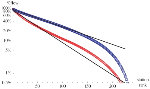
 (outflow
  ) of a station
  (
( ) is defined as
  (
( ). The straight lines are exponential fits of the form
  with
with  for the inflow and
  for the outflow.
 meters of an already-defined center are aggregated to this main center. This yields the dendrogram shown here which highlights the hierarchical nature of the polycentric organization of this urban system. The bold names to the left of the aggregates — such as “West End” for the group of stations around Oxford Circus — are used throughout the paper as convenient labels to denote the polycenters.
 means that there is no deviation in a given direction with respect to the null model. Circles correspond to various levels of identical propensity values: the thicker circle in the middle corresponds to
  , inner circles correspond to propensities of
  and
and  , and outer circles to
  and
and  . The anisotropy is essentially in opposite directions from the center, thus showing a strong bias towards the suburbs for peripheral centers essentially, rather than for central centers. Moreover, most stations control their own regions and seem to have their own distinctive basins of attraction.
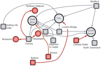
 of the total flow in the network, we observe sources (represented as squares) with outdegree
  such as London Bridge, Stratford, or Waterloo connecting to three different centers (represented as circles), as well as sources with
  (eg. Victoria) and
  (eg. Elephant and Castle). We also show how the pattern of flows is constructed iteratively when we go to larger fraction of the total flow (from
  shown in black to
  shown in red). We represent in red the new sources, centers and connections. The new sources connect to the older centers (eg. West End, City, etc) and the existing sources (eg. Victoria) connect to new centers (eg. Northern stations, Museums, and Parliament).
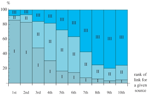
 (from the first link appearing, at left, to the last link, at right).
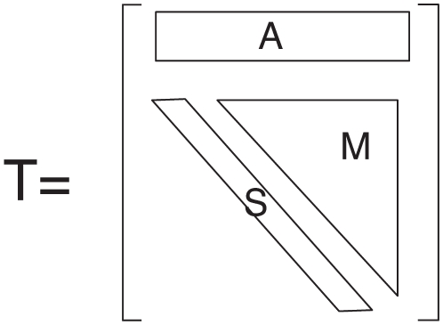
 , consisting essentially of a row vector (
 , inexistent sources before the transition) and an upper triangular matrix (made of a diagonal
  of sources having the same out-degree after the transition, and a submatrix
  of sources whose out-degree increases after the transition).
 ) versus the total flow
  . (b) Fraction of existing sources whose type is changing (
 ) when the total flow varies from
  to
to  . Here
  .
.References
-
- Eubank S, Guclu H, Kumar VSA, Marathe M, Srinivasan A, et al. Modelling disease outbreaks in realistic urban social networks. Nature. 2004;429:180–184. - PubMed
-
- Wang P, Gonzalez M, Hidalgo C, Barab'asi AL. Understanding the spreading patterns of mobile phone viruses. Science. 2009;324:1071–1075. - PubMed
-
- Batty M. Cities and Complexity. Cambridge, , MA: The MIT Press; 2005.
-
- Fujita M, Krugman P, Venables A. The Spatial Economy. Cambridge, , MA: The MIT Press; 2001.
MeSH terms
LinkOut - more resources
Full Text Sources
