

Visual analytics for epidemiologists: understanding the interactions between age, time, and disease with multi-panel graphs
- PMID: 21347221
- PMCID: PMC3039641
- DOI: 10.1371/journal.pone.0014683
Visual analytics for epidemiologists: understanding the interactions between age, time, and disease with multi-panel graphs
Abstract
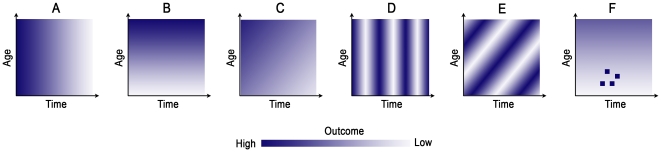
Background: Visual analytics, a technique aiding data analysis and decision making, is a novel tool that allows for a better understanding of the context of complex systems. Public health professionals can greatly benefit from this technique since context is integral in disease monitoring and biosurveillance. We propose a graphical tool that can reveal the distribution of an outcome by time and age simultaneously.
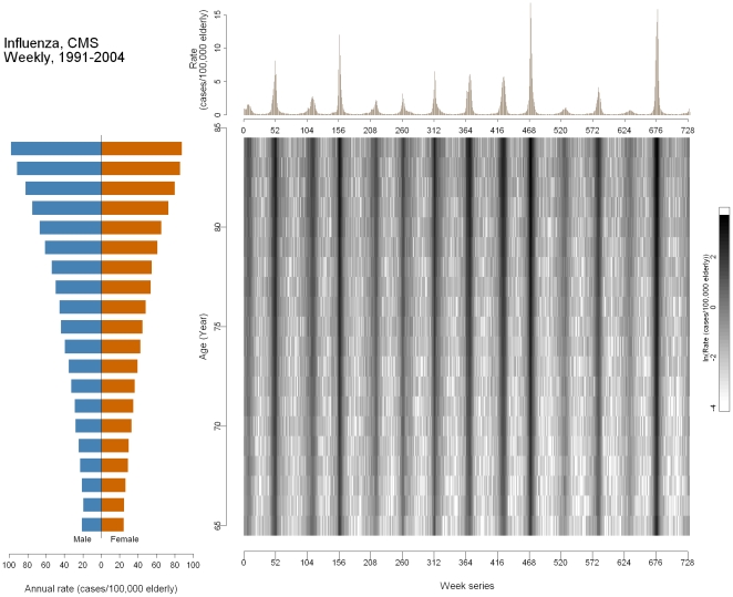
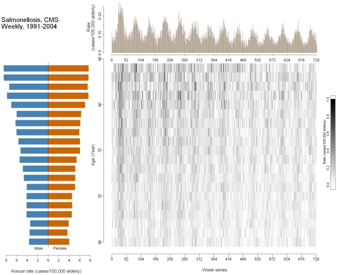
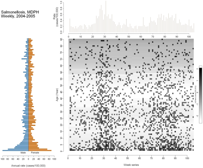
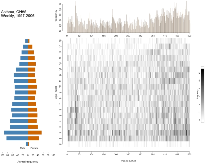
Methodology/principal findings: We introduce and demonstrate multi-panel (MP) graphs applied in four different settings: U.S. national influenza-associated and salmonellosis-associated hospitalizations among the older adult population (≥65 years old), 1991-2004; confirmed salmonellosis cases reported to the Massachusetts Department of Public Health for the general population, 2004-2005; and asthma-associated hospital visits for children aged 0-18 at Milwaukee Children's Hospital of Wisconsin, 1997-2006. We illustrate trends and anomalies that otherwise would be obscured by traditional visualization techniques such as case pyramids and time-series plots.
Conclusion/significance: MP graphs can weave together two vital dynamics--temporality and demographics--that play important roles in the distribution and spread of diseases, making these graphs a powerful tool for public health and disease biosurveillance efforts.
Conflict of interest statement
Figures
Similar articles
-
Salmonellosis in Poland in 2015 and 2016.Przegl Epidemiol. 2018;72(4):419-431. doi: 10.32394/pe.72.4.17. Przegl Epidemiol. 2018. PMID: 30809752
-
Salmonellosis in Poland in 2021.Przegl Epidemiol. 2024 May 20;77(4):504-519. doi: 10.32394/pe.77.41. Przegl Epidemiol. 2024. PMID: 38783660 English, Polish.
-
Laboratory-Confirmed Influenza-Associated Hospitalizations Among Children and Adults - Influenza Hospitalization Surveillance Network, United States, 2010-2023.MMWR Surveill Summ. 2024 Oct 31;73(6):1-18. doi: 10.15585/mmwr.ss7706a1. MMWR Surveill Summ. 2024. PMID: 39471107 Free PMC article.
-
Investigations of Possible Multistate Outbreaks of Salmonella, Shiga Toxin-Producing Escherichia coli, and Listeria monocytogenes Infections - United States, 2016.MMWR Surveill Summ. 2020 Nov 13;69(6):1-14. doi: 10.15585/mmwr.ss6906a1. MMWR Surveill Summ. 2020. PMID: 33180756 Free PMC article.
-
Folic acid supplementation and malaria susceptibility and severity among people taking antifolate antimalarial drugs in endemic areas.Cochrane Database Syst Rev. 2022 Feb 1;2(2022):CD014217. doi: 10.1002/14651858.CD014217. Cochrane Database Syst Rev. 2022. PMID: 36321557 Free PMC article.
Cited by
-
Temporal phenome analysis of a large electronic health record cohort enables identification of hospital-acquired complications.J Am Med Inform Assoc. 2013 Dec;20(e2):e281-7. doi: 10.1136/amiajnl-2013-001861. Epub 2013 Aug 1. J Am Med Inform Assoc. 2013. PMID: 23907284 Free PMC article.
-
THALIS: Human-Machine Analysis of Longitudinal Symptoms in Cancer Therapy.IEEE Trans Vis Comput Graph. 2022 Jan;28(1):151-161. doi: 10.1109/TVCG.2021.3114810. Epub 2021 Dec 24. IEEE Trans Vis Comput Graph. 2022. PMID: 34591766 Free PMC article.
-
Web GIS in practice IX: a demonstration of geospatial visual analytics using Microsoft Live Labs Pivot technology and WHO mortality data.Int J Health Geogr. 2011 Mar 16;10:19. doi: 10.1186/1476-072X-10-19. Int J Health Geogr. 2011. PMID: 21410968 Free PMC article.
-
Interactive Visualization Applications in Population Health and Health Services Research: Systematic Scoping Review.J Med Internet Res. 2022 Feb 18;24(2):e27534. doi: 10.2196/27534. J Med Internet Res. 2022. PMID: 35179499 Free PMC article.
-
Visual Analytic Tools and Techniques in Population Health and Health Services Research: Protocol for a Scoping Review.JMIR Res Protoc. 2019 Oct 28;8(10):e14019. doi: 10.2196/14019. JMIR Res Protoc. 2019. PMID: 31661081 Free PMC article.
References
-
- Thomas JJ, Cook KA. Illuminating the Path: The Research and Development Agenda for Visual Analytics: National Visualization and Analytics Ctr. 2005. pp. 3–33.
-
- Guo D. Visual analytics of spatial interaction patterns for pandemic decision support. International Journal of Geographical Information Science. 2007;21:859–877.
-
- Maciejewski R, Rudolph S, Hafen R, Abusalah AM, Yakout M, et al. A Visual Analytics Approach to Understanding Spatiotemporal Hotspots. Ieee Transactions on Visualization and Computer Graphics. 2010;16:205–220. - PubMed
Publication types
MeSH terms
Grants and funding
LinkOut - more resources
Full Text Sources
