Review
. 2011 Aug 9;11(5):10.1167/11.5.8 8.
doi: 10.1167/11.5.8.

Does print size matter for reading? A review of findings from vision science and typography

Affiliations
Review

Does print size matter for reading? A review of findings from vision science and typography

Gordon E Legge et al. J Vis. .

Abstract

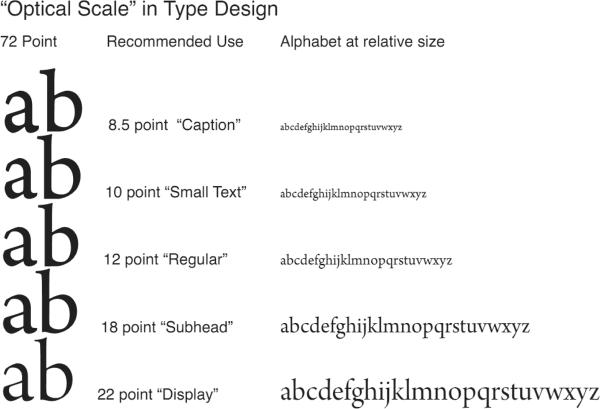
The size and shape of printed symbols determine the legibility of text. In this paper, we focus on print size because of its crucial role in understanding reading performance and its significance in the history and contemporary practice of typography. We present evidence supporting the hypothesis that the distribution of print sizes in historical and contemporary publications falls within the psychophysically defined range of fluent print size--the range over which text can be read at maximum speed. The fluent range extends over a factor of 10 in angular print size (x-height) from approximately 0.2° to 2°. Assuming a standard reading distance of 40 cm (16 inches), the corresponding physical x-heights are 1.4 mm (4 points) and 14 mm (40 points). We provide new data on the distributions of print sizes in published books and newspapers and in typefounders' specimens, and consider factors influencing these distributions. We discuss theoretical concepts from vision science concerning visual size coding that help inform our understanding of historical and modern typographical practices. While economic, social, technological, and artistic factors influence type design and selection, we conclude that properties of human visual processing play a dominant role in constraining the distribution of print sizes in common use.


Figures

Figure 1
Figure 1
(a) Three typefaces with the same body size but different x-height fractions (in parentheses), from left to right: Lucida Bright (0.53); Times Roman (0.45); Centaur (0.37). The letters are aligned at the base-line. The white “gaps” between ascenders or descenders and their respective guidelines are components of the body size. (b) Three versions of a typeface, Lucida Bright, with same x-height but different ascender-descender lengths, corresponding to the proportions of the three typefaces of Figure 1a. From left to right, the approximate body size progression is: 1.0; 1.17; 1.43.
Figure 1
Figure 1
(a) Three typefaces with the same body size but different x-height fractions (in parentheses), from left to right: Lucida Bright (0.53); Times Roman (0.45); Centaur (0.37). The letters are aligned at the base-line. The white “gaps” between ascenders or descenders and their respective guidelines are components of the body size. (b) Three versions of a typeface, Lucida Bright, with same x-height but different ascender-descender lengths, corresponding to the proportions of the three typefaces of Figure 1a. From left to right, the approximate body size progression is: 1.0; 1.17; 1.43.
Figure 2
Figure 2
Reading Speed (words per minute) vs. Print Size (x-height in degrees). Data are replotted from four experiments. Legge et al. (2007) used the RSVP method (open circles). The other three studies used scrolling text—filled circles (Legge et al., 1985, Matrix Sampling); filled squares (Legge et al., 1985, blur); and triangles (Akutsu et al, 1991). The data points are means across subjects. RSVP is known to yield much higher reading speeds than scrolling text, accounting for the vertical shift in the curve for Legge et al. (2007). See the text for more details.
Figure 3
Figure 3
Optical Scale. A digital typeface (Arno Pro) implemented as five fonts designed for printing at five different body sizes. The “caption” size (8.5 point body size and smaller) has a bigger x-height, greater width, thicker details, and looser spacing than the design for “display” body size (22 point and larger).
Figure 4
Figure 4
Measuring the Visual Span with the Trigram Method. Top: Illustrates schematically that trials consist of the presentation of trigrams, random strings of three letters, at specified letter positions left and right of fixation. Bottom: Example of a visual-span profile, in which letter recognition accuracy (% correct) is plotted as a function of letter position for data accumulated across a block of trials.
Figure 5
Figure 5
Frequency distributions of x-heights in hardcover novels, paperback novels, and daily newspapers. Distribution frequencies are shown as percentages, e.g., an x-height of 0.23° constitutes 47% of the hardcover novel sample.
Figure 6
Figure 6
Distribution of roman text sizes (x-heights) in books and type specimens from the 15th, 16th, and 18th centuries. 15th century Italian types cluster at the large end of the range, while 16th century French types span nearly the whole range, and 18th century English and French types extend the small end of the range.

References

    1. Arditi A. Typography, print legibility, and low vision. In: Cole R, Rosenthal B, editors. Remediation and Management of Low Vision. Mosby; St. Louis, MO: 1996. pp. 237–248.
    1. Akutsu H, Legge GE, Ross JA, Schuebel KJ. Psychophysics of reading. X. Effects of age-related changes in vision. J Gerontol. 1991;46(6):325–331. - PubMed
    1. Arnold E. Modern Newspaper Design. Harper & Row; New York: 1969.
    1. Bigelow C. Form, Pattern, & Texture in the Typographic Image. Fine Print. 1989;15(1)
    1. Bigelow C, Day D. Digital Typography. Scientific American. 1983;249(2):106–119.

Publication types