Statistical inference for multi-pathogen systems
- PMID: 21876665
- PMCID: PMC3158042
- DOI: 10.1371/journal.pcbi.1002135
Statistical inference for multi-pathogen systems
Abstract
There is growing interest in understanding the nature and consequences of interactions among infectious agents. Pathogen interactions can be operational at different scales, either within a co-infected host or in host populations where they co-circulate, and can be either cooperative or competitive. The detection of interactions among pathogens has typically involved the study of synchrony in the oscillations of the protagonists, but as we show here, phase association provides an unreliable dynamical fingerprint for this task. We assess the capacity of a likelihood-based inference framework to accurately detect and quantify the presence and nature of pathogen interactions on the basis of realistic amounts and kinds of simulated data. We show that when epidemiological and demographic processes are well understood, noisy time series data can contain sufficient information to allow correct inference of interactions in multi-pathogen systems. The inference power is dependent on the strength and time-course of the underlying mechanism: stronger and longer-lasting interactions are more easily and more precisely quantified. We examine the limitations of our approach to stochastic temporal variation, under-reporting, and over-aggregation of data. We propose that likelihood shows promise as a basis for detection and quantification of the effects of pathogen interactions and the determination of their (competitive or cooperative) nature on the basis of population-level time-series data.
Conflict of interest statement
The authors have declared that no competing interests exist.
Figures

 categorized according to their status with regards to the two pathogens. Letters
  ,
,  ,
,  , and
, and  stand for susceptible, infected, convalescent, and recovered, respectively. The horizontal arrows follow the progression of a host's infection due to the first pathogen, and the vertical arrows follow the progression of the second. The diagonal arrows represent disease independent births and deaths. The transitions denoted by red arrows are affected by pathogen interaction.
 of a period. The three points marked (I), (II) and (III) are distinct scenarios examined in our inference tests. Model parameters are as in Table 1, with
  .
.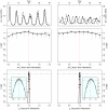
 ) [Middle] and the long term (
 ) [Bottom] interactions. In the insets, we show close-ups of the profiles near the peaks. Plotted
  are relative difference in the raw log-likelihood from the reference point set at
  , indicated by the horizontal dashed line.
  represents the 95% confidence interval–parameter values corresponding to a positive
  are within the confidence bound. The gray dots indicate the repeated likelihood estimates (
 replicate SMC calculations for each profile point,
  particles in each SMC calculation). The profiles are created by fitting a smooth line through the log of the arithmetic mean likelihoods (shown in black dots). The vertical red dashed line is plotted at the actual parameter value used to generate the simulated case-data. Parameters not shown in the graph are taken from Table 1.
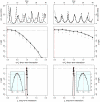
 ) [Middle] and the long term (
 ) [Bottom] interactions. In the insets, we show close-ups of the profiles near the peaks. Plotted
  are relative difference in the raw log-likelihood from the reference point set at
  , indicated by the horizontal dashed line.
  represents the 95% confidence interval – parameter values corresponding to a positive
  are within the confidence bound. The gray dots indicate the repeated likelihood estimates (
 replicate SMC calculations for each profile point,
  particles in each SMC calculation). The profiles are created by fitting a smooth line through the log of the arithmetic mean likelihoods (shown in black dots). The vertical red dashed line is plotted at the actual parameter value used to generate the simulated case-data. Parameters not shown in the graph are taken from Table 1.
 ) [Middle] and the long term (
 ) [Bottom] interactions. In the insets, we show close-ups of the profiles near the peaks. Plotted
  are relative difference in the raw log-likelihood from the reference point set at
  , indicated by the horizontal dashed line.
  represents the 95% confidence interval – parameter values corresponding to a positive
  are within the confidence bound. The gray dots indicate the repeated likelihood estimates (
 replicate SMC calculations for each profile point,
  particles in each SMC calculation). The profiles are created by fitting a smooth line through the log of the arithmetic mean likelihoods (shown in black dots). The vertical red dashed line is plotted at the actual parameter value used to generate the simulated case-data. Parameters not shown in the graph are taken from Table 1.
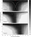
 loglik contours (strength of the short term interaction,
  , on the horizontal axis and the average duration of such interaction,
  , on the vertical axis) for (top to bottom) scenarios I, II, and III. The red cross indicates the actual parameter values. Darker contours correspond to parameter regions that have higher log-likelihood, and more consistent with the data. Solid white lines show the 95% confidence regions. Parameters as in Table 1.
 as the size of the data varies, in three different scenarios. Other parameters are taken from Table 1.
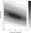
 loglik contours (strength of the long-term interaction,
  , on the horizontal axis and the reporting rate,
  , on the vertical axis). Marked in red crosses are the actual parameter values for
  and
and  . Darker contours correspond to parameter regions that have higher log-likelihood. Solid white lines show the 95% confidence regions. For this figure, short term interaction
  . Parameters not shown in the graph are taken from Table 1. See Fig. S3 in the supplementary information (Text S1) for the simulated data and corresponding profiles.
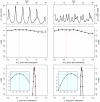
 ) [Middle] and the long term (
 ) [Bottom] interactions. In the insets, we show close-ups of the profiles near the peaks. Plotted
  are relative difference in the raw log-likelihood from the reference point set at
  , indicated by the horizontal dashed line.
  represents the 95% confidence interval – parameter values corresponding to a positive
  are within the confidence bound. The gray dots indicate the repeated likelihood estimates (
 replicate SMC calculations for each profile point,
  particles in each SMC calculation). The profiles are created by fitting a smooth line through the log of the arithmetic mean likelihoods (shown in black dots). The vertical red dashed line is plotted at the actual parameter value used to generate the simulated case-data. Parameters not shown in the graph are taken from Table 1.
References
-
- Anderson RM, May RM. Infectious Diseases of Humans; Dynamics and Control. Oxford: Oxford University Press; 1991.
-
- Grenfell B, Bjornstad O, Kappey J. Travelling waves and spatial hierarchies in measles epidemics. Nature. 2001;414:716–723. - PubMed
-
- Keeling M, Rohani P. Modelling Infectious Diseases. Princeton: Princeton University Press; 2008.
Publication types
MeSH terms
LinkOut - more resources
Full Text Sources
Medical

