. 2011 Sep 13:2:467.
doi: 10.1038/ncomms1467.

Genome-wide association mapping reveals a rich genetic architecture of complex traits in Oryza sativa

Affiliations

Genome-wide association mapping reveals a rich genetic architecture of complex traits in Oryza sativa

Keyan Zhao et al. Nat Commun. .

Abstract

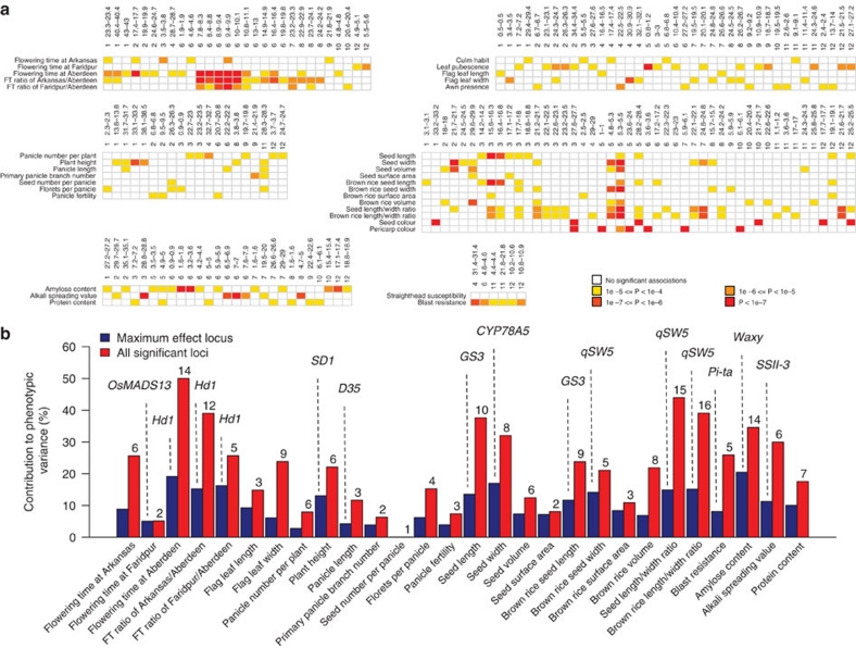
Asian rice, Oryza sativa is a cultivated, inbreeding species that feeds over half of the world's population. Understanding the genetic basis of diverse physiological, developmental, and morphological traits provides the basis for improving yield, quality and sustainability of rice. Here we show the results of a genome-wide association study based on genotyping 44,100 SNP variants across 413 diverse accessions of O. sativa collected from 82 countries that were systematically phenotyped for 34 traits. Using cross-population-based mapping strategies, we identified dozens of common variants influencing numerous complex traits. Significant heterogeneity was observed in the genetic architecture associated with subpopulation structure and response to environment. This work establishes an open-source translational research platform for genome-wide association studies in rice that directly links molecular variation in genes and metabolic pathways with the germplasm resources needed to accelerate varietal development and crop improvement.


Figures

Figure 1
Figure 1. Population structure in O. sativa.
(a) The large pie chart summarizes the distribution of subpopulations in the 413 O. sativa samples in our diversity panel, and the smaller pie charts on the world map correspond to the country-specific distribution of subpopulations sampled (note: large countries such as China, India and the US were divided into several major rice growing regions). The size of the pie chart is proportional to the sample size and colours within each pie chart are reflective of the percentage of samples in each subpopulation. Seeds representing each subpopulation are displayed with and without hull in the centre, with 1 cm scale bar. (b) Principal component analysis was used to provide a statistical summary of the genetic data, and the top four principle components are illustrated in the bottom panels.
Figure 2
Figure 2. Identity by State and phenotypic variation among subpopulations.
(a) Individuals are ordered according to their genotypic distance (1-IBS, identified by state) clustering with the tree shown on the right. The upper diagonal shows the IBS-sharing between individuals (values rescaled from 0 to 1). The lower diagonal shows the individual correlation coefficients based on all phenotypes. Coloured bars along the bottom of the panel reflect the sample subpopulation assignment as labelled; dark colour within each subpopulation indicates admixed individuals. (b) Summary of phenotypic distributions among all individuals, with phenotypes grouped by trait category and individuals grouped by subpopulation as in (a).
Figure 3
Figure 3. Phenotypic distribution and genome-wide association scan for plant height.
(a) Quantile–Quantile plots for both naïve and mixed model for plant height in all samples. (b) Boxplot showing the differences in plant height among subpopulations. Box edges represent the upper and lower quantile with median value shown as bold line in the middle of the box. Whiskers represent 1.5 times the quantile of the data. Individuals falling outside the range of the whiskers shown as open dots. (c) Histogram of plant height in all samples. Dashed black line represents the null distribution. (d) Genome-wide P-values from the mixed model and naïve method. x axis shows the SNPs along each chromosome; y axis is the −log10 (P-value) for the association. Coloured dots in (a) and (c) indicate SNPs with P-values <1×10⁻⁴ in the mixed model and the top 50 SNPs in the naïve method; SNPs within 200 kb range of known genes are in red; other significant SNPs are in blue. Candidate gene locations shown as red vertical dashed lines with names on top.
Figure 4
Figure 4. Genetic heterogeneity of panicle length across subpopulations.
(a) Histogram showing distribution of panicle length across the diversity panel and boxplot showing differences in panicle length among subpopulations. In boxplot, the box edges represent the upper and lower quantile with median value shown as bold line in the middle of the box. Whiskers represent 1.5 times the quantile of the data. Individuals outside of the range of the whiskers shown as open dots. (b) Genome-wide P-values from the mixed model for panicle length for all 413 accessions in top panel (all), and for tropical japonica, temperate japonica, indica and aus subpopulations individually in subsequent panels. Note: the aromatic subpopulation was not included because of the small sample size. X-axis indicates the SNP location along the 12 chromosomes; y axis is the −log10 (P value) from each method. Coloured dots indicate SNPs with P-values <1×10⁻⁴ in the mixed model; SNPs within 200 kb range of known genes are in red; other significant SNPs are in blue. Candidate genes near peak SNP regions known to be previously associated with panicle, stem and internode elongation in rice are shown along the top.
Figure 5
Figure 5. Genome-wide association scan for flowering time.
(a) Genome-wide P-values from the mixed model for flowering time in three geographic locations are shown in the three panels. Association analysis in each subpopulation is shown in each row of the matrix. X axis indicates the SNP location along the 12 chromosomes, with chromosomes separated by vertical grey lines; y axis is the −log10 (P value) from each method. Candidate genes previously shown to determine flowering time near peak SNPs are shown along the top, rice genes are in red, Arabidopsis homologues are in black. SNPs with P value <1×10⁻⁴ are indicated by coloured dots. SNPs within 200 kb range of known rice flowering time genes are in red; SNPs within 200 kb range of Arabidopsis flowering-time homologues are in magenta; other significant SNPs are in blue. (b) GWAS regions associated with photoperiod sensitivity, calculated as the ratio of days-to-flowering across pairs of environments.
Figure 6
Figure 6. Summary of trait associations across genomic regions and percentage of variance explained by significant locus.
(a) Each row represents a trait, and each column corresponds to a genomic region containing multiple SNPs that are significantly associated with a trait. Significance is colour-coded based on the P value of the association. (b) The x axis represents the trait, the y axis shows the contribution (%) of significant loci. Candidate genes detected within 200 Kb region of significant loci are labelled on top of the maximum effect locus.

References

    1. Toriyama K., Heong K. L. & Hardy B. Rice is Life: Scientific Perspectives for the 21st Century: Proceedings of the World Rice Research Conference, Tsukuba, Japan (International rice research institute, 2005).
    1. Greenland D. J. The Sustainability of Rice Farming (Cab International, 1997).
    1. Goff S. A. et al.. A draft sequence of the rice genome (Oryza sativa L. ssp. japonica). Science 296, 92–100 (2002). - PubMed
    1. Yu J. et al.. A draft sequence of the rice genome (Oryza sativa L. ssp. indica). Science 296, 79–92 (2002). - PubMed
    1. Huang X. et al.. Genome-wide association studies of 14 agronomic traits in rice landraces. Nat. Genet. 42, 961–967 (2010). - PubMed

Publication types