. 2012 Feb 15;59(4):3227-42.
doi: 10.1016/j.neuroimage.2011.11.004. Epub 2011 Nov 9.

Along-tract statistics allow for enhanced tractography analysis

Affiliations

Along-tract statistics allow for enhanced tractography analysis

John B Colby et al. Neuroimage. .

Abstract

Diffusion imaging tractography is a valuable tool for neuroscience researchers because it allows the generation of individualized virtual dissections of major white matter tracts in the human brain. It facilitates between-subject statistical analyses tailored to the specific anatomy of each participant. There is prominent variation in diffusion imaging metrics (e.g., fractional anisotropy, FA) within tracts, but most tractography studies use a "tract-averaged" approach to analysis by averaging the scalar values from the many streamline vertices in a tract dissection into a single point-spread estimate for each tract. Here we describe a complete workflow needed to conduct an along-tract analysis of white matter streamline tract groups. This consists of 1) A flexible MATLAB toolkit for generating along-tract data based on B-spline resampling and compilation of scalar data at different collections of vertices along the curving tract spines, and 2) Statistical analysis and rich data visualization by leveraging tools available through the R platform for statistical computing. We demonstrate the effectiveness of such an along-tract approach over the tract-averaged approach in an example analysis of 10 major white matter tracts in a single subject. We also show that these techniques easily extend to between-group analyses typically used in neuroscience applications, by conducting an along-tract analysis of differences in FA between 9 individuals with fetal alcohol spectrum disorders (FASDs) and 11 typically-developing controls. This analysis reveals localized differences between FASD and control groups that were not apparent using a tract-averaged method. Finally, to validate our approach and highlight the strength of this extensible software framework, we implement 2 other methods from the literature and leverage the existing workflow tools to conduct a comparison study.


Figures

Figure 1
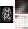
Figure 1. FA variations throughout the brain
Fractional anisotropy (FA) varies widely throughout the white matter, with values ranging from below 0.2 at the transition to gray matter near the cortex (top breakout panel), to greater than 0.8 in tightly coherent fiber bundles like the midline corpus callosum (bottom breakout panel).
Figure 2
Figure 2. Along-tract variations in the human brain and the Los Angeles highway system
(Top panel) Deterministic tractography dissection of the left corticospinal tract in one individual. Color is used to encode FA variations along the tract. (Bottom panel) Highway map of Los Angeles, CA. Color is used to encode traffic speed.
Figure 3
Figure 3. B-spline based resampling
(A) Raw deterministic tractography streamlines are difficult to analyze along their length due to differing numbers of vertices, and non-uniform spatial sampling. To address this, the raw streamlines can be re-parameterized using cubic B-spline curves (B), and then resampled to allow for a straightforward analysis at different tract “cross-sections” (C). (D) Streamline processing for an example tract group (left corticospinal tract) derived from actual data. The streamlines are first reoriented so that their origins (red points) are near a common tract terminus, and then resampled to allow for comparison across streamlines at different cross-sections (dotted lines, right).
Figure 4
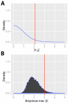
Figure 4. Correcting for multiple comparisons
(A) Theoretical probability density function and p<0.05 critical value for a single two-tailed t-test with 18 degrees of freedom. (B) The empirical null distribution of the maximum test statistic across the many along-tract comparisons from an example analysis. The p<0.05 critical value has been shifted appropriately to control the family-wise error rate (i.e. the chance of any false positives across all of the multiple comparisons).
Figure 5
Figure 5. Single subject along-tract analysis
The raw streamlines (left panels), mean tract geometries (middle panels), and along-tract variations in FA (right panels) are displayed for 10 major white matter tracts in the human brain. In the two streamline views, color is used to encode variation in FA. In the along-tract plots, FA is plotted versus position from tract origin (designated as the side of the tract near the red star in the streamline views; see also Table 1). The distribution of individual streamlines is shown in the background (black lines; transparency and slight x-axis jitter used to control overplotting). Overlaid is the along-tract cross-sectional mean FA (blue; ± pointwise standard deviation). Also included is the standard tract-averaged point-spread estimate (red).
Figure 6
Figure 6. Between-group along-tract analysis in fetal alcohol exposure
FA is plotted versus position from tract origin, with plots faceted by tract name and hemisphere, and colored according to group membership (Control or FASD). Along-tract estimates from individual subjects are displayed semi-transparently in the background (line width encodes the relative number of streamlines), and are overlaid with locally weighted smooth estimates of the group means (± pointwise 95% confidence range). The number of streamlines in each tract (± pointwise 95% confidence interval) is also included in an accompanying panel at right.
Figure 7
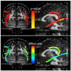
Figure 7. Visualization of between-group results
Statistical results are displayed on the mean tract geometry of one representative subject. (A) p-value map (yellow color indicates regions of significant effects (p<0.05, corrected). (B) Effect size map (cooler colors represent regions of decreased FA in FASD subjects).
Figure 8
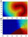
Figure 8. Distance map method (2-dimensional)
Euclidean distances are calculated from each point on a grid to each point on the prototype fiber, and used to generate a minimum distance map (A) and corresponding label map (B) matching regions of the grid to different points on the prototype. This lookup table can then be used for rapid processing of multiple fibers that share the same prototype (Maddah et al., 2008).
Figure 9
Figure 9. Correspondence plots
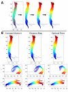
Streamlines are colored by vertex index, highlighting which vertices have assigned correspondence and will be grouped together for the analysis (i.e. all vertices with the same dark blue hue will be grouped together, etc.). (A) Left corticospinal tract, after 1) import of raw streamlines, 2) reorientation of streamlines toward a common origin, 3) resampling of streamlines to have the same number of vertices, and 4) automatic prescription of an additional interior point of correspondence. (B) Comparison of 3 different correspondence schemes (columns; Constant Vertex #, Distance Map, Optimal Point), for 3 different tract files (rows; left corticospinal tract, left arcuate fasciculus, left inferior longitudinal fasciculus). The mean tract geometry (i.e., the prototype fiber) is also plotted, and is visible where not obscured by the other fibers.
Figure 10
Figure 10. Along-tract plots using different correspondence schemes
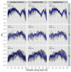
FA is plotted versus position from tract origin (similar to Fig. 5). The distribution of individual streamlines is shown in the background (black lines; transparency and slight x-axis jitter used to control overplotting). Overlaid is the along-tract cross-sectional mean FA (blue; ± pointwise standard deviation). Plots are annotated with number of streamlines (n), and transparency value used (alpha). As in Fig. 9, these plots are facetted into a 3×3 grid of different correspondence schemes (columns), and tracts (rows).
Figure 11
Figure 11. Comparison of resampling strategies
(A,B) Streamlines resampled with a constant number of vertices, but variable spacing, and pinned together at either end (tract origins designated by the gray groupings of vertices). (C,D) Streamlines resampled with variable numbers of vertices, but constant spacing, and pinned together at the midpoint of the mean tract geometry.

References

    1. Adluru N, Hinrichs C, Chung MK, Lee J-E, Singh V, Bigler ED, Lange N, Lainhart JE, Alexander AL. Classification in DTI using shapes of white matter tracts. Conf. Proc. IEEE Eng. Med. Biol. Soc. 2009;2009:2719–22. - PMC - PubMed
    1. Alexander DC, Pierpaoli C, Basser PJ, Gee JC. Spatial transformations of diffusion tensor magnetic resonance images. IEEE Trans. Med. Imaging. 2001;20:1131–9. - PubMed
    1. Aron AR, Behrens TE, Smith S, Frank MJ, Poldrack RA. Triangulating a cognitive control network using diffusion-weighted magnetic resonance imaging (MRI) and functional MRI. J. Neurosci. 2007;27:3743–52. - PMC - PubMed
    1. Arsigny V, Fillard P, Pennec X, Ayache N. Log-Euclidean metrics for fast and simple calculus on diffusion tensors. Magn. Reson. Med. 2006;56:411–21. - PubMed
    1. Asato MR, Terwilliger R, Woo J, Luna B. White matter development in adolescence: A DTI study. Cereb. Cortex. 2010;20:2122–31. - PMC - PubMed

Publication types