

Temporal patterns of happiness and information in a global social network: hedonometrics and Twitter
- PMID: 22163266
- PMCID: PMC3233600
- DOI: 10.1371/journal.pone.0026752
Temporal patterns of happiness and information in a global social network: hedonometrics and Twitter
Abstract
Individual happiness is a fundamental societal metric. Normally measured through self-report, happiness has often been indirectly characterized and overshadowed by more readily quantifiable economic indicators such as gross domestic product. Here, we examine expressions made on the online, global microblog and social networking service Twitter, uncovering and explaining temporal variations in happiness and information levels over timescales ranging from hours to years. Our data set comprises over 46 billion words contained in nearly 4.6 billion expressions posted over a 33 month span by over 63 million unique users. In measuring happiness, we construct a tunable, real-time, remote-sensing, and non-invasive, text-based hedonometer. In building our metric, made available with this paper, we conducted a survey to obtain happiness evaluations of over 10,000 individual words, representing a tenfold size improvement over similar existing word sets. Rather than being ad hoc, our word list is chosen solely by frequency of usage, and we show how a highly robust and tunable metric can be constructed and defended.
Conflict of interest statement
Figures
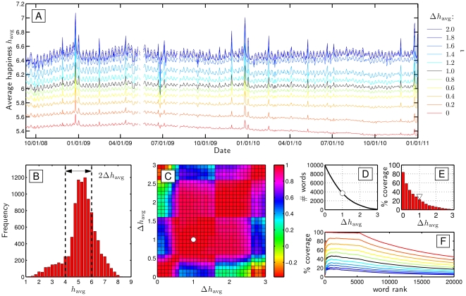
 as indicated in plot B, which shows the overall distribution of average happiness of individual words. For
  we use all words; as
  increases, we progressively remove words centered around the neutral evaluation of 5. Plot C provides a test for robustness through a pairwise comparison of all time series using Pearson's correlation coefficient. For
  , the time series show very strong mutual agreement. We choose
  (black curve in A and F, shown in B, white symbols in C, D, and E) for the present paper because of its excellent correlation in output with that of a wide range of
  , and for reasons concerning the following trade-offs. In A, we see that as the number of stop words increases, so does the variability of the time series, suggesting an improvement in instrument sensitivity. However, at the same time, we lose coverage of texts. Plot D first shows how the number of individual words for which we have evaluations decreases as
  increases. For
  , we have 3,686 individual words down from 10,222. Plot E next shows the percentage of the Twitter data set covered by each word list, accounting for word frequency; for
  , our metric uses 22.7% of all words. Lastly, in plot F (which uses plot A's legend), we show how coverage of words decreases with word rank. When
  , we incorporate all low rank words, with a decline beginning at rank 5,000. For
  , we see similar patterns with the maximum coverage declining; for
  , we see a maximum coverage of approximately 50%.
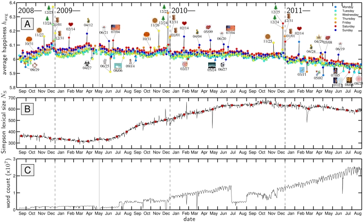
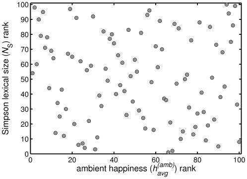
 as a function of date using Simpson's concentration as the base entropy measure (solid gray line; see Sec. 3). The red squares with the dashed line show
  as a function of calendar month. C. The number of words extracted from all tweets as a function of date for which we used evaluations from Mechanical Turk. For both the happiness and Simpson lexical size plots, we omit dates for which we have less than 1000 words with evaluations.
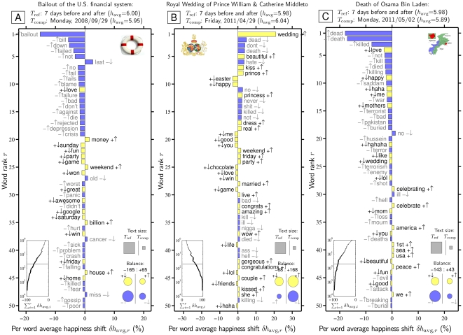
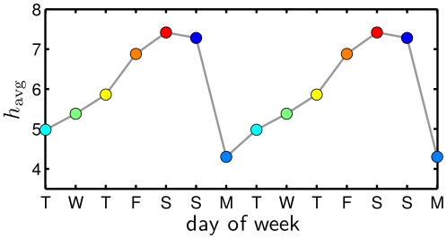
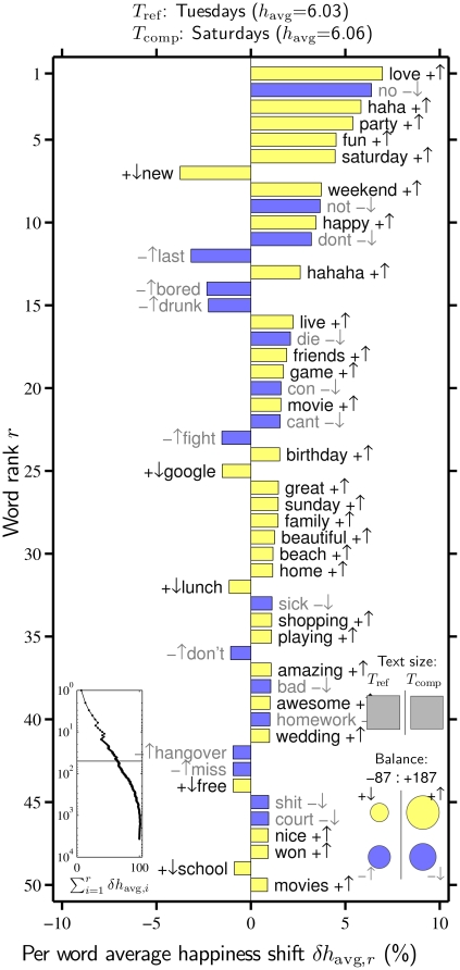
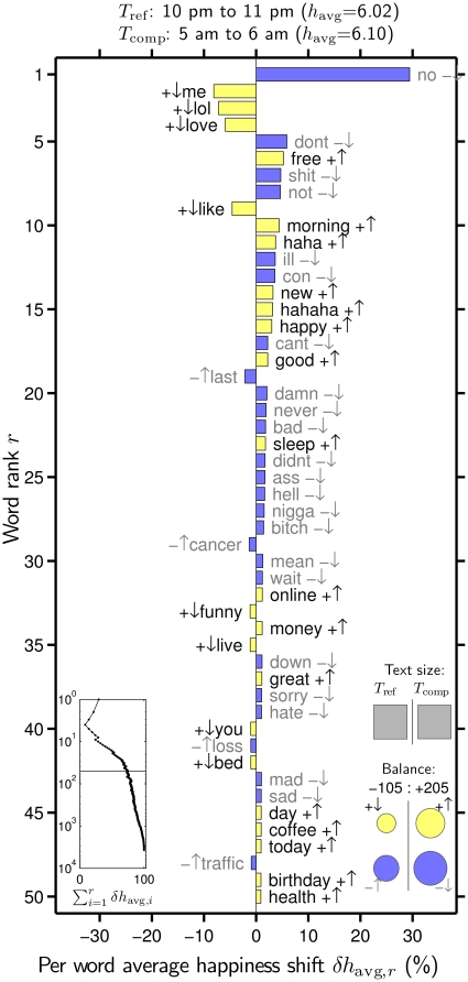
 . The background 14 days are set as the reference text (
 ) and the individual dates as the comparison text (
 ). How individual words contribute to the shift is indicated by a pairing of two symbols:
  shows the word is more/less happy than
  as a whole, and
  shows that the word is more/less relatively prevalent in
  than in
  . Black and gray font additionally encode the
  and
and  distinction respectively. The left inset panel shows how the ranked 3,686 labMT 1.0 words (Data Set S1) combine in sum (word rank
  is shown on a log scale). The four circles in the bottom right show the total contribution of the four kinds of words (
 ,
, 
 ,
, 
 ,
, 
 ). Relative text size is indicated by the areas of the gray squares. See Eqs. 2 and 3 and Sec. 4.2 for complete details.
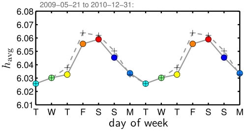
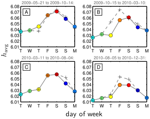
 for individual dates Fig. 3B, again excluding dates shown in Fig. 3A, and then average these values. (See also Fig. S20 for the effects of alternate approaches.)
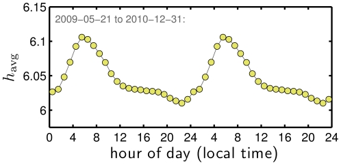
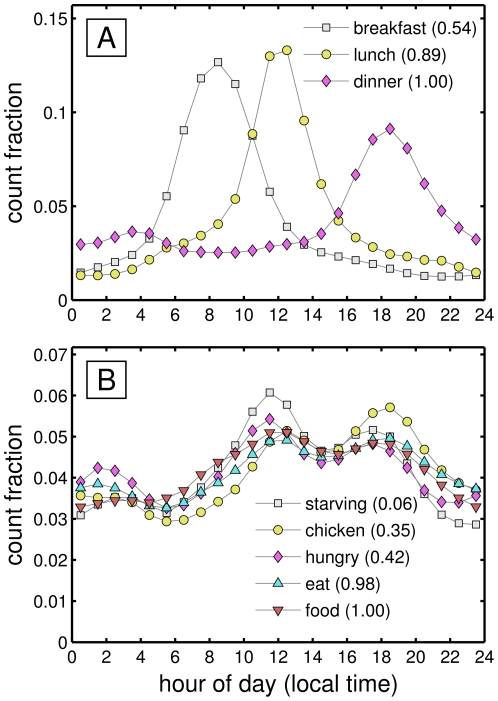
 between 10 and 11 pm to a high of
  between 5 and 6 am.
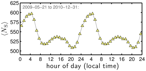
 throughout the day under alternate averaging schemes.
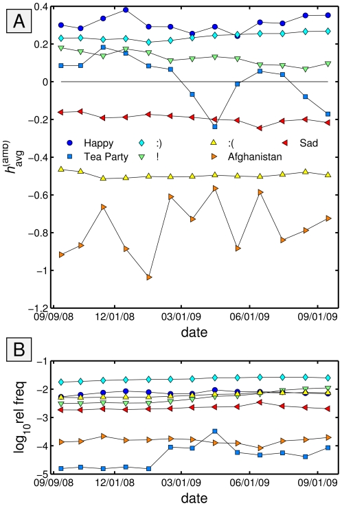
 (
( -value
  ).
).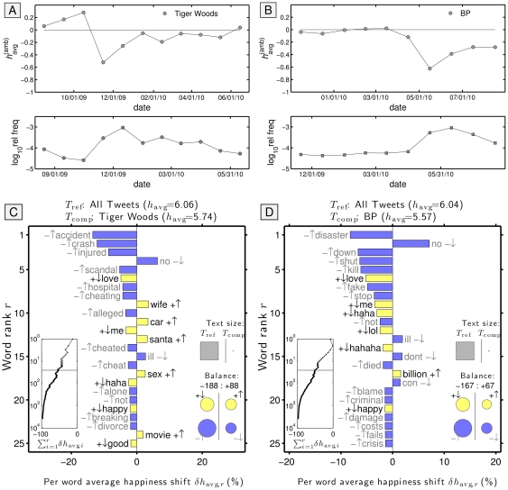
 for all words co-occurring in tweets containing that keyword, with the overall trend for all tweets subtracted. The word shift graphs are for tweets made during the worst month and the ensuing one–November and December, 2009 for ‘Tiger Woods’ and May and June, 2010 for ‘BP’.
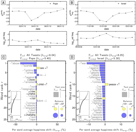
References
-
- Hedström P. Experimental macro sociology: Predicting the next best seller. Science. 2006;311:786–786. - PubMed
-
- Bell G, Hey T, Szalay A. Computer Science: Beyond the Data Deluge. Science. 2009;323:1297–1298. - PubMed
-
- Halevy A, Norvig P, Pereira F. The unreasonable effectiveness of data. IEEE Intelligent Systems. 2009;24:8–12.
-
- Hey T, Tansley S, Tolle K, editors. The Fourth Paradigm: Data-Intensive Scientific Discovery. Redmond, WA: Microsoft Research; 2009.
-
- Collins JP. Sailing on an ocean of 0 s and 1 s. Science Magazine. 2010;327:1455–1456.
Publication types
MeSH terms
LinkOut - more resources
Full Text Sources
Other Literature Sources
