. 2011:2011:5975490.
doi: 10.1109/ICORR.2011.5975490.

Limit-push training reduces motor variability

Affiliations

Limit-push training reduces motor variability

Ian Sharp et al. IEEE Int Conf Rehabil Robot. 2011.

Abstract

Variability in human motor control has been a long observed phenomenon, which has come to be known by some as repetition without repetition. There are several explanations for this. One such explanation asserts that many equally optimal solutions exist for accomplishing the same task that naturally allows choices in how it can be successfully executed. The aim of this study was to determine whether variability could be conditioned within an invisible subspace, using visual and force feedback. We utilized a novel haptic-graphic boundary-oriented environment to condition motor variability. Subjects reduced the variability of their movements, such that action predominated within a subspace determined apriori; while the untreated group did not. These results show encouraging preliminary evidence that neural rehabilitative haptic-graphic interfaces can condition human motor variability. This type of training may benefit neurologically impaired individuals, who exhibit the commonly seen motor deficits of large trial to trial variability, such as victims of stroke and traumatic brain injury.


Figures

Fig. 1.
Fig. 1.
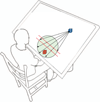
Subject seated at the haptic/graphic apparatus. The red cube represents the subjects hand. The blue cube represents the projectile. Vectors from the blue cube represent possible launch directions of the projectile (always intersection the green workspace). The two dotted red parallel lines were not visible to the subject and represent the boundary region. This image is not drawn to scale.
Fig. 2.
Fig. 2.
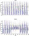
The control group is on the top subplot while the treatment group is on the bottom subplot. Each colored dot represents a different subject. The location of the dot shows where the subject’s came closest to contacting the projectile. The two horizontal lines display the location of the boundary. Blue semi-transparent histograms are overlayed on top of the raw data to display the movement distribution of the group along the anterior axis. The baseline phase is located within trials 1 to 200, the training phase is located within trials 201 to 400, and the washout phase is located within trials 401 to 600.
Fig. 3.
Fig. 3.
Displays the point of closest contact in the XZ plane (view from above). The rectangle in each phase displays the safety region that treatment subjects were attempting to stay inside of while performing the task. Note that feedback was not delivered to the treatment subjects at the end of baseline, onset of washout, or end of washout.
Fig. 4.
Fig. 4.
Four different views of how Limit-push changes movement. a. Distance-to-edge. Displays the average distance-to-edge of the boundary at the closest point of interception. The treatment group moves farther from the edge by the end of training. b. Distance-to-center. Displays the average distance-to-center of the boundary at the closest point of interception. The treatment group moves closer to the center by the end of training. c. Fraction of time spent outside boundary. Displays what percentage of the movement was spent outside of the boundaries of the boundary. The treatment group spent more time inside the boundary by the end of training. d. Mean time-to-edge. Displays the average time-to-edge for each phase. The treatment group has an increased time-to-edge by the end of training. Asterisks show significance at p < = 0.05.
Fig. 5.
Fig. 5.
Movement distributions of uniformity and normality change over the course of training. a. Each box and whisker plot displays the distribution of each subjects normalized entropy. The dotted horizontal line at the top represents the normalized differential entropy of a uniform distribution, and the dotted horizontal line at the bottom represents the normalized differential entropy of a normal distribution with a variance equal to the width of the region. b. Each box and whisker plot displays the mean squared error of the best-fit of a normal distribution for each subject’s movement distribution. c. Each box and whisker plot displays the mean squared error of the best-fit of a uniform distribution for each subject’s movement distribution.

References

    1. Byl NN, Merzenich MM, Cheung S, Bedenbaugh P, Nagarajan SS, and Jenkins WM A primate model for studying focal dystonia and repetitive strain injury: effects on the primary somatosensory cortex. Physical therapy, 77(3):269, 1997. - PubMed
    1. Churchland MM, Afshar A, and Shenoy KV A central source of movement variability. Neuron, 52(6):1085–1096, 2006. - PMC - PubMed
    1. Fasoli SE, Krebs HI, Stein J, Frontera WR, and Hogan N Effects of robotic therapy on motor impairment and recovery in chronic stroke. Archives of physical medicine and rehabilitation, 84(4):477–482, 2003. - PubMed
    1. Fitts PM The information capacity of the human motor system in controlling the amplitude of movement. J of. - PubMed
    1. Izenman AJ Recent developments in nonparametric density estimation. Journal of the American Statistical Association, 86(413):205–224, 1991.