. 2012;7(1):e30136.
doi: 10.1371/journal.pone.0030136. Epub 2012 Jan 19.

Statistical inference for valued-edge networks: the generalized exponential random graph model

Affiliations

Statistical inference for valued-edge networks: the generalized exponential random graph model

Bruce A Desmarais et al. PLoS One. 2012.

Abstract

Across the sciences, the statistical analysis of networks is central to the production of knowledge on relational phenomena. Because of their ability to model the structural generation of networks based on both endogenous and exogenous factors, exponential random graph models are a ubiquitous means of analysis. However, they are limited by an inability to model networks with valued edges. We address this problem by introducing a class of generalized exponential random graph models capable of modeling networks whose edges have continuous values (bounded or unbounded), thus greatly expanding the scope of networks applied researchers can subject to statistical analysis.


Conflict of interest statement

Competing Interests: The authors have declared that no competing interests exist.

Figures

Figure 1
Figure 1. Bivariate distributions for edges in a two-vertex di-graph.
(c) The darker the shading, the higher the relative likelihood of a point. In this example, formula image 
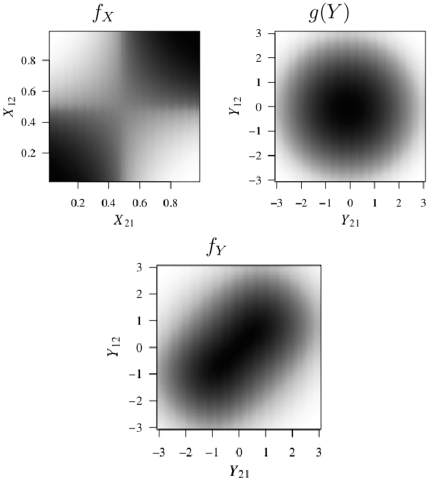
is the standard normal PDF (b), and formula image (a) is defined by formula image, and formula image, representing negative density and positive reciprocity effects.
Figure 2
Figure 2. Estimation by iterative MLE-MCMC-MLE.
Figure 3
Figure 3. The increases and decreases in year-to-year migration.
The upper-left and upper-right plots respectively show the largest 5% of decreases and increases from one state to another; the width of the line corresponds to the magnitude of the exodus. The lower-left and lower-right plots display the states with the highest total number of citizens leaving and the highest total number of citizens arriving respectively. These data are available at http://www.census.gov/population/www/socdemo/state-to-state.html.
Figure 4
Figure 4. Dependence statistics in a 25 vertex network
formula image with a standard normal formula image 
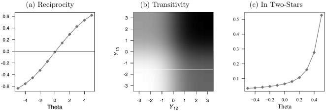
. The Y-axis in (a) is the Pearson's correlation coefficient between edges in a dyad. The transitivity graphic in (b) is shaded to reflect the mean value of formula image, with darker values indicating higher values. The parameter value is set to 1. The Y-axis in plot (c) depicts the variance in the in-degrees across vertices.
Figure 5
Figure 5. Estimates of the parameters for covariates (cell a) and dependence terms (cell b).
The coefficients are depicted as points whose values are captured by their location on the x-axis. The bars spanning from each point are 95% confidence intervals based on 5,000 draws for three iterations used in the MCMC-MLE. Confidence intervals not including zero are statistically significant at the traditional 0.05 level. Points and lines in black refer to our Cauchy GERGM, those in grey refer to the CRM.
Figure 6
Figure 6. MCMC-based Degeneracy Diagnostics.
Plots depict diagnostics for the GERGM results reported in Figure 5. Diagnostics are computed on three Markov Chains of 500,000 networks each, constructed via 500,000 iterations of a Gibbs sampler in which a complete network is drawn in each iteration. Each chain is started at a network with highly dispersed start values drawn from a U-shaped distribution on the unit interval, followed by a burn-in of 10,000 iterations. Panels (a.1)–(a.3) give the trace plots of the chains by iteration. The dark gray lines track the mean edge value and the light gray lines track the 95% confidence interval around the mean. Panel (b) gives the histogram of the Gelman-Rubin diagnostic of whether the three chains converged to the same stationary distribution, over all 2,550 directed edges in the migration network. Panels (c.1)–(c.3) give normal quantile plots, which compare the distribution of the Geweke time serial convergence diagnostic over the edges within each chain to the null standard normal distribution (i.e., the distribution implied by the null hypothesis of a chain in convergence). Note: the R package coda was used to compute the Geweke and Gelman-Rubin diagnostics.
Figure 7
Figure 7. Dependence Feature Prediction.
The boxplots represent the respective dependence statistic computed on 1,000 instances of the latent intensity network drawn from each model. Horizontal colored bars are placed at the statistic computed on the estimated intensity network.

References

    1. Cerami E, Demir E, Schultz N, Taylor BS, Sander C. Automated network analysis identifies core pathways in glioblastoma. PLoS ONE. 2010;5:e8918. - PMC - PubMed
    1. Madi A, Kenett DY, Bransburg-Zabary S, Merbl Y, Quintana FJ, et al. Network theory analysis of antibody-antigen reactivity data: The immune trees at birth and adulthood. PLoS ONE. 2011;6:e17445. - PMC - PubMed
    1. Vass JK, Higham DJ, Mudaliar MAV, Mao X, Crowther DJ. Discretization provides a conceptually simple tool to build expression networks. PLoS ONE. 2011;6:e18634. - PMC - PubMed
    1. Karrer B, Newman MEJ. Stochastic blockmodels and community structure in networks. Phys Rev E. 2010;83 - PubMed
    1. Karrer B, Newman M. Random graph models for directed acyclic networks. Phys Rev E. 2009;80:1–14. - PubMed

Publication types