. 2012 Apr;190(4):1533-45.
doi: 10.1534/genetics.111.137075. Epub 2012 Jan 31.

A test for selection employing quantitative trait locus and mutation accumulation data

Affiliations

A test for selection employing quantitative trait locus and mutation accumulation data

Daniel P Rice et al. Genetics. 2012 Apr.

Abstract

Evolutionary biologists attribute much of the phenotypic diversity observed in nature to the action of natural selection. However, for many phenotypic traits, especially quantitative phenotypic traits, it has been challenging to test for the historical action of selection. An important challenge for biologists studying quantitative traits, therefore, is to distinguish between traits that have evolved under the influence of strong selection and those that have evolved neutrally. Most existing tests for selection employ molecular data, but selection also leaves a mark on the genetic architecture underlying a trait. In particular, the distribution of quantitative trait locus (QTL) effect sizes and the distribution of mutational effects together provide information regarding the history of selection. Despite the increasing availability of QTL and mutation accumulation data, such data have not yet been effectively exploited for this purpose. We present a model of the evolution of QTL and employ it to formulate a test for historical selection. To provide a baseline for neutral evolution of the trait, we estimate the distribution of mutational effects from mutation accumulation experiments. We then apply a maximum-likelihood-based method of inference to estimate the range of selection strengths under which such a distribution of mutations could generate the observed QTL. Our test thus represents the first integration of population genetic theory and QTL data to measure the historical influence of selection.


Figures
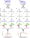
Figure 1
Figure 1
A depiction of our approach toward characterizing the neutral or selected evolution of phenotype based on mutation accumulation and quantitative trait locus data for a phenotype. (A) A constructed example of phenotypic change due to unbiased mutation within seven mutation accumulation lines. (B) A constructed example of phenotypic change due to downwardly biased mutation within seven mutation accumulation lines. (C and D) The distribution of mutational effects inferred from A. (E and F) The distribution of mutational effects inferred from B. (G and I) A depiction of a probability of fixation of novel mutations that is invariant across potential phenotypic values. (H and J) A depiction of probability of fixation of novel mutations that increases with the phenotypic value. (K) The product of the functions depicted in C and G: in this case, a symmetrical distribution of fixed mutations with a zero mode. (L) The product of D and H: in this case, an asymmetrical distribution of fixed mutations with a positive mode and positive skewness. (M) The product of the functions depicted in I and M: in this case, a symmetrical distribution with a negative mode. (N) The product of the functions depicted in F and J: in this case, an asymmetrical distribution with a zero mode and positive skewness. (O) An example of a single sample of mutations (outlines) drawn from the distribution depicted in K, compared to the experimentally observed positive and negative QTL (shaded bars): in this case, the sample matched the QTL well. (P) An example of a single sample of mutations (outlines) drawn from the distribution depicted in L, compared to the experimentally observed positive and negative QTL (shaded bars): in this case, the sample matched the positive QTL fairly well, but matched the negative QTL poorly. (Q) An example of a single sample of mutations (outlines) drawn from the distribution in M, compared to the experimentally observed positive and negative QTL (shaded bars): in this case, the sample matched the positive QTL poorly, but matched the negative QTL fairly well. (R) An example of a single sample of mutations (outlines) drawn from the distribution in N, compared to the experimentally observed positive and negative QTL (shaded bars): in this case, the sample matched the positive and negative QTL well. The mutations drawn here “happen” to exactly match the QTL effects depicted in O, but in fact sampling from the fixed mutation distribution is highly stochastic and requires numerically integrating over many samples to accurately yield the likelihood that the fixed mutation distribution underlies the experimentally observed QTL. (S) A plot of the likelihood across a range of values of the strength of selection: in this case, samples drawn from the distribution in K are identified as fitting better than samples drawn from the distribution in L, indicating neutral evolution of the phenotype. Parts of the plot that lie above the dashed line correspond to a 95% CI. The plot at the y-axis corresponds to neutrality and falls within the CI, so we cannot reject a hypothesis of selective neutrality for this phenotype. (T) A plot of the likelihood across a range of values of the strength of selection: in this case, samples drawn from the distribution in N are identified as fitting better than samples drawn from the distribution in M, indicating evolution of the phenotype driven by natural selection. The plot at the y-axis corresponds to neutrality and falls outside the CI, so we can reject a hypothesis of selective neutrality for this phenotype and estimate that the strength of selection corresponds to the level of selection identified by the peak of the plot.
Figure 2
Figure 2
Frequency distribution of changes in bristle traits during mutation accumulation. (A) Change in sternopleural bristle number between measurements in a mutation accumulation experiment by Paxman (1957). Six lines of D. melanogaster were raised in unselective conditions in which they were subjected to population bottlenecks for 40 generations. The mean sternopleural bristle number was assayed five times over the course of the experiment. (B) Change in abdominal bristle number in a mutation accumulation experiment by Lopez and Lopez-Fanjul (1993). Ninety-three mutation-accumulation lines of D. melanogaster were maintained for 61 generations and then assayed for mean abdominal bristle number.
Figure 3
Figure 3
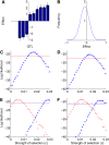
Selection in the HST population. (A) The effects and standard errors of sternopleural bristle QTL detected in the HST population selected for high sternopleural bristle number. (B) The maximum-likelihood estimate of the distribution of mutational effects for sternopleural bristles. (C) Log likelihood vs. c, the strength of selection, given the HST QTL data and the maximum-likelihood distribution of mutational effects. The horizontal line indicates the likelihood threshold for a 95% confidence interval. (D) Log likelihood vs. c, given the HST QTL data plus four imputed unobserved loci. (E) Log likelihood vs. c, given the HST QTL data, with the estimate of μ perturbed by adding 1 SD (crosses, dashed threshold line) and subtracting 1 SD (circles, solid threshold line). (F) Log likelihood vs. c given the HST QTL data, with the estimate of σ perturbed by adding 1 SD (crosses, dashed threshold line) and by subtracting 1 SD (circles, solid threshold line).
Figure 4
Figure 4
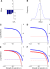
Selection in the LST population. (A) The effects and standard errors of sternopleural bristle QTL detected in the LST population, selected for low sternopleural bristle number. (B) The maximum-ikelihood estimate of the distribution of mutational effects for sternopleural bristles. (C) Log likelihood vs. c, the strength of selection, given the LST QTL data and the maximum-likelihood distribution of mutational effects. The horizontal line indicates the likelihood threshold for a 95% confidence interval. (D) Log likelihood vs. c, given the LST QTL data plus four imputed unobserved loci. (E) Log likelihood vs. c, given the LST QTL data, with the estimate of μ perturbed by adding 1 SD (crosses, dashed threshold line) and subtracting 1 SD (circles, solid threshold line). (F) Log likelihood vs. c given the LST QTL data, with the estimate of σ perturbed by adding 1 SD (crosses, dashed threshold line) and by subtracting 1 SD (circles, solid threshold line).
Figure 5
Figure 5
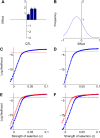
Selection in the HAB population. (A) The effects and standard errors of abdominal bristle QTL detected in the HAB population (selected for high abdominal bristle number. (B) The maximum-likelihood estimate of distribution of mutational effects for abdominal bristles. (C) Log likelihood vs. c, the strength of selection, given the HAB QTL data and the maximum-likelihood distribution of mutational effects. The horizontal line indicates the likelihood threshold for a 95% confidence interval. (D) Log likelihood vs. c, given the HAB QTL data plus five imputed unobserved loci. (E) Log likelihood vs. c given the HAB QTL data, with the estimate of μ perturbed by adding 1 SD (crosses, dashed threshold line) and by subtracting 1 SD (circles, solid threshold line). (F) Log likelihood vs. c given the HAB QTL data, with the estimate of σ perturbed by adding 1 SD (crosses, dashed threshold line) and by subtracting 1 SD (circles, solid threshold line).
Figure 6
Figure 6
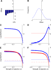
Selection in the LAB population. (A) The effects and standard errors of abdominal bristle QTL detected in the LAB population. (B) The maximum-likelihood estimate of distribution of mutational effects for abdominal bristles. (C) Log likelihood vs. c, the strength of selection, given the LAB QTL data and the maximum-likelihood distribution of mutational effects. The horizontal line indicates the likelihood threshold for a 95% confidence interval. (D) Log likelihood vs. c, given the LAB QTL data plus 13 imputed unobserved loci. (E) Log likelihood vs. c given the LAB QTL data, with the estimate of μ perturbed by adding 1 SD (crosses, dashed threshold line) and subtracting 1 SD (circles, solid threshold line). (F) Log likelihood vs. c given the LAB QTL data, with the estimate of σ perturbed by adding 1 SD (crosses, dashed threshold line) and subtracting 1 SD (circles, solid threshold line).
Figure 7
Figure 7
Power vs. the number of loci detected. We applied the likelihood-ratio test to all subsets of the four QTL data sets, with the appropriate mutation-effect distribution. The y-axis represents the proportion of subsets with a given number of loci for which the test rejected the hypothesis of neutrality.

References

    1. Albertson R., Streelman J., Kocher T., 2003. Genetic basis of adaptive shape differences in the cichlid head. J. Hered. 94: 291–301 - PubMed
    1. Anderson E., Slatkin M., 2003. Orr’s quantitative trait loci sign test under conditions of trait ascertainment. Genetics 165: 445–446 - PMC - PubMed
    1. Ashton K., Wagoner A., Carrillo R., Gibson G., 2001. Quantitative trait loci for the monoamine-related traits heart rate and headless behavior in Drosophila melanogaster. Genetics 157: 283–294 - PMC - PubMed
    1. Atwood K. C., Schneider L. K., Ryan F. J., 1951. Periodic selection in Escherichia coli. Proc. Natl. Acad. Sci. USA 37: 146–155 - PMC - PubMed
    1. Barrett R. D. H., Schluter D., 2008. Adaptation from standing genetic variation. Trends Ecol. Evol. 23: 38–44 - PubMed

Publication types

LinkOut - more resources