Review
. 2012 Apr;19(2):338-46.
doi: 10.1007/s12350-011-9509-2.

Quantitative analysis of perfusion studies: strengths and pitfalls

Affiliations
Review

Quantitative analysis of perfusion studies: strengths and pitfalls

Piotr Slomka et al. J Nucl Cardiol. 2012 Apr.

Abstract

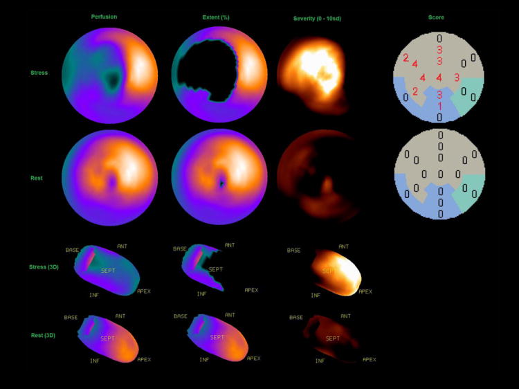
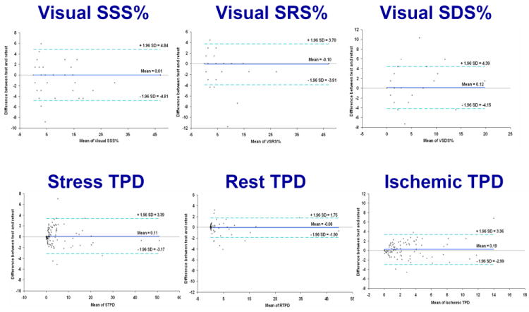
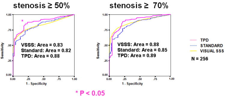
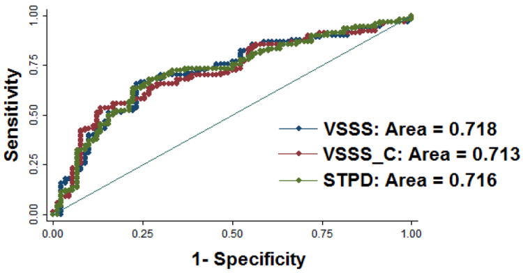
Tools for automated quantification of myocardial perfusion are available to nuclear cardiology practitioners and researchers. These methods have demonstrated superior reproducibility with comparable diagnostic and prognostic performance, when compared with segmental visual scoring by expert observers. A particularly useful application of the quantitative analysis can be in the detection of subtle changes or in precise determination of ischemia. Some challenges remain in the routine application of perfusion quantification. Multiple quantitative parameters may need to be reconciled by the expert reader for the final diagnosis. Computer analysis may be sensitive to imaging artifacts, resulting in false positive scans. Perfusion quantification may require site specific normal limits and some degree of manual interaction. New software improvements have been proposed to address some of these challenges.


Figures

Figure 1
Figure 1
An example of quantitative polar map displays of extent, severity and automatically generated scores with stress (top) and rest (bottom).
Figure 2
Figure 2
Visual (top) versus automatic (bottom) reproducibility of perfusion analysis. Stress (left column), rest (middle column), and ischemic (right column) measures are shown. (Reproduced with permission from (14))
Figure 3
Figure 3
Diagnostic accuracy of quantitative software vs. visual analysis. ROC curves for detection of CAD (≥ 50% and ≥ 70% stenosis cutoff) for (TPD), previous automated analysis (standard quantification [STD]), and visual scoring (VIS) for the overall test population (n = 256). (Reproduced with permission from (3))
Figure 4
Figure 4
Prediction of cardiac death by quantitative software and visual analysis. ROC curves for evaluating the prognosis power from Cox proportional hazard model including clinical and perfusion parameters. Red ROC curve is the result from the Cox model including clinical and visual perfusion parameters without clinical information and computer quantifications’ aids; blue ROC curve is the result from the Cox model including clinical and visual perfusion parameters with aids of clinical information and computer scores; green ROC curve is the result from the Cox model including the same clinical parameters as in the Cox model for generating red ROC curve and quantitative perfusion parameter. There was no difference in the area-under-the-curve when comparing quantitative and visual determination of myocardial perfusion. (Reproduced with permission from (25))
Figure 5
Figure 5
Comparison of inducible ischemia with MPS pretreatment and after 6 to 18 months of optimal medical therapy (OMT) with or without percutaneous coronary intervention (PCI) in COURAGE trail. (Modified with permission from (26))
Figure 6
Figure 6
Artifact avoidance by combined supine-prone analysis. An example of supine diaphragmatic attenuation artifact on MPS normalizing on prone MPS in 60-y-old male with history of diabetes, hypertension, hypercholesterolemia, and family history of premature CAD who achieved a heart rate of 148 (89% of maximum predicted heart rate). His body mass index was 34 and the ECG response to exercise stress was ischemic for ST segment depression. Subsequent coronary angiogram showed no significant stenosis. Images displayed in 3 short axis (SA), horizontal long axis (HLA), and vertical long axis (VLA) reveal apparent perfusion abnormality in inferior wall in supine images (top row); however, prone images show uniform tracer distribution (middle row). Quantitative results shown as black-out maps (bottom row) show 10% S-TPD, 2% P-TPD, and 0% C-TPD, consistent with absence of CAD. (Modified with permission from (41))

References

    1. Germano G, Kavanagh PB, Su HT, et al. Automatic reorientation of three-dimensional, transaxial myocardial perfusion SPECT images. J Nucl Med. 1995;36(6):1107–1114. - PubMed
    1. Faber TL, Cooke CD, Folks RD, et al. Left ventricular function and perfusion from gated SPECT perfusion images: an integrated method. J Nucl Med. 1999;40(4):650–659. - PubMed
    1. Slomka PJ, Nishina H, Berman DS, et al. Automated Quantification Of Myocardial Perfusion SPECT Using Simplified Normal Limits. J Nucl Cardiol. 2005;12(1):66–77. - PubMed
    1. Van Train KF, Areeda J, Garcia EV, et al. Quantitative same-day rest-stress technetium-99m-sestamibi SPECT: definition and validation of stress normal limits and criteria for abnormality. J Nucl Med. 1993;34(9):1494–1502. - PubMed
    1. Tilkemeier PL, Cooke CD, Ficaro EP, Glover DK, Hansen CL, McCallister BD., Jr American Society of Nuclear Cardiology information statement: Standardized reporting matrix for radionuclide myocardial perfusion imaging. J Nucl Cardiol. 2006;13(6):e157–171. - PubMed

MeSH terms