

Bump hunting to identify differentially methylated regions in epigenetic epidemiology studies
- PMID: 22422453
- PMCID: PMC3304533
- DOI: 10.1093/ije/dyr238
Bump hunting to identify differentially methylated regions in epigenetic epidemiology studies
Abstract
Background: During the past 5 years, high-throughput technologies have been successfully used by epidemiology studies, but almost all have focused on sequence variation through genome-wide association studies (GWAS). Today, the study of other genomic events is becoming more common in large-scale epidemiological studies. Many of these, unlike the single-nucleotide polymorphism studied in GWAS, are continuous measures. In this context, the exercise of searching for regions of interest for disease is akin to the problems described in the statistical 'bump hunting' literature.
Methods: New statistical challenges arise when the measurements are continuous rather than categorical, when they are measured with uncertainty, and when both biological signal, and measurement errors are characterized by spatial correlation along the genome. Perhaps the most challenging complication is that continuous genomic data from large studies are measured throughout long periods, making them susceptible to 'batch effects'. An example that combines all three characteristics is genome-wide DNA methylation measurements. Here, we present a data analysis pipeline that effectively models measurement error, removes batch effects, detects regions of interest and attaches statistical uncertainty to identified regions.
Results: We illustrate the usefulness of our approach by detecting genomic regions of DNA methylation associated with a continuous trait in a well-characterized population of newborns. Additionally, we show that addressing unexplained heterogeneity like batch effects reduces the number of false-positive regions.
Conclusions: Our framework offers a comprehensive yet flexible approach for identifying genomic regions of biological interest in large epidemiological studies using quantitative high-throughput methods.
Figures
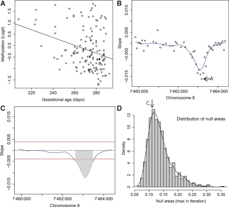
 is retained for the next step. (B) For 48 consecutive probes, the estimated are plotted against their genomic location tj. The specific estimated slope from the probe in (A) is indicated by ‘A’ and an arrow. The blue curve represents the smooth estimate
  obtained using loess. (C) The smooth estimate from (b) is shown but here with predefined thresholds represented by red horizontal lines. The region for which exceeds the lower threshold is considered a candidate DMR. The area shaded in grey is used as a summary statistic. (D) A null distribution for the area summary statistic described in (c) is estimated by performing using permutations (as described in the text). The histogram summarizes the null areas obtained from permutations and estimates the null distribution. The area obtained from the region shown in (C) is highlighted with an arrow and the label ‘C’. Note that this DMR region is not statistically significant as it can easily happen by chance
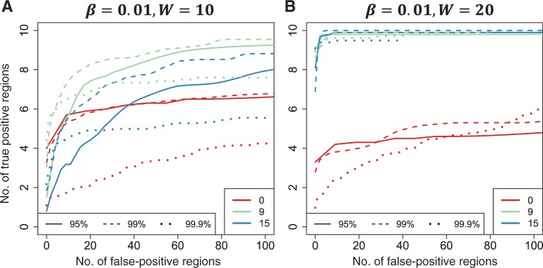 . We also compared three choices of smoothing parameters used by loess: no smoothing and smoothing windows of 9 probes (675 bp) and 15 probes (1125 bp). These are represented by colour. We assessed performance in two scenarios. (A) We inserted 10 true DMRs each 10 probes long (~750 bp) with true effect size β = 0.01. (B) As in (A), but true DMRs were 20 probes long (~1500 bp) with the same effect size
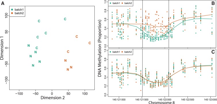
Comment on
- Int J Epidemiol.
References
-
- Shendure J, Ji H. Next-generation DNA sequencing. Nat Biotechnol. 2008;26:1135–45. - PubMed
-
- Mockler TC, Chan S, Sundaresan A, Chen H, Jacobsen SE, Ecker JR. Applications of DNA tiling arrays for whole-genome analysis. Genomics. 2005;85:1–15. - PubMed
-
- Arking DE, Pfeufer A, Post W, et al. A common genetic variant in the NOS1 regulator NOS1AP modulates cardiac repolarization. Nat Genet. 2006;38:644–51. - PubMed
Publication types
MeSH terms
Grants and funding
LinkOut - more resources
Full Text Sources
Other Literature Sources
Miscellaneous
