. 2012 Apr 23:13:58.
doi: 10.1186/1471-2105-13-58.

Methods for visual mining of genomic and proteomic data atlases

Affiliations

Methods for visual mining of genomic and proteomic data atlases

John Boyle et al. BMC Bioinformatics. .

Abstract

Background: As the volume, complexity and diversity of the information that scientists work with on a daily basis continues to rise, so too does the requirement for new analytic software. The analytic software must solve the dichotomy that exists between the need to allow for a high level of scientific reasoning, and the requirement to have an intuitive and easy to use tool which does not require specialist, and often arduous, training to use. Information visualization provides a solution to this problem, as it allows for direct manipulation and interaction with diverse and complex data. The challenge addressing bioinformatics researches is how to apply this knowledge to data sets that are continually growing in a field that is rapidly changing.

Results: This paper discusses an approach to the development of visual mining tools capable of supporting the mining of massive data collections used in systems biology research, and also discusses lessons that have been learned providing tools for both local researchers and the wider community. Example tools were developed which are designed to enable the exploration and analyses of both proteomics and genomics based atlases. These atlases represent large repositories of raw and processed experiment data generated to support the identification of biomarkers through mass spectrometry (the PeptideAtlas) and the genomic characterization of cancer (The Cancer Genome Atlas). Specifically the tools are designed to allow for: the visual mining of thousands of mass spectrometry experiments, to assist in designing informed targeted protein assays; and the interactive analysis of hundreds of genomes, to explore the variations across different cancer genomes and cancer types.

Conclusions: The mining of massive repositories of biological data requires the development of new tools and techniques. Visual exploration of the large-scale atlas data sets allows researchers to mine data to find new meaning and make sense at scales from single samples to entire populations. Providing linked task specific views that allow a user to start from points of interest (from diseases to single genes) enables targeted exploration of thousands of spectra and genomes. As the composition of the atlases changes, and our understanding of the biology increase, new tasks will continually arise. It is therefore important to provide the means to make the data available in a suitable manner in as short a time as possible. We have done this through the use of common visualization workflows, into which we rapidly deploy visual tools. These visualizations follow common metaphors where possible to assist users in understanding the displayed data. Rapid development of tools and task specific views allows researchers to mine large-scale data almost as quickly as it is produced. Ultimately these visual tools enable new inferences, new analyses and further refinement of the large scale data being provided in atlases such as PeptideAtlas and The Cancer Genome Atlas.


Figures
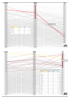
Figure 1
Figure 1
Cancer comparator. The cancer comparison macro view uses a parallel coordinates [31] to provide a cross disease comparison. In this case the visualizations are used to show the differences in gene disruptions, measured by examining structural aberration, between a carcinoma (Colon Cancer), a sarcoma (Ovarian Cancer) and GlioBlastoma (GBM). The values shown on each axis are the number of patients in which the specific gene has been disrupted. The visualization uses the Protoviz libraries, and provides blending and color coding to portray the trends of gene disruptions across the cancers. The visualization allows for range selection across the different axis, so that specific patterns across the cancers can be identified. The parallel coordinates allows for the queries to be performed directly on the data set. In the example (1a) the question being asked is which set of genes show a high level of structural aberration in GBM and a low level of structural aberration in ovarian cancer. The range selection tool has been used to select all genes that have shown aberrations in more than 27 (out of 43) patients in GBM, and also only show aberrations in less than 6 of the ovarian patients. The genes that show these characteristics are HYDIN, DNAH3 and OR2L13. HYDIN aberrations [34,35] are known to cause Hydrocephalus (water on the brain), and so the disruption of this gene in the brain produces a aberration that induces a survival physiological change. DNAH3 produces a Dynein protein and has been shown to be over expressed in ovarian cancer, under expressed in GBM [36] and also to be important in APC mutation based carcinogenesis in colon adenocarcinoma [37]. The OR2L13 olfactory gene is one without obvious function, however it is one of the main 44 recurrently mutated genes in this disease [38]. Figure 1b shows a second query, where the selection tool is used to identify all genes that show a high level of structural aberration across all three cancers. All the genes have been identified by others as being important in cancer and generally appear on multiple gene lists as complied by the MSKCC TCGA gene ranker tool [39]. The three genes that score lowest on this tool are PKHD1 [40] which is known to be involved in colorectal adenocarcinoma, DYNA9 which is involved in cilia transduction signals related to tumorgenesis important in Hedgehog and Wnt pathways [41], and SYNE1 which has recently been implicated in GBM [42]. SYNE1 is followed through the linked tools in Figures 2 and 3 to show the types of information that can be discovered and visualized.
Figure 2
Figure 2
Single cancer view. The genome visualization provides a high level (macro) view to show similarities and differences across samples within a single cancer (Ovarian Cancer). This visualization is based around Circos [33], and allows for the display of high level aggregated features as concentric circles, with connecting arches showing identified associations, in this case common translocations. The concentric rings show, in this instance, information about the genes and karyotypes, and can include experiment information (e.g. identified mutations, methylation, expression). The associations are calculated, and in this instance show genes that have similar levels of disruptions. Selection of information allows for drill down into the related data sets, and filters can be applied which allow for control over the amount of information displayed.
Figure 3
Figure 3
Individual sample comparator. The individual sample comparison tool allows for sets of patients to be explored. It shows disruptions at the gene or sub chromosome level and shows the complexity of gene disruptions between patients and normal/disease pairs. Using the cancer comparison (Figure 1) and genome focused (Figure 2) views, regions or genes of interest can be mined from hundreds of samples and then smaller sets of samples can be visually compared. In this instance on the right hand side are cancer samples, and on the left hand side are the matched normal tissues. The visualization displays the level of rearrangement at the chosen loci. The rearrangements can be complex and involve multiple crossovers or translations across different loci. To accommodate such complexity a nested layout procedure is used, where the main x-axis shows the scaffold chromosome, and the graph that is drawn directly from this shows represents how the rearrangement has resulted in connections between new non-contiguous portions of the chromosome (the thickness of the connecting curves gives an indication as to the portion of reads that show this level of structural variation). For complex multi-site rearrangements this branching procedure is repeated using nested graphs. The amount of disruption, and degree of gene fusion or similar, can then be visually compared. Color coding is used to show different chromosomes, and coverage information is displayed below the x-axis. The system is interactive so selecting on different loci will allow for further exploration filters can also be applied to change the patients being viewed.
Figure 4
Figure 4
mspecLINE Tool. The mspecLINE tool [46] enables the mining of associations between literature information regarding specific diseases and observed peptide spectra. The resulting peptide lists can then be used to generate transition lists for new experiments. The user starts exploration from a specific disease and then all proteins associated with that disease are then discovered. Associations are discovered using an information theory based measure called Normalized Medline Distance. The evidence for the associations, and identified proteotypic peptides can then be retrieved or displayed in Cytoscape.
Figure 5
Figure 5
Visualizing PeptideAtlas. The PeptideAtlas can be explored through literature and disease associations (Figure 4) as well as through gene centered views. The genome visualization on the left allows a user to mine observed spectra based on chromosome location, and drill down can be undertaken by selecting a location of interest and viewing available genomic and proteomic annotations. The user starts exploration of the repository through the main genome browser to find genes of interest, information about relationships between genes can be displayed in the center of the viewer. Information about the protein products of the genes, relating to information stored in PeptideAtlas, is shown in the concentric rings. The display on the right provides further details about the protein products, including detectability.
Figure 6
Figure 6
Cytoscape detectable proteins. Using Cytoscape, PeptideAtlas information can be overlaid on TCGA data in a network context, allowing users to locate potential biomarkers within the context of a given cancer network. In this instance genes that have been identified as having being important in cancer progression, through changes in gene dosage, are shown. The diamonds show loci of the genes, and the circles show the genes themselves. Information from PeptideAtlas, relating to if it is known if the corresponding protein is detectable, is overlaid.

Similar articles

Cited by

References

    1. Desiere F, The PeptideAtlas project. Nucleic Acids Res. 2006. pp. D655–D658. - PMC - PubMed
    1. McLendon R. et al.Comprehensive genomic characterization defines human glioblastoma genes and core pathways. Nature. 2008;455(7216):1061–1068. doi: 10.1038/nature07385. - DOI - PMC - PubMed
    1. Santamaria R. et al.Systems biology of infectious diseases: a focus on fungal infections. Immunobiology. 2011;216(11):1212–1227. doi: 10.1016/j.imbio.2011.08.004. - DOI - PubMed
    1. Ideker T, Galitski T, Hood L. A new approach to decoding life: systems biology. Annu Rev Genomics Hum Genet. 2001;2:343–372. doi: 10.1146/annurev.genom.2.1.343. - DOI - PubMed
    1. Suderman M, Hallett M. Tools for visually exploring biological networks. Bioinformatics. 2007;23(20):2651–2659. doi: 10.1093/bioinformatics/btm401. - DOI - PubMed

Publication types