. 2012;7(4):e35954.
doi: 10.1371/journal.pone.0035954. Epub 2012 Apr 26.

Spatial and temporal trends of global pollination benefit

Affiliations

Spatial and temporal trends of global pollination benefit

Sven Lautenbach et al. PLoS One. 2012.

Abstract

Pollination is a well-studied and at the same time a threatened ecosystem service. A significant part of global crop production depends on or profits from pollination by animals. Using detailed information on global crop yields of 60 pollination dependent or profiting crops, we provide a map of global pollination benefits on a 5' by 5' latitude-longitude grid. The current spatial pattern of pollination benefits is only partly correlated with climate variables and the distribution of cropland. The resulting map of pollination benefits identifies hot spots of pollination benefits at sufficient detail to guide political decisions on where to protect pollination services by investing in structural diversity of land use. Additionally, we investigated the vulnerability of the national economies with respect to potential decline of pollination services as the portion of the (agricultural) economy depending on pollination benefits. While the general dependency of the agricultural economy on pollination seems to be stable from 1993 until 2009, we see increases in producer prices for pollination dependent crops, which we interpret as an early warning signal for a conflict between pollination service and other land uses at the global scale. Our spatially explicit analysis of global pollination benefit points to hot spots for the generation of pollination benefits and can serve as a base for further planning of land use, protection sites and agricultural policies for maintaining pollination services.


Conflict of interest statement

Competing Interests: The authors have declared that no competing interests exist.

Figures

Figure 1
Figure 1. Temporal trend of global pollination benefit.
Displayed are the values based on the average pollination dependency of crops (bold line) as well as on the upper and lower range of the values given by . Values are in billion US $ inflation corrected for the year 2009.
Figure 2
Figure 2. Share of the six most important countries on total pollination benefits.
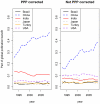
The left graph shows the part of global pollination benefits in each year that was produced in the different countries if the purchasing power parities correction were applied. The graph on the right side shows the same situation for the uncorrected pollination benefits.
Figure 3
Figure 3. Temporal trend for pollination-weighted production quantities and pollination benefits (equation (1) and 2) as well as production quantities and producer prices-weighted production quantities for selected pollination-independent crops (maize, rice, wheat, rye, yams, sorghum, and taro).
For comparison all time series have been standardized to a value of 1 for 1993.
Figure 4
Figure 4. Temporal trend for prices for all pollination-dependent crops (bold line) and for selected pollination-independent crops (maize, rice, wheat, rye, yams, sorghum, taro, dashed line).
All time series have been standardized to 1 for 1993.
Figure 5
Figure 5. Temporal trend of vulnerability indicators.
The left panel shows the development of the part of the global GDP that is dependent on pollination while the right panel shows the part of the agricultural GDP dependent on pollination.
Figure 6
Figure 6. Spatial pattern of vulnerability.
The maps show the national dependency of the agricultural GDP on pollination for the years 1993 and 2009 as an indicator of the vulnerability of agriculture in the different countries.
Figure 7
Figure 7. Changes in pollination benefit between 1993 and 2009 compared to changes in the agricultural GDP in the same time period.
A value of one represents an increase by 100% relative to 1993. Bubble area as well as color intensity represents the size of the agricultural economy in 2009 – color intensity is inversely related to the size of the agricultural economy. The 1∶1 line (depicting proportional changes) has been added to aid interpretation. Fiji (rel. change in agricultural production = 0, relative change of pollination benefits = ∼80) has been excluded from the plot.
Figure 8
Figure 8. Global map of pollination benefits.
Values are given as US $ per hectare for the year 2000. The values have been corrected for inflation (to the year 2009) as well as for purchasing power parities. The area we relate yields to is the total area of the raster cell.
Figure 9
Figure 9. Global map of pollination benefits for soybeans.
Values are given as US $ per hectare for the year 2000. The values have been corrected for inflation (to the year 2009) as well as for purchasing power parities. The area we relate yields to is the total area of the raster cell. Missing data refers to situations there yield information is available but no information on the cultivated area is available. Missing data typically occur in locations there yield per hectare agricultural is low.
Figure 10
Figure 10. Global map of pollination benefits for cotton.
Values are given as US $ per hectare for the year 2000. The values have been corrected for inflation (to the year 2009) as well as for purchasing power parities. The area we relate yields to is the total area of the raster cell. Missing data refers to situations there yield information is available but no information on the cultivated area is available. Missing data typically occur in locations there yield per hectare agricultural is low.
Figure 11
Figure 11. Global map of pollination benefits for apples.
Values are given as US $ per hectare for the year 2000. The values have been corrected for inflation (to the year 2009) as well as for purchasing power parities. The area we relate yields to is the total area of the raster cell. Missing data refers to situations there yield information is available but no information on the cultivated area is available. Missing data typically occur in locations there yield per hectare agricultural is low.
Figure 12
Figure 12. Global map of pollination benefits for pears.
Values are given as US $ per hectare for the year 2000. The values have been corrected for inflation (to the year 2009) as well as for purchasing power parities. The area we relate yields to is the total area of the raster cell. Missing data refers to situations there yield information is available but no information on the cultivated area is available. Missing data typically occur in locations there yield per hectare agricultural is low.
Figure 13
Figure 13. Global map of pollination benefits for almonds.
Values are given as US $ per hectare for the year 2000. The values have been corrected for inflation (to the year 2009) as well as for purchasing power parities. The area we relate yields to is the total area of the raster cell. Missing data refers to situations there yield information is available but no information on the cultivated area is available. Missing data typically occur in locations there yield per hectare agricultural is low.
Figure 14
Figure 14. Global map of pollination benefits for cacao.
Values are given as US $ per hectare for the year 2000. The values have been corrected for inflation (to the year 2009) as well as for purchasing power parities. The area we relate yields to is the total area of the raster cell. Missing data refers to situations there yield information is available but no information on the cultivated area is available. Missing data typically occur in locations there yield per hectare agricultural is low.
Figure 15
Figure 15. Global map of pollination benefits for coffee.
Values are given as US $ per hectare for the year 2000. The values have been corrected for inflation (to the year 2009) as well as for purchasing power parities. The area we relate yields to is the total area of the raster cell. Missing data refers to situations there yield information is available but no information on the cultivated area is available. Missing data typically occur in locations there yield per hectare agricultural is low.

References

    1. MEA (Millenium Ecosystem Assessment) 2005. Ecosystems and human well-being: current state and trends (Island Press)
    1. TEEB. 2010. The Economics of Ecosystems & Biodiversity - Mainstreaming the economics of nature - a synthesis of the approach, conclusions and recommendations of TEEB Available at: http://www.teebweb.org/
    1. Fisher B, Turner K, Zylstra M, Brouwer R, de Groot R, et al. Ecosystem services and economic theory: integration for policy-relevant research. Ecological Applications. 2008;18:2050–67. - PubMed
    1. Seppelt R, Eppink FV, Lautenbach S, Schmidt S, Dormann CF. A quantitative review of ecosystem service studies: Approaches, shortcomings and the road ahead. Journal of Applied Ecology. 2011;48:630–636.
    1. de Groot RS, Alkemade R, Braat L, Hein L, Willemen L. Challenges in integrating the concept of ecosystem services and values in landscape planning, management and decision making. Ecological Complexity. 2010;7:260–272.

Publication types