. 2012 Jun 26:13:147.
doi: 10.1186/1471-2105-13-147.

Arrow plot: a new graphical tool for selecting up and down regulated genes and genes differentially expressed on sample subgroups

Affiliations

Arrow plot: a new graphical tool for selecting up and down regulated genes and genes differentially expressed on sample subgroups

Carina Silva-Fortes et al. BMC Bioinformatics. .

Abstract

Background: A common task in analyzing microarray data is to determine which genes are differentially expressed across two (or more) kind of tissue samples or samples submitted under experimental conditions. Several statistical methods have been proposed to accomplish this goal, generally based on measures of distance between classes. It is well known that biological samples are heterogeneous because of factors such as molecular subtypes or genetic background that are often unknown to the experimenter. For instance, in experiments which involve molecular classification of tumors it is important to identify significant subtypes of cancer. Bimodal or multimodal distributions often reflect the presence of subsamples mixtures. Consequently, there can be genes differentially expressed on sample subgroups which are missed if usual statistical approaches are used. In this paper we propose a new graphical tool which not only identifies genes with up and down regulations, but also genes with differential expression in different subclasses, that are usually missed if current statistical methods are used. This tool is based on two measures of distance between samples, namely the overlapping coefficient (OVL) between two densities and the area under the receiver operating characteristic (ROC) curve. The methodology proposed here was implemented in the open-source R software.

Results: This method was applied to a publicly available dataset, as well as to a simulated dataset. We compared our results with the ones obtained using some of the standard methods for detecting differentially expressed genes, namely Welch t-statistic, fold change (FC), rank products (RP), average difference (AD), weighted average difference (WAD), moderated t-statistic (modT), intensity-based moderated t-statistic (ibmT), significance analysis of microarrays (samT) and area under the ROC curve (AUC). On both datasets all differentially expressed genes with bimodal or multimodal distributions were not selected by all standard selection procedures. We also compared our results with (i) area between ROC curve and rising area (ABCR) and (ii) the test for not proper ROC curves (TNRC). We found our methodology more comprehensive, because it detects both bimodal and multimodal distributions and different variances can be considered on both samples. Another advantage of our method is that we can analyze graphically the behavior of different kinds of differentially expressed genes.

Conclusion: Our results indicate that the arrow plot represents a new flexible and useful tool for the analysis of gene expression profiles from microarrays.


Figures
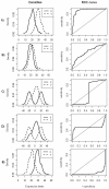
Figure 1
Figure 1
Relationship between densities and ROC curves considering equal variances on both groups. Probability density functions of gene expression values of two groups and their corresponding empirical ROC curves, where Y is the random variable which represents the expression values under the experimental condition and X the random variable which represents the expression values for the control group. The same classification rule was considered for all ROC plots, namely, high values of the decision variable correspond to positive regulation. Density plots were obtained using kernel density estimation from two samples of size 100 simulated from normal distributions. A)X ∼ N(20, 4),Y ∼ N(30, 4); B)X ∼ N(20, 4),Y ∼ N(22, 4); C)X ∼ 0.5N(−20, 2) + 0.5N(20, 2),Y ∼ N(0, 11); D)X ∼ N(0, 11),Y ∼ 0.5N(−20, 2) + 0.5N(20, 2); E)X ∼ N(30, 4),Y ∼ N(20, 4).
Figure 2
Figure 2
Relationship between densities and ROC curves, considering different variances and similar means on both groups. Probability density functions of gene expression values of two groups and their corresponding empirical ROC curves, where Y is the random variable which represents the expression values under the experimental group and X is the random variables which represents the expression values for the control group. The same classification rule was considered in all ROC plots, i.e., high values of the decision variable correspond to positive regulation. Density plots were obtained using kernel density estimation from two samples of size 100 simulated from normal distributions. A)X ∼ N(20, 15),Y ∼ N(20, 60); B)X ∼ N(20, 40),Y ∼ N(20, 5).
Figure 3
Figure 3
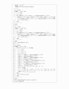
Algorithm 1. Pseudo code to estimate OVL based on kernel density estimates.
Figure 4
Figure 4
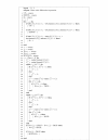
Algorithm 2. Pseudo code to select differentially expressed genes based on AUC and OVL estimates.
Figure 5
Figure 5
Arrow plot of lymphoma data. AUC≥ 0.9 and OVL< 0.5 was considered to select up-regulated genes, corresponding to red dots on the plot. To select down-regulated genes an AUC≤0.1 and OVL< 0.5 was considered, corresponding to blue dots on the plot. To select special genes an OVL< 0.5 and 0.4 <AUC< 0.6 was considered. Orange dots correspond to a bimodal or multimodal density in the experimental group, cyan dots correspond to a bimodal or multimodal density in the control group and green dots correspond to a bimodal or multimodal densities in both groups.
Figure 6
Figure 6
Kernel density plots and empirical ROC plots. Kernel density estimate of the 20 special selected genes expression values, where red densities represent the experimental sample and black densities represent the control sample. The x-axis is on log base 2 scale. From left to the right, each plot pair correspond to densities and respective empirical ROC curve of the gene ID’s: GENE1141X GENE3521X, GENE3547X, GENE3473X, GENE2547X, GENE2519X, GENE1877X, GENE3343X, GENE3322X, GENE3323X, GENE3389X, GENE3388X, GENE3909X, GENE2887X, GENE2778X, GENE463X, GENE1004X, GENE3407X, GENE75X, GENE1817X.
Figure 7
Figure 7
Arrow plot of simulated data. Orange dots correspond to truly no differentially expressed genes, red dots correspond to truly up-regulated genes, blue dots correspond to truly down-regulated genes and green dots to truly special genes. We considered as up-regulated genes those for which AUC≥ 0.9 and an OVL< 0.5. To select down-regulated genes an AUC≤ 0.1 and an OVL< 0.5 were considered and to select differentially expressed genes with bimodal or multimodal densities we considered an OVL< 0.5 and 0.4 <AUC< 0.6.
Figure 8
Figure 8
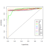
Empirical ROC curves. Comparison of ROC curves in experiments where the goal is to select up- and down-regulated genes and special genes.
Figure 9
Figure 9
Empirical ROC curves. Comparison of ROC curves in experiments where the goal is to select special genes.

Similar articles

Cited by

References

    1. Horn T, Sandmann T, Fischer B, Axelsson E, Huber W, Boutros M. Mapping of signalling networks through synthetic genetic interaction analysis by RNAi. Nat Methods. 2011;8(4):341–349. doi: 10.1038/nmeth.1581. - DOI - PubMed
    1. Xu Z, Wei W, Gagneur J, Clauder-Munster S, Smolik M, Huber W, Steinmetz L. Antisense expression increases gene expression variability and locus interdependency. Molecular Systems of Biology. 2011;7:1–10. - PMC - PubMed
    1. Mancera E, Bourgon R, Huber W, Steinmetz LM. Genome-wide survey of post-meiotic segregation during yeast recombination. Genome Biol. 2011;12:R36. doi: 10.1186/gb-2011-12-4-r36. - DOI - PMC - PubMed
    1. Thomsen S, Anders S, Janga SC, Huber W, Alonso CA. Genome-wide analysis of mRNA decay patterns during early Drosophila development. Genome Biol. 2010;11:R93. doi: 10.1186/gb-2010-11-9-r93. - DOI - PMC - PubMed
    1. Parodi S, Pistoia V, Muselli M. Not proper ROC curves as new tool for the analysis of differentially expressed genes in microarray experiments. BMC Bioinformatics. 2008;9:410. doi: 10.1186/1471-2105-9-410. - DOI - PMC - PubMed

Publication types

LinkOut - more resources