

Design and update of a classification system: the UCSD map of science
- PMID: 22808037
- PMCID: PMC3395643
- DOI: 10.1371/journal.pone.0039464
Design and update of a classification system: the UCSD map of science
Abstract
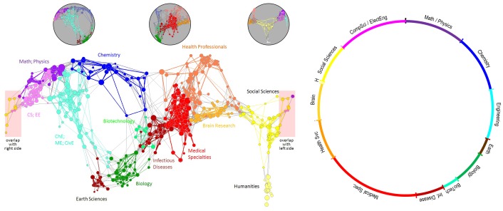
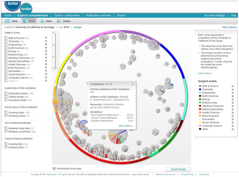
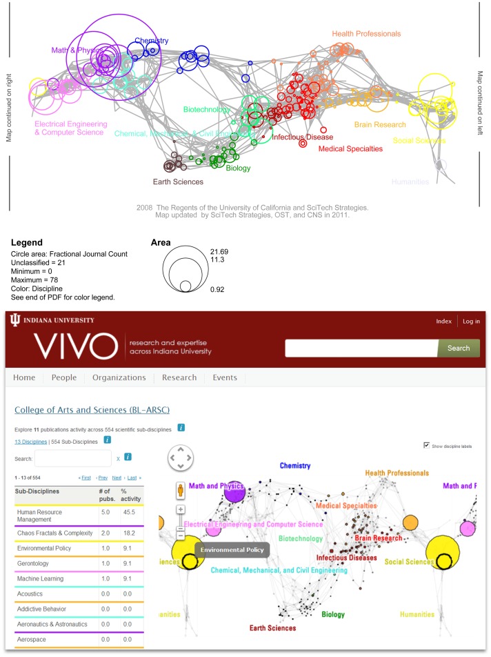
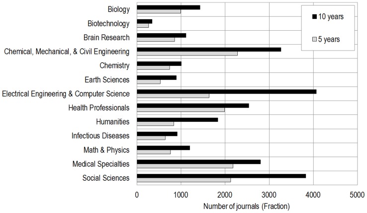
Global maps of science can be used as a reference system to chart career trajectories, the location of emerging research frontiers, or the expertise profiles of institutes or nations. This paper details data preparation, analysis, and layout performed when designing and subsequently updating the UCSD map of science and classification system. The original classification and map use 7.2 million papers and their references from Elsevier's Scopus (about 15,000 source titles, 2001-2005) and Thomson Reuters' Web of Science (WoS) Science, Social Science, Arts & Humanities Citation Indexes (about 9,000 source titles, 2001-2004)-about 16,000 unique source titles. The updated map and classification adds six years (2005-2010) of WoS data and three years (2006-2008) from Scopus to the existing category structure-increasing the number of source titles to about 25,000. To our knowledge, this is the first time that a widely used map of science was updated. A comparison of the original 5-year and the new 10-year maps and classification system show (i) an increase in the total number of journals that can be mapped by 9,409 journals (social sciences had a 80% increase, humanities a 119% increase, medical (32%) and natural science (74%)), (ii) a simplification of the map by assigning all but five highly interdisciplinary journals to exactly one discipline, (iii) a more even distribution of journals over the 554 subdisciplines and 13 disciplines when calculating the coefficient of variation, and (iv) a better reflection of journal clusters when compared with paper-level citation data. When evaluating the map with a listing of desirable features for maps of science, the updated map is shown to have higher mapping accuracy, easier understandability as fewer journals are multiply classified, and higher usability for the generation of data overlays, among others.
Conflict of interest statement
Figures
References
-
- Börner K, Chen C, Boyack KW. Visualizing Knowledge Domains. In Cronin B, editor. Annual Review of Information Science & Technology. 2003. pp. 179–255.
-
- Boyack KW, Börner K. Indicator-Assisted Evaluation and Funding of Research: Visualizing the Influence of Grants on the Number and Citation Counts of Research Papers. Journal of the American Society of Information Science and Technology. 2003;54(5):447–461.
-
- Leydesdorff L, Rafols I. A Global Map of Science Based on the ISI Subject Categories. Journal of the American Society for Information Science and Technology. 2009;60(2):348–362.
Publication types
MeSH terms
Grants and funding
LinkOut - more resources
Full Text Sources
