Animated graphics for comparing two risks: a cautionary tale
- PMID: 22832208
- PMCID: PMC3409597
- DOI: 10.2196/jmir.2030
Animated graphics for comparing two risks: a cautionary tale
Abstract
Background: The increasing use of computer-administered risk communications affords the potential to replace static risk graphics with animations that use motion cues to reinforce key risk messages. Research on the use of animated graphics, however, has yielded mixed findings, and little research exists to identify the specific animations that might improve risk knowledge and patients' decision making.
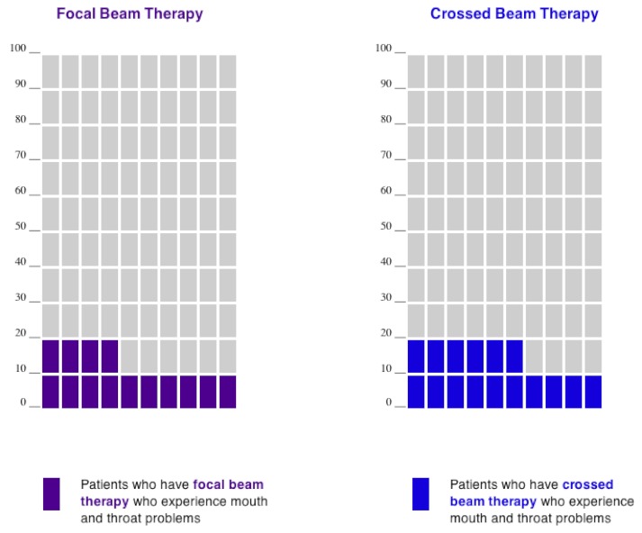
Objective: To test whether viewing animated forms of standard pictograph (icon array) risk graphics displaying risks of side effects would improve people's ability to select the treatment with the lowest risk profile, as compared with viewing static images of the same risks.
Methods: A total of 4198 members of a demographically diverse Internet panel read a scenario about two hypothetical treatments for thyroid cancer. Each treatment was described as equally effective but varied in side effects (with one option slightly better than the other). Participants were randomly assigned to receive all risk information in 1 of 10 pictograph formats in a quasi-factorial design. We compared a control condition of static grouped icons with a static scattered icon display and with 8 Flash-based animated versions that incorporated different combinations of (1) building the risk 1 icon at a time, (2) having scattered risk icons settle into a group, or (3) having scattered risk icons shuffle themselves (either automatically or by user control). We assessed participants' ability to choose the better treatment (choice accuracy), their gist knowledge of side effects (knowledge accuracy), and their graph evaluation ratings, controlling for subjective numeracy and need for cognition.
Results: When compared against static grouped-icon arrays, no animations significantly improved any outcomes, and most showed significant performance degradations. However, participants who received animations of grouped icons in which at-risk icons appeared 1 at a time performed as well on all outcomes as the static grouped-icon control group. Displays with scattered icons (static or animated) performed particularly poorly unless they included the settle animation that allowed users to view event icons grouped.
Conclusions: Many combinations of animation, especially those with scattered icons that shuffle randomly, appear to inhibit knowledge accuracy in this context. Static pictographs that group risk icons, however, perform very well on measures of knowledge and choice accuracy. These findings parallel recent evidence in other data communication contexts that less can be more-that is, that simpler, more focused information presentation can result in improved understanding. Decision aid designers and health educators should proceed with caution when considering the use of animated risk graphics to compare two risks, given that evidence-based, static risk graphics appear optimal.
Conflict of interest statement
None declared.
Figures
Similar articles
-
Cool but counterproductive: interactive, Web-based risk communications can backfire.J Med Internet Res. 2011 Aug 25;13(3):e60. doi: 10.2196/jmir.1665. J Med Internet Res. 2011. PMID: 21868349 Free PMC article.
-
Blocks, ovals, or people? Icon type affects risk perceptions and recall of pictographs.Med Decis Making. 2014 May;34(4):443-53. doi: 10.1177/0272989X13511706. Epub 2013 Nov 18. Med Decis Making. 2014. PMID: 24246564 Free PMC article.
-
Animated randomness, avatars, movement, and personalization in risk graphics.J Med Internet Res. 2014 Mar 18;16(3):e80. doi: 10.2196/jmir.2895. J Med Internet Res. 2014. PMID: 24642037 Free PMC article.
-
Computer animations in medical education: a critical literature review.Med Educ. 2009 Sep;43(9):838-46. doi: 10.1111/j.1365-2923.2009.03429.x. Med Educ. 2009. PMID: 19709008 Review.
-
How Difference Tasks Are Affected by Probability Format, Part 2: A Making Numbers Meaningful Systematic Review.MDM Policy Pract. 2025 Feb 24;10(1):23814683241310242. doi: 10.1177/23814683241310242. eCollection 2025 Jan-Jun. MDM Policy Pract. 2025. PMID: 40094048 Free PMC article. Review.
Cited by
-
Insufficient evidence for interactive or animated graphics for communicating probability.J Am Med Inform Assoc. 2024 Nov 1;31(11):2760-2765. doi: 10.1093/jamia/ocae123. J Am Med Inform Assoc. 2024. PMID: 38904366 Free PMC article.
-
Impact of Game-Inspired Infographics on User Engagement and Information Processing in an eHealth Program.J Med Internet Res. 2016 Sep 22;18(9):e237. doi: 10.2196/jmir.5976. J Med Internet Res. 2016. PMID: 27658469 Free PMC article.
-
How Point (Single-Probability) Tasks Are Affected by Probability Format, Part 1: A Making Numbers Meaningful Systematic Review.MDM Policy Pract. 2025 Feb 24;10(1):23814683241255333. doi: 10.1177/23814683241255333. eCollection 2025 Jan-Jun. MDM Policy Pract. 2025. PMID: 39995779 Free PMC article. Review.
-
Information visualizations of symptom information for patients and providers: a systematic review.J Am Med Inform Assoc. 2019 Feb 1;26(2):162-171. doi: 10.1093/jamia/ocy152. J Am Med Inform Assoc. 2019. PMID: 30535152 Free PMC article.
-
Presenting quantitative information about decision outcomes: a risk communication primer for patient decision aid developers.BMC Med Inform Decis Mak. 2013;13 Suppl 2(Suppl 2):S7. doi: 10.1186/1472-6947-13-S2-S7. Epub 2013 Nov 29. BMC Med Inform Decis Mak. 2013. PMID: 24625237 Free PMC article. Review.
References
-
- Gigerenzer G. The psychology of good judgment: frequency formats and simple algorithms. Med Decis Making. 1996;16(3):273–80. - PubMed
-
- Schapira MM, Nattinger AB, McHorney CA. Frequency or probability? A qualitative study of risk communication formats used in health care. Med Decis Making. 2001 Dec;21(6):459–67. - PubMed
Publication types
MeSH terms
LinkOut - more resources
Full Text Sources