. 2012;7(8):e43528.
doi: 10.1371/journal.pone.0043528. Epub 2012 Aug 16.

Local variations in spatial synchrony of influenza epidemics

Affiliations

Local variations in spatial synchrony of influenza epidemics

James H Stark et al. PLoS One. 2012.

Abstract

Background: Understanding the mechanism of influenza spread across multiple geographic scales is not complete. While the mechanism of dissemination across regions and states of the United States has been described, understanding the determinants of dissemination between counties has not been elucidated. The paucity of high resolution spatial-temporal influenza incidence data to evaluate disease structure is often not available.

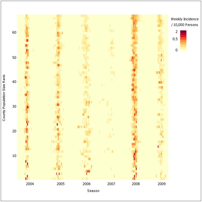
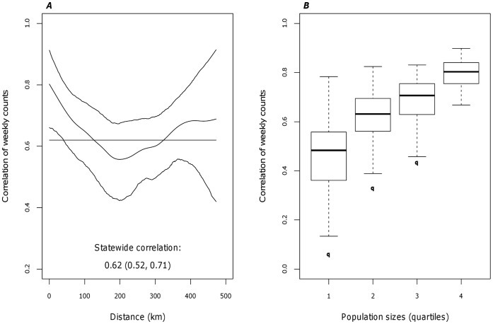
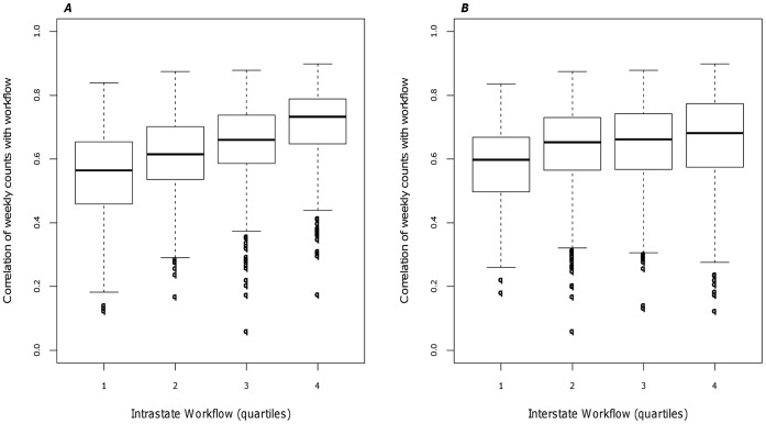
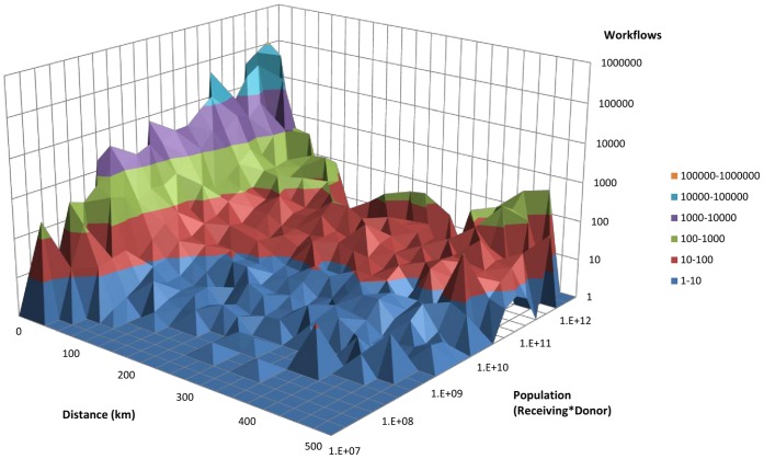
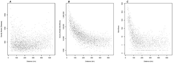
Methodology and findings: We report on the underlying relationship between the spread of influenza and human movement between counties of one state. Significant synchrony in the timing of epidemics exists across the entire state and decay with distance (regional correlation=62%). Synchrony as a function of population size display evidence of hierarchical spread with more synchronized epidemics occurring among the most populated counties. A gravity model describing movement between two populations is a stronger predictor of influenza spread than adult movement to and from workplaces suggesting that non-routine and leisure travel drive local epidemics.

Conclusions: These findings highlight the complex nature of influenza spread across multiple geographic scales.


Conflict of interest statement

Competing Interests: The authors have declared that no competing interests exist.

Figures

Figure 1
Figure 1. Map of Pennsylvania, US detailing the county boundaries, urban areas, and transportation networks.
Pittsburgh in Allegheny County is highlighted in the West and Philadelphia is highlighted in the South East. Both urban areas have international airports and are connected by a major interstate highway.
Figure 2
Figure 2. Weekly case incidence for 67 counties by population size.
Intensity image displace weekly case incidence (per 10,000 persons) sorted by population size. The counties are arranged from largest population size (67 = Philadelphia) to the smallest population size (1 = Forest). The surveillance system defines each influenza season to begin in the 40th week of the calendar year through the last week of April of the following year.
Figure 3
Figure 3. Correlation of weekly time series with distance and population size.
A) Synchrony as a function of distance. The spline function (middle curve) is presented with a 95% confidence interval (outer curves). B) Synchrony as a function of population size (product of population i, j). The distribution of population was categorized by quartile. The boxplot within each quartile represent the distribution of the correlation of population between pairs of counties.
Figure 4
Figure 4. Correlation of weekly time series with human movement.
A) Synchrony as a function of workflows. B) Synchrony as a function of Pennsylvania and neighboring county workflows. The distribution of workflow was categorized by quartile. The boxplot within each quartile represent the distribution of the correlation of workflow between pairs of counties.
Figure 5
Figure 5. Association of workflows, population and distance.
(y-axis and z-axis log10 scale). The relationship between workflows (z-axis), population size (y-axis) and distance (x-axis).
Figure 6
Figure 6. Correlation of gravity model and workflows with distance.
A) Each point represents the distance between two counties as a function of the gravity model fitted to disease for the pair of counties. B) Each point represents the distance between two counties as a function of the gravity model fitted to workflows for the pair of counties (y-axis log10 scale). C) Each point represents the distance between two counties as a function of the workflows for the pair of counties (y-axis log 10 scale).

References

    1. Grenfell BT, Bjornstad ON, Kappey J (2001) Travelling waves and spatial hierarchies in measles epidemics. Nature 414: 716–723. - PubMed
    1. Vora A, Burke DS, Cummings DA (2008) The impact of a physical geographic barrier on the dynamics of measles. Epidemiol Infect 136: 713–720. - PMC - PubMed
    1. Cummings DA, Irizarry RA, Huang NE, Endy TP, Nisalak A, et al. (2004) Travelling waves in the occurrence of dengue haemorrhagic fever in Thailand. Nature 427: 344–347. - PubMed
    1. Grenfell BT, Bolker BM (1998) Cities and villages: infection hierarchies in a measles metapopulation. Ecology Letters 1: 63–70.
    1. Alonso WJ, Viboud C, Simonsen L, Hirano EW, Daufenbach LZ, et al. (2007) Seasonality of Influenza in Brazil: A Traveling Wave from the Amazon to the Subtropics. American Journal of Epidemiology 165: 1434–1442. - PubMed

Publication types